SHOW ME
Tuesday, October 31, 2006
The Magic Pudding And The Great War
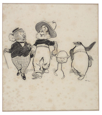 My brother recently sent me a copy of the fantastic and inimitable children's story The Magic Pudding, written by Norman Lindsay and published in 1918. At nearly forty, the artist and author had already made a name for himself with his controversial artwork (he became a devotee of Nietzsche's moral philosophy as well as embracing his neo-Classicism) and had scandalized audiences in his native Australia and abroad with works like his 1912 "Crucified Venus." The pen-and-ink drawing depicts a nude woman in a Venus de Miloesque pose being nailed to a cross by Catholic friars while Puritans, priests, and preachers look on, and showcases his marriage of a realist style from the 19th century with a strong desire to criticize conventional social mores. (You can see that as well as more of his drawings, paintings and etchings here.)
That combination would have made him a fitting companion for the Italian Dionysian and political dynamo Gabriele D'Annunzio, fifteen years his senior and half a world away. The term many such men favored - "vitalist" - speaks to the hypermasculinity (scenes of rape were popular "classical" subjects) that was the antithesis of those other libertines, the Bohemians (not to be confused with people from Bohemia). Lindsay illustrated Petronius and Casanova, and like D'Annunzio blended politics and art fluently, following that strange path of libertines turned nationalists, whose calcified views in that period saw heroic "supermen" as the champions of exalted appetites rather than as the Puritans they proved themselves to be. Drawing on his years as a political cartoonist, Lindsay first showed the strength of his poison pen with a portrayal of World War I-era Germany that would have been at home in a Gothic (or graphic) novel. Lindsay did for the German menace in 1918 what Frank Miller would do for urban street gangs in his seminal 1986 Batman-redefining graphic novel The Dark Knight Returns; both preyed on dark, primal fears by drawing nightmarish references into Technicolor reality to approach an anxiety-inducing threat: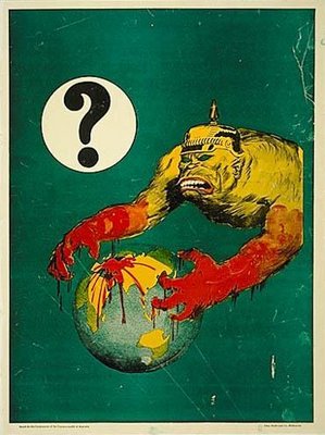 Australia's position in World War I was markedly different from that of the U.S. As a part of the British Commonwealth, Australia was saddled with both immediate participation in the war and the lack of an existing army beyond what England believed Australia needed for her self-defense, so there was immense pressure to raise a standing army from scratch. With the help of a massive propaganda campaign the Australian government raised an army of 20,000 men in less than four months, and kept the bodies coming for four years. Lindsay had learned in 1917 that his brother had been killed in the war, and took part in Australia's final recruiting drive the following year, producing several recruitment posters that worked hard to stir up patriotic guilt among young Australian men.
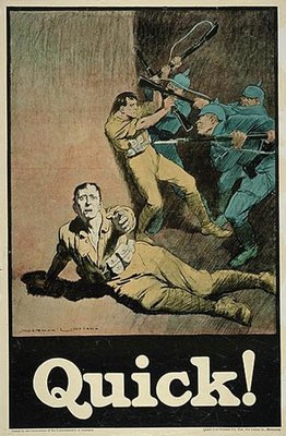 Tensions were high in the recruiting of Australian troops. Referenda to allow for conscription were twice put before the Australian people and defeated both times, while the government used techniques of harrassment, censorship, and arrests of prominent opponents of the war to put as much pressure as possible on a generation of Australian men. The strongest voices of opposition were often the labor organizations, who feared that Australian workers would be replaced by cheap foreign labor which would undercut wages, as well as being motivated by a pacifistic opposition to the war consistent with international workers' movements.
The U.S. has rarely produced such blatant appeals to young men to back up endangered fellow soldiers, and in World War I there was certainly much less at stake. The U.S. did not enter the war until 1918 and then confronted the heavily-reported horrors of the Great War with recruitment posters like this one: In World War II there was no need of U.S. recruitment posters, except to smoke out the few able-bodied men who did not immediately enlist, and the vast majority of wartime propaganda dealt with issues of conservation, production, and secrecy. In the only official "wars" of the late 20th and early 21st centuries, the U.S. government has stuck with the theme of personal benefit in its recruiting efforts (college education, work experience, adventure, development of character) and never dared to play to young Americans' guilt in attempts to draw recruits. The closest U.S. recruitment efforts have come comes in its recently unveiled new recruitment campaign, which participates in a broader cultural commendation of the army unit as a collective source of spiritual value for its members independent of the particular work they happen to be doing.
Unfortunately, Lindsay's devotion to Nietzsche and to heroic politics carried him fully down the path of anti-Semitism and broader Anglo racism. That, as well as his lifelong war against Modernism in art, had more to do with his current status as a minor footnote in the history of art than his Australian provenance, for he was truly an international figure in his day.
Against all that we must weigh The Magic Pudding, a wonderful, boisterous, lyrical work of fiction which is quite possibly the funniest children's book ever written. From its initial conceit - a walking, talking bowl of steak-and-kidney pudding which is not only "bottomless" but demands to be consumed, and prods its owners into brisk exercise when they are full, that they might eat again sooner - Lindsay tells the going-nowhere-fast story of a koala bear, a penguin, and a sailor who struggle to protect their prized possession from a pair of "Puddin' Thieves," complete with violent brawls, sea chantys, mock oratory and obfuscating legal proceedings, and illustrated throughout in the truly delicious style of an expert caricaturist.
It is easy to opine that Lindsay used The Magic Pudding as a means of escaping from the intense seriousness and tragedy of the war that consumed Europe and, by extension, his home country of Australia. It is also probably true. But it is equally likely that the sentiments of The Magic Pudding are entirely consistent with Lindsay's other work and with an eccentric's self-made philosophy, applied towards children, which insisted that the world is yours for the taking, that the worst in life is full of humor, and that pomposity seeks to oppress the free spirit everywhere. The book depicts a world in which even the greatest flights of fancy are permeated by perpetual conflict - a world Lindsay could depict in a cathartic way, but also one that he could only do justice to in the form of a freewheeling comic parable.
Some have cited the story's creation as Lindsay's follow-up to an argument he had with a friend, who observed that children preferred above all to read books about fairies. Lindsay countered, the story goes, that what children really loved to read about was food.
A more detailed assessment of Lindsay's life and work can be found here.
Posted by
Jeremiah McNichols
0
comments
![]()
Monday, October 30, 2006
Friday, October 27, 2006
Notes On Blogger's Worst Week Ever
Allow me to apologize for something completely beyond my control.
Blogger's service this week was abysmal, and you may have been one of the many visitors who were turned away from Think In Pictures at various points by a generic "Internal Server Error" message. Needless to say, I have spent much of the past several days trolling the Internet for advice on just how difficult it is to import a blog to Wordpress.
Google promises that once we blogspotters are allowed to upgrade to the beta version of the new Blogger, all of these problems will be solved. But there is no telling when that will be, and what problems will await us when we attempt to convert. Will we be kept busy tinkering with a host of wonderful new tools, or spend our days struggling to correct archived posts blooming with new bugs?
Google has (finally) moved its own Blogger Status blog from blogspot to the new beta Blogger, which they claim will prevent it from going down along with everyone else's. I'd love to see a friendly redirect or explanatory page when the server's down, as well as more honest real-time statistics on the Blogger Status blog when it is up. (Several "planned maintenance" downtimes declared to last 90 minutes were actually emergency situations and kept blogspot offline for hours. What non-blogspotters don't know is that even after Blogger comes back online, the image server is often still completely fried, and we can't blog anything but text for hours after that.
An engineer later wrote, charmingly, on the Blogger Buzz blog:
It’s been a bad week for Blogger, and, as I hope you can tell, we’re not denying it. Instead, we have taken and will continue to take specific steps that make Blogger a more reliable, overall better service for you to use.I say, prove it. I will wait and try to upgrade before making any move. In the meantime, all I can do is apologize for the downtime.
Posted by
Jeremiah McNichols
3
comments
![]()
Why The Tilt-A-Whirl Is A Fountain Of Youth
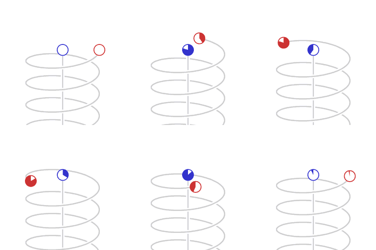
Schematic representation of asymmetric velocity time dilation. The animation represents motion as mapped in a Minkowski space-time diagram, with two dimensions of space, (the horizontal plane) and position in time vertically. The circles represent clocks, counting lapse of proper time. The Minkowski coordinate system is co-moving with the non-accelerating clock.
Created by Wikipedia contributor Cleonis.
Posted by
Jeremiah McNichols
0
comments
![]()
Labels: animation/video/film/television
Thursday, October 26, 2006
In Search of an International Sign For Breastfeeding
 Mothering.com is holding a contest for an international sign for breastfeeding, meant to designate a breastfeeding-friendly location. The contest's organizers write:
The image of a baby bottle announcing the location of a "parents lounge" in an airport got us thinking: Is there an international symbol for breastfeeding? Similar to the familiar icons we've all seen indicating a handicapped parking spot or the women's restroom, this image would be a recognizable symbol indicating that a place is breastfeeding friendly. Ideally, the space would be private, quiet, with a comfortable chair and an electrical outlet for pumping.The contest is an interesting design opportunity, because there is such a need for this symbol (I'm speaking here as the husband of a breastfeeding mother) and such a vacuum in U.S. culture surrounding official acknowledgment of the culture of public (non-sequestered) breastfeeding. That the winning entry (or, if a very bad entry happened to win, an alternate) could actually be adopted internationally is a testament to that need.
You can view the 12 finalists and vote for the winner here. Votes can be cast through October 30.
Posted by
Jeremiah McNichols
0
comments
![]()
Labels: graphic design
Significance of Cornell Autism and Early Childhood Television Link Cast Into Doubt
I wrote recently about research at Cornell which suggested a possible link between early childhood television viewing and autism. The paper was publicized on Slate as an "exclusive" on their front page on October 16. Early skeptics pointed out that the findings were the basis of a conference paper, not a published study, that it had not been peer-reviewed, and that the ramifications of its suggestions were profound. Given that its authors were not arguing that they had unequivocal findings, but merely that further study was needed, I felt that the information was worth passing on to Think In Pictures readers.
A few pundits have since taken the study's methods to task, and Slate readers' criticisms have been among the most perceptive. Since I pointed to the paper and the article when they were published, I thought I should comment on the findings of readers forced to do the research that should have tempered Slate's coverage of this astonishing study.
One Slate reader wrote:
Easterbrook consistently refers to the increase in autism that begins "around 1980, about the same time cable television and VCRs became common". If Easterbrook had done his homework he would have found that 1980 was also the year the diagnosis of "Autism" actually became a diagnostic entry in its own right in the DSM-III. It was reclassified from being part of "psychotic" disorders (like schizophrenia) to having a specific heading in "developmental" disorders. Furthermore, in 1980's the 'autism spectrum' (autism, PDD-NOS, and the newly-minted Asperger's syndrome) definitions were changed or created to include persons with normal range IQ, and less severe symptoms. All of these changes to diagnosis would significantly impact the makeup of the population called "autism spectrum disorders" (ASD)-- sometimes just called "autism" by the media. (to the confusion of many readers). All of these changes coincided with the increase in television-watching, but (am i going out on a limb here?) weren't caused by television.There is a great critique of the study on the blog Autisum Diva. There's also a great critique of the study's logic and methodology on the autism blog Natural Variation.
In retrospect, I should also have seen Slate's "exclusive" coverage of this study as a red flag. With all due respect to a great web magazine, their strength is in commentary, not reporting, and they frequently abuse one of the most challenging tenets of the Society of Professional Journalists' Code of Ethics, which I combed through yesterday when looking for published stances on interview editing:
[Journalists should] Make certain that headlines, news teases and promotional material, photos, video, audio, graphics, sound bites and quotations do not misrepresent. They should not oversimplify or highlight incidents out of context.No one needs to be told that the pressure to "sell" one's story - at the levels of reporting and editing - all conspire to inflame controversy on the pages of daily publications. This seems to be a case of inflation at both levels, which means that, technically speaking, the SPJ guideline as stated can't touch them; the front page sold the story as it was written. The real question is not whether the article accurately described the limitations of the study; it is whether the quality of the study rose to the level that it should receive front-page "exclusive" coverage on Slate.com, or whether the author was competent to evaluate the true value of the findings, given his predisposition towards their message.
But between an enthusiastic and underinformed reporter and the pages of any publication stands an editor. I don't claim to know what Slate science editor Emily Bazelon was thinking on the night of October 15, but it's pretty clear what she was not thinking about: the column editor-at-large Jack Shafer wrote about Easterbrook back in 2003, after the New Republic columnist and Slate contributor was fired from his post as ESPN.com's "Tuesday Morning Quarterback" and attacked by the Anti-Defamation League for an ill-informed blog post. Shafer mused about Easterbrook's fumble:
How could such a thoughtful, deliberate, and precise journalist have gone so stupendously wrong? Having edited Easterbrook numerous times over the years, I know him to be a polymath and a quick study, as well as a good critic of his own work. But this is the first Easterbrook piece that appears to be written from a position of ignorance. His career has been about rigor, originality, and sincerity. That said, perhaps he's not the guy who should write without the safety net of an editor.Make that two pieces, Jack. And so much for that safety net!
Posted by
Jeremiah McNichols
0
comments
![]()
Labels: education
Wednesday, October 25, 2006
When It Comes To The Ethics of Interview Editing, Let the Buyer Beware
Do you have guidelines that govern how you edit interviews? What are they?
I have a lot of personal rules when it comes how I edit interviews, but I believe they are just that - personal. There is far less consensus on the topic of interview editing than on some areas of reporting, and in a litigious age in which reporters are often playing defense, the ethics of the many editing techniques applied to interview material are one of those things journalists don't much like to talk about. So I thought it would be interesting to outline some practices I employ which some journalists might take issue with, and others I avoid that some journalists feel are acceptable.
I wrote yesterday about how great it was using Google Talk to conduct an interview for this blog. The chat client created its own transcript and the format had the immediacy of a telephone interview and the ease of an email interview, and with just a little coordination can be the best way for a busy blogger to get a good feature interview. That got me thinking about publishing the transcript of our interview so readers could see how different an interview transcript can be from a finished interview. I believe that a lot of editing - some of it quite aggressive - is often necessary to create interviews that meet the basic criteria for good stories in other forms. But I also think that these methods should be fairly transparent, so that readers are aware of the ways in which what they see on paper may differ from what occurred.
Reporters may or may not have covered these finer points of interviewing ethics in journalism school, but there is no gold standard on the topic. The best we can really hope for is that reporters apply consistent standards that are in line with broader journalism ethics and err on the side of preserving their subjects' autonomous ability to speak for themselves.
Here are a few things I do with my interviews:
- Rewrite questions in Q&A interviews to better set up answers. The course of a natural conversation can seem disjointed on paper, and statements by the interview subject may require additional explanation which in some cases is more naturally "seeded" prior to the question than interrupting the quote or inserting an editor's note. I do this only if the changes don't put the interview subject at a disadvantage. Of course, if the interviewee was deliberately changing the subject, that's sometimes informative to leave in.
- Edit multiple answers together and strip out questions, or break up long answers with new questions, to improve the flow of the interview.
- Move questions and answers in a Q&A around at will to improve the "story" of the interview and to make sure that it leads off well and ends with a punch.
- Use ellipses ("...") liberally. I use them to excise not only words but whole sentences or paragraphs if my break points fit together nicely and truly represent the same "train of thought," even if it means hopping over statements by the interviewer along the way. In keeping with the original intention of the quotational ellipses, which (I believe) is to strip out material within a single quote, I will not, under any circumstances, create a sequence of fragments that violates the natural time-sequence of the interview - for example, using a part of a quote from an early point in a conversation to round out a quote at the end. This is fairly easy for me to justify in a profile interview, where huge blocks of narrative dross interject between quotations, but in Q&A interviews I typically require myself to move whole Q&A chunks rather than breaking them up, and eschew the practice completely in "documentary" features which follow a conversation through an action - although even then things can get tricky.
- Construct quotes from handwritten notes. I used to have to do this occasionally when I reported news. I never liked it, so I stopped doing it in my features interviewing. Now that that's all I do, I have made it a rule.
- Correct bad grammar. I take out the "ums" and "ers" of interview clips and correct the occasional slip of the tongue which the interviewee would immediately recognize as such, but the language we use says a lot about who we are, and I prefer to err on the side of accuracy. It is amazing to me that so many reporters graciously "correct" bad grammar for their interview subjects on a routine basis. I prefer to allow people to speak as they are.
Here is what I wrote, in part, to Whipple to propose that she give me permission to share the full transcript of our interview:
Below is the edited interview I'd like to post. I have reordered a few things (you can see what by comparing with your chat transcript), combined some question/answer segments to make our blocks of speaking longer and correct any delayed responses, and done grammar edits throughout. I also rephrased a couple of my questions where I saw that there were better words I could use. You are welcome to request edits to your own speech, but try to do it with a light hand - a conversational tone is really important for a Q&A interview. Please let me know of any changes you'd like to make in the next few days.Click here to read the full transcript.
Another thing:
I have been thinking about how well the chat format worked for our interview and had a thought. I have done hundreds of interviews - phone, email, and live - and always edit them in this way, but have often thought that readers would be interested to see how an interview transcript translates into a finished interview. Since obfuscation is a necessary theme of your Languages of War, and since we conducted our interview in a format people don't use much yet (a chat client) I thought it might be interesting to offer the original transcript of our conversation for readers who would like to see how an interview is edited and how a chat interview constructs itself. Granted, not everyone would be interested in this, but it isn't something I've seen done before and I think it would be interesting to some, and I would roll it up in a conversation about the benefits of using Gmail chat for interviewing.
As an experiment in openness, how would you feel about this? We might each have said a thing or two we would not have phrased in exactly that way if we had planned from the start on publishing a straight transcript (the interview would have been pretty bad if we had!) but unless you feel like there's something very compromising to you in it, I'd like to do it.
Posted by
Jeremiah McNichols
0
comments
![]()
Labels: interviews, journalism
Classic Slow-Motion Physics Now On YouTube
I emailed David Alciatore ("Dr. Dave") a couple of weeks ago to encourage him to put some of the amazing slow-motion films he had made of everyday (and not so everyday) microevents on YouTube. The hundreds of short segments give viewers a glimpse of the physics behind moments like Jello hitting the floor, a pop can being shot with a bb gun, an egg being dropped on a mousetrap, and a few acts of genuine suffering for the sake of "Jackass"-style science, but were stuck in a downloadable .wma format. After very carefully outlining the benefits of shared media in general and YouTube in particular, I was thrilled when he responded to let me know that he had been planning on doing just that.
Dr. Dave contacted me yesterday afternoon to let me know that he'd just posted two playlists worth of clips on YouTube - one of tricky billiard shots (his other love is the physics of pool and how to improve your game with them) and the other a selection of the water balloon bursts, bb-absorbing chests, and egg-on-mousetrap drops that made him a minor Internet celebrity. Just try not to be mesmerized by this:
If the YouTube playlists aren't enough for you, his full (Windows Media Player-formatted) archive of clips is here. It is truly a treasure-trove of content, and I for one encourage him to do more conversions!
Posted by
Jeremiah McNichols
0
comments
![]()
Tuesday, October 24, 2006
How Do Phone and Email Interviewing Measure Up Against Google Talk? They Don't.
 Rebecca Whipple and I conducted our "Languages of War" interview on September 21 at about 5 a.m. CST, which is about noon in Paris. It's the first interview I have ever conducted via the Gmail-embedded Google Talk client. I was inspired to try because of the limitations of both phone and email interviews, and wanted to see how using a chat client like Google Talk measured up against each of these formats.
Google Talk: The Blog Interviewer's New Best Friend
Telephone interviews are far too difficult, both logistically and in terms of available time, for part-time bloggers to conduct on a regular basis. The alternative, the email interview, generally feels less spontaneous and open-ended than a feature interview should be; sending list of questions means there is no conversational flow and no chance for shared information to shape the dialogue. But this has been the standard for interviewers who are short on time. It takes far less time to work an email interview into a final form, whereas telephone interview transcription can take a long time, time most bloggers don't have if they want to keep up with the blogosphere's running conversation.
The crux of the matter is that a good interviewer responds to their subject in a relational, non-scripted way. Many of us learn this the hard way; as a young A&E reporter in college I once interviewed Kurt Vonnegut with a set of tortured lit-crit "questions" and then impersonated a piece of petrified wood while he spend 45 minutes telling stories I'd already read in multiple interviews or even in Palm Sunday. He didn't follow my script, and when he ventured into well-worn territory, I lacked the skills to drag him back to new ground. An email interview simply forces an interview subject to submit to a bad interview, and there's little either party can do about it.
The chat client built into Gmail creates its own transcripts and stores them as emails. That means that with a little grep cleanup in a text-editing program (find/replace should work almost as well) I was beginning the real work of editing my artist interview within minutes. For many bloggers, this kind of time savings can make the difference between having the time to interview your most interesting subjects and not doing interviews at all.
Google Talk For Newsrooms?
When news reporters confront the heavy time requirements of features interviewing, their solution is to do a phone interview and jot down fairly detailed notes on their reporting pad, reconstruct their quotes later, and (if necessary) run them by the interview subject over the phone to make sure they haven't screwed anything up. This keeps them from having to do a lot of transcription, especially now, when newspaper transcription pools are a luxury of a bygone age. But the interview subject's voice is stripped out in this economizing. This doesn't matter in news reporting, but for a feature or in-depth interview or profile it can be a killer.
Google Talk bridges the gap between the convenience of an email interview and the natural, conversational style of a good phone interview. I find taped phone interviews to be as good as in-person interviews for Q&A formatted material (profiles really benefit from in-person interaction, which give the writer much to observe and record), but I'd recommend chatting as superior even to phone interviewing because all you lose is the tone of voice behind speech, and I think this is actually a good thing to lose. In conversation, variations in tone communicate a lot. The result is that printed quotes may distort a subject's view simply because that conversational data that was available to the interview has not made it onto the page.
Interestingly, the chat format preserves the exact conversation for both parties, which represents a shift in power from the publisher towards the subject - a shift that would be even more profoundly felt in a newsroom, where adversarial interviewing occurs every day, and thus creates an environment in which things are sometimes misinterpreted, misreported or denied, especially when the subject refuses to be recorded for the interview (a sure sign that they wish to reserve the right to deny later what they have said to the reporter). While this power shift does come at some cost to the publisher, it is one few could argue against, as it preserves, above all, the integrity of the interview. It protects readers, editors, and sources from bad reporting, and protects publications from fraudulent lawsuits. The only catch is that the transcript is web-generated, and in extreme cases reporters might find Google (or whatever transcript-enabled chat client they used) turning over their transcript to the government. If chat reporting became a dominant form of interviewing for publication, as I believe it should, this fact could alter the landscape of First Amendment protection for journalists as it is currently interpreted by the publishing community.
How Interviews Are Edited For Publication
Tomorrow I will post about the kinds of changes interviewers make to feature interviews which average readers may not know about, and the questions reporters face when editing interviews into a lively format with a good flow. I will also post a transcript of the raw interview I conducted with Rebecca Whipple, which interested readers can compare with the published Q&A. This will offer some examples of the kinds of changes and edits that I consider to be legitimate but which do "misrepresent," in the narrowest sense, the original conversation.
Posted by
Jeremiah McNichols
2
comments
![]()
Labels: interviews, journalism
Monday, October 23, 2006
Steve Mack: From Letters to Numbers
 I interviewed illustrator Steve Mack several weeks ago when he completed his gorgeous Alphabet Book, and was inspired as much by his seizing of the blogging format for a new take on serialized creativity as I was by his great illustrations. The print edition of that book isn't yet back from the printer's, but he recently announced that he's begun work on a new book, With Hammer and Nail: A 123... Count Along With Me Book, and will be publishing pages on his blog over the next 10-15 weeks. Mack has a treasured spot on my feed reader because no matter how many news, commentary and art criticism blogs I go through each day I always have time to look at a great illustration. [Link]
Posted by
Jeremiah McNichols
0
comments
![]()
Labels: graphic design
Purple America, 1960-2004
 Princeton University professor Robert Vanderbei invented the use of gradients to show the mix of party voting in single reporting districts after the intensely-contested 2000 election. Others did some nice graphic work with it after the not-so-intensely-contested 2004 election, and may have developed it independently; the idea seemed to be in the air in that year. (Disclosure: I went to high school with Jeff Culver, who received a lot of publicity for one of these 2004 maps.)
Vanderbei emailed me this morning to show off an animation he just created that shows step-by-step shifts in the results from the 1960 through 2004 elections. The graphic above is a static screen capture of just one region of this dense and fantastically data-rich map. Visit his website yourself to see postwar American political history unfold before your eyes, and zoom in on regions of interest to examine what went right or wrong, and when, depending on your perspective.
Posted by
Jeremiah McNichols
0
comments
![]()
30,000 YouTube Videos Removed, And One Blog Suffers Greatly For It
 I've always wondered how it would feel to have YouTube videos I'd blogged get taken down. I tend to think of blog posts on sites like this one to have some lasting value, but if you start ending up with a lot of broken links, your old content is toast. Ars Technica (and many others) reported yesterday that the now Google-owned YouTube had taken down 30,000 Japanese television clips. The move undoubtedly hit no one harder than the creator of the blog TV In Japan, but he is defiantly optimistic:
But I want you to know, I will not give up. In fact, Japanese clips get removed from YouTube all the time. Sure, links get broken but there’s like a bajillion Japanese people uploading TV at any given moment. I will still find the good, the bad (meaning good), the perverted, the intriguing and, most especially, the abusive.I wonder if he would feel any differently if he were writing about content he had something to say about, and the text was difficult or impossible to follow without the visuals. I don't mean that to sound critical. There's nothing wrong with getting a daily dose of whatever and never looking back. But there's also something to be said for looking back incessantly just because you find something extremely satisfying, and that's a big part of what TV In Japan offers - tons of material indexed and blogged and waiting for you to waste your time on. Thinking you're just keeping one step ahead of the content police means you are officially just a web-based, video-enabled desk calendar. It won't be long before a content scraper can do that better than a blogger can.
Posted by
Jeremiah McNichols
0
comments
![]()
Labels: animation/video/film/television
Sunday, October 22, 2006
I Will Bet Anyone One Billion Zorkons That Oliver Curry Is Wrong
Posted by
Jeremiah McNichols
0
comments
![]()
Friday, October 20, 2006
Imaginary Landscapes
From the series in progress "Beautiful Vision," photographs of subjects hypnotized to believe they are experiencing the most beautiful landscape they can imagine.
Image copyright Benjamin Donaldson and reproduced with permission. Not to be reproduced in any format without permission from the artist.
Posted by
Jeremiah McNichols
0
comments
![]()
Labels: graphic design, photography
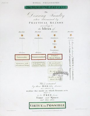
Two Proofs of the Possibility of Virtue
Posted by
Jeremiah McNichols
0
comments
![]()
Labels: visualization
Q&A With Intrepid Art Collector Lisa Hunter
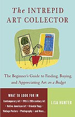 Lisa Hunter, author of the forthcoming book The Intrepid Art Collector, answered some questions I posed in an email interview the other day. Here's what she said.
TiP: What are some indicators that an artist is more likely to "make it" in the art world - not necessarily to become an art star, but to do well and survive long term and leave some sort of legacy? This is something I consider when I'm thinking about buying art: Will this person still be thinking about and making art in ten or twenty years, or are they going to drop out of the art world? For some reason this matters to me, far more than whether they will be considered "notable" later.
Many new collectors assume wrongly that if an artist is "popular," the work will become more valuable. That’s not necessarily true. The work must also be relatively rare, so that collectors have to compete to own it. For example, dealers with "hot" new artists carefully control the supply of their art, and routinely turn away would-be buyers. This builds pent-up market demand, so that the artist’s prices can go through the roof later. In contrast, some popular artist their make most of their money by producing huge quantities of relatively inexpensive multiples; those aren’t likely to go up in value as much.
As for your question about whether the artist will drop out of the art market: You yourself have a role in that. Encourage the artist to keep at it by being a good collector. Try to raise interest in the artist’s career. Buy more than one piece. Cheerlead. As I've mentioned on my blog, the collector has a role in the artist’s success. Don’t just hang the picture over your couch and wait passively for the artist to "make it." Help out as much as you can.
TiP: What do artists or galleries do to help sell work which a sophisticated collector would "filter out"?
With galleries, the hard-sell is always a red flag, as is the emphasis on profits over aesthetics. Truly desirable art doesn’t need a hard sell. Whenever a dealer tells you that your art purchase is going to make a lot of money, what he really means is that it’s going to make a lot of money for HIM.
TiP: How did you get into art consulting? Do you offer private services?
TiP: Some photographers (including several I know) believe that editioning photographs is antithetical to something essential about the medium of photography (or bronze sculpture, or video projects, etc.). I'd rather not get into the merits or drawbacks of that position - many artists have their own "lines in the sand" on one issue or another, which may impact their career path but which are important to them artistically and help define their work. What I'd like to hear from you is, if an artist in a reproducible format does believe this, do you have any advice for them to help maximize the perceived and real value of their work in the eyes of collectors that are specific to this situation?
An artist who refuses to make limited editions needs to have a very, very good dealer if he or she hopes to get high prices for the work. Collectors are naturally skittish about paying a lot of money for something that may later be devalued if the work becomes commonplace.
The other option, of course, is for the photographer simply to charge low prices so that collectors don’t worry about devaluation. In that case, the artist could make money on volume, rather than on higher-priced individual sales.
TiP: What circumstances might cause an artist's work to be undervalued? (You have mentioned gender!)
The most overlooked of all are the late-blooming, 40-ish artists who are only now coming into their own style. I see tremendous talent out there that isn’t being snapped up because collectors wonder, "Well, if you're really any good, how come you haven't made it already?" It’s so unfair. A University of Chicago economist published a fascinating study about how artists and writers tend to follow one of two different career trajectories: either the young innovator who does ground-breaking work at 20, or the plodder who keeps developing and suddenly does amazing work around 40. Historically, you can find big-name examples of both. But today, the market only seems to want the young hot-shots. This stinks for mid-career artists, but presents real opportunity for collectors who are willing to trust their own "eye."
TiP: How important is an artist's full body of work, or a full series, to you when selecting artwork, and how much does it just come down to the power of one piece?
Collectors who care about resale value also consider whether the work is one of the artist’s "signature" works – i.e. if it's in the best-known style, with the characteristic subject matter. I'm personally uncomfortable with this criterion, because it can limit artists' creativity and pressure them into repeating themselves endlessly, but the market definitely has a preference for the known quantity.
I think buying art is sort of like dating. A lot of things seem attractive at first glance, and it's hard to know what you’ll be happy to live with forever. If you go on your own instincts, you definitely risk short-term infatuations and heartbreak. But if you limit yourself to what other people tell you is good, that's sort of like an arranged marriage. You may make a safe choice, even a prosperous choice, but without love, what's the point?
You can pre-order Hunter's new book, The Intrepid Art Collector, here.
Posted by
Jeremiah McNichols
0
comments
![]()
Labels: interviews
Wednesday, October 18, 2006
Distributed Reporting With "The War Tapes"
The War Tapes, now in theatres, is the result of a filmmaker putting digital cameras into the hands of soldiers who took them to Iraq and documented their time there. The resulting 1,000 hours of footage were edited down to 97 minutes which feature three soldiers' experiences of the war in Iraq. Please disregard the fact that their web address could also be read as "The Wart Apes" - I promise that is not what this film is about.
I met a veteran of the Iraq war at a wedding over the weekend. He is now married to an old friend of my wife's and had been back in the U.S. for less than three weeks. He served two tours in Iraq, first in Tikrit and most recently in Bagdhad. He also served in Bosnia, as he had come into the service during Clinton's presidency. I don't meet many young soldiers for whatever reason so I was startled to hear him say he was very much opposed to the war. We got as far into the topic as seemed appropriate for the circumstances of a wedding and old friends getting back together. Needless to say he seemed very relieved to be home and at the prospect of not having to go back again, which he seemed pretty confident of.
This kind of film seems to have been a long time in coming - the stage was set by Born Into Brothels (and the Kids With Cameras program, which has made great use of distributed documentary photography) and the Beastie Boys made it famous. It's not surprising then that the same distributor picked up both indie films. Picking up The War Tapes would be a natural move.
Posted by
Jeremiah McNichols
0
comments
![]()
Two New Views On Digital Photographs
Things are getting very interesting over at oughtful these days. Poet, photographer, designer and programmer Matthew Hollett recently posted two visual experiments in which he atttempts to "'translate' digital photographic data into other systems."
The first is his "index of first lines," which stacks the first row of pixels from each digital photo he took over two months in 2004. The resulting image, generated by a hand-rolled PHP script, reminds me of tree rings and geological strata. Since the 1,000 included images span only two months (another byproduct of our digital age) there are areas of banding throughout which Hollett can tie to specific events and locations.
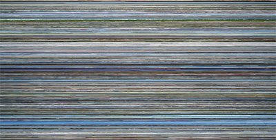 index of first lines
Of the project, Hollett writes:
While it's impossible for me to identify individual photos, looking at this image does bring back memories. Its hazy horizontal sweep evokes a landscape seen from the window of a moving train, a suitable metaphor for the fleeting, mesmerizing summer I remember. The 'busiest' areas (with the most contrasting lines) represent hectic days wandering London or Paris, when no two photos were alike. Thicker bands of colour indicate slower times, when I snapped many photos with similar scenery - the greenery of The Gibberd Garden, or a clear blue sky over Brighton Pier. A certain band of white a third of the way down - near the end of the first month - is a trace of the overcast sky on the afternoon I first visited Stonehenge. In this way, index of first lines is an accurate cross-section of my memory, or at least my photographic habits. I read it in the same way I occasionally reread the journals I kept during that summer's travels: not top-to-bottom, but discursively, letting my eyes and mind wander. Nevertheless, examining it is an act of reading.

Hollett's second project, posted yesterday, is a "paint-by-number" chart which codes every pixel in a digital image with a number to create a black-and-white grid that could be filled in from a printout. Visit oughtful to see a resampled view of a full image rendered in this way.

Taken on its own, the paint-by-number experiment feels as unnatural as the "index" feels natural. While Hollett's first-line experiment suggests life, or perhaps its decay and calcification - a historical record generated according to a set of rules (written in PHP!) which operate silently and unthinkingly to produce their result - we are here faced with an image that has been denuded of its richness, its color stripped out in favor of a hungry, anticipatory indexing, like a map of new territory apportioned out for eager colonists without regard to topology or ecological biome. Here the information is not ignored; it is all there, just translated into a format that is not visually accessible. But like real and metaphorical geography (the image above is a detail of a small portion of Ohio's share of the Northwest Ordinance), the whole cannot be read intelligibly in fragments without sacrificing the collective forms that give meaning to the whole.
Posted by
Jeremiah McNichols
0
comments
![]()
Labels: photography
Tuesday, October 17, 2006
War and Peace: The Art of Rebecca Whipple and the World Beyond the Sound Bite
I first encountered several of Rebecca Whipple's astonishing "Language of War" watercolors during a group show at the San Francisco Art Institute last year. The images, which measure about 15x24" - roughly the size of a medieval folio edition of a hand-copied book - were presented in two-page diptychs, without much explanation, in SFAI's peaceful Diego Rivera Gallery, but I found their tenor to be almost uniquely relevant to their topic, the 2003 U.S. invasion of Iraq.
I am afraid to attempt to speak directly to the tone they strike because this is truly a case where images can open doors that words only close. Despite the artist's kind suggestion that she would like to hear what I think of her work ("I already know what I have to say about it," she wrote prior to our Gmail chat interview), for once I will keep my mouth shut and let the images - and our talk - speak for themselves. (Rebecca has graciously granted me permission to post images of her work throughout this post. You can click on any of them to see larger views.)
Whipple, born in Philadephia and now twenty-five years old, recently moved to Paris after earning an MFA from the Art Institute in 2006. She anticipates that "The Language of War" will take another two years to finish; she completes a new piece for the series every one to two months, and hopes to have twenty in the final set. She does not intend to bind the final version, but will seek to publish a reproduction edition (at the original size) bound in book format.
TiP: Tell me about your process in creating these images.
Whipple: With each piece I have some original idea, and work as intuitively as possible. That idea is like a little seed in my head and it usually takes a few weeks for it to develop more, at which point I do some sketches. Often when people see my work they respond to it, because of the detail and precision, as if they are very planned and thought-out pieces. Although each one is thought and rethought, I actually only make very rough sketches to figure out basic compositional elements before moving directly to the piece. Because each piece takes a month to two months to finish my thoughts and ideas change throughout the work, and although I often start from some basic response to a political event, the works accumulate their own meaning. I think that this is an important point because they really become the antithesis of a sound bite - what we are used to as a visual address of these issues.
"Gladiolus," for example, really took on a life of its own. All of my titles reference flowers, and their "meanings," which I've found in online lists of flower meanings. I take a flower whose meaning attracts me and use it in the piece with which I think it functions. In this case I began with the flower Gladiolus, the meaning being "Give Me a Break, I'm Really Sincere" - this is really composed of two separate meanings but using them as if they were connected added a very interesting intonation to me. When I began the piece it was to be of a "red" and "green" zone. From the green zone a media circus would be looking across onto a scene with a suicide bomber. The "green" zone was going to be done in a more western illuminated manuscript style and the "red" zone in a more eastern manner, but the two would intermix. In the end the media circus became a self-portrait, and the suicide bomber never appeared but the title seemed to take on even more significance.
TiP: The intuitive nature comes through, which is one of the things I like so much about your work. It feels almost dreamlike, very open to mystery, while still being very formally structured and also very pointed, as dreams can be. I think this can open a viewer up to your perspective.
Whipple: It is interesting that you say dreamlike. This is critical to me. The work I was doing before this was in response to dreams.
TiP: And the way you reference works on paper - medieval illumination, Japanese prints - feels very textual, which by its nature is a critique of doublespeak. It posits a record of events that has been set down, a world memory, that politicians often disregard by their actions. I am picturing you now with a thick packet of news photos for reference - all of these likenesses. Is the "Delphinium" piece a composition related to a news photo?
Whipple: Yes, almost every piece uses news photos or just photos found on the Internet. The drawing of the museum came from a picture of the museum with a tank beside it, after the looting. The pieces are really collages. I don't usually think of them as relating too directly to one image.
TiP: Is there anyone whose work helped you better understand how politics could be a part of good art and not just propaganda? I ask because the tension between art and political messages seems so delicate.
Whipple: Yes, indeed.
TiP: I'm trying to understand what makes some politically-charged art so wonderful and why some other stuff will just look like propaganda in ten years. I have some ideas but wonder what you think.
Whipple: Well, to begin with the most obvious, illuminated manuscripts and Indian and Persian miniatures were a huge influence.
TiP: When you look at these influences do you see them as political artifacts?
Whipple: What I love about art and history and art history is being able to explore an old piece and discover how it relates to that time, to what people were thinking about and to the very real and sometimes ugly propaganda that goes on in all times. In other words, yes, sure, why not.
Also, Shakespeare is an influence. I know he's not a visual artist, but I've been very inspired by how he weaves ideas and theories and politics into beautiful and even seemingly fanciful work. These ideas are able to withstand time because they are sewn into the work with great dedication and eloquence even if they are somewhat hidden at times.
TiP: I wonder if the indirectness of some of them is more inviting to the viewer to contemplate - that this helps differentiate it from propaganda.
Whipple: Not necessarily indirectness, as much as not being closed, I think.
TiP: How do you mean?
Whipple: That certain works are more open to the intermixing of concerns. It is not just politics, it is life, it is flowers, it is animals, it is buildings, and they work together somehow and coexist, and dreams, too.
TiP: One piece that I had difficulty engaging with was "Begonia" - the reference to the children's book session was so prominent in Fahrenheit 9/11 that it kind of played itself out for me. This even though it is such a powerful and significant bit of historical information - even though it is so telling - you are somewhat at the mercy of the "rest" of the media in how effective these iconic images can be in your work. Of course, you make them your own as well - Bush's blank expression and profound (Christian-mystical) hand gesture are a briliant combination with his advisor at his ear... Okay, I take it back, I like that one too. Any thoughts, though, about what viewers will bring to your work, and how your interpretation can benefit or be harmed by how fully the images were explored or "used up" before you worked with them?
Whipple: Yes, images are certainly used up sometimes. That piece was one of the earliest and I think it may be a little more naive. However, part of this project is to look at different types of events, used up ones and unused, and to see how they hold weight in our minds and bodies in different ways. What has been exciting to me is how people always respond more harshly to the paintings that have the faces of political figures in them. To me it is a necessity to have them, and I deal with them with great care and concern because I think the specificity is so important. However, people almost always seem to think that the paintings with politicians are more didactic and simple then those without. I tend to disagree, but I think it shows the weight that those images carry.
TiP: You described your process a bit ago. What point are you at now in the one- to two-month cycle of an image? I know you just moved, but I guess I'm asking, are you in the middle of a piece now, or have a "seed"? Can you tell me what it is, what you're thinking about?
Whipple: Well, the move has certainly disrupted my flow. I have a few pieces that I'm thinking about and one that I have almost finished. These pieces are a bit more simple in some attributes, in that I'm working more directly on portraits. The portrait I almost finished is of Donald Rumsfeld. However, I am also in the midst of starting some animation work. It is a different project about which I'm excited and which I plan to work on at the same time as the book.
TiP: Animation! In what format? How produced?
Whipple: Well, I can't give away all my secrets yet.
TiP: Well... hand-drawn and filmed, or Flash, or what? You have to give me something.
Whipple: Okay, hand-drawn. No Flash. When they are further along I can tell you a lot more.
All images in the above post are reproduced with the express permission of the artist and may not be reproduced in any format without her permission. Click here to visit Rebecca Whipple's website, where you can see three wonderful "Languages of War" pieces not shown here as well as her other drawing and painting series.
Posted by
Jeremiah McNichols
0
comments
![]()
Labels: interviews
Reuters Opens News Bureau In Second Life
Reuters has just opened a news bureau in Second Life, with a full-time bureau chief and a news reading/viewing room in-world. Early stories include an overview of the virtual world's economy and a profile of SL's biggest lender, which charges interest rates of 40%. You can read a New York Times interview with bureau chief Adam Pasick and others here, one with Wagner James Au (the original SL reporter) here, or check out the agency's nice news hub here.
It sounds as though the Reuters outpost will be focusing on business stories, which isn't at all what I find interesting about the virtual world, but it's a start, and will probably have a significant impact on the economic development in Second Life. [Via]
Posted by
Jeremiah McNichols
0
comments
![]()
Labels: games, journalism
Monday, October 16, 2006
Could Early Television Viewing Be Linked To Autism?
A new study published today by researchers at Cornell suggests a strong potential link between autism and TV-watching among children under three. Slate reports:
The researchers studied autism incidence in California, Oregon, Pennsylvania, and Washington state. They found that as cable television became common in California and Pennsylvania beginning around 1980, childhood autism rose more in the counties that had cable than in the counties that did not. They further found that in all the Western states, the more time toddlers spent in front of the television, the more likely they were to exhibit symptoms of autism disorders.The study (which was not peer-reviewed) corrected for a variety of factors but was unable to "filter-out" the potential effect merely being indoors might have on the incidence of autism, which is an almost universally coincidental variable, and the EPA recently warned that indoor air can be more hazardous than outdoor air. But the study offers an interesting alternative to the risk of infant vaccinations due to the presence of ethyl mercury in vaccination stocks (Slate reporter Gregg Easterbrook confidently states that thimerosal has been banned in U.S. vaccines, but the reality on the ground is much less clear), which has had an inconclusive research history and has been mired in controversy for years.
You can download the study from Cornell's website here.
Posted by
Jeremiah McNichols
0
comments
![]()
Labels: education
Visualization Versus Symbol In Mapping Social Networks
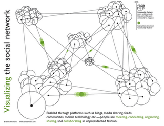
Data Mining's Matthew Hurst brought up an excellent point about data visualization in his critique of the above graphic, and Hurst's observations sparked an interesting debate with the image's creator, David Armano.
The graphic offers a "visualization" of relationships between social networks that bears little resemblance to their actual organization, and Hurst neatly dissects what is wrong with this image, and provides a classic example of why reference to data is imporant in constructing any visualization, however abstract its intentions. I encourage you to read their short discussion and think about what each of them is saying.
Any teacher can tell you that simplicity and accuracy are not mutually exclusive. On one level, we all know this. A statistical mean, for example, is not a falsehood; it is a simplification which is grounded in data and reflects it in a logical way. Describing a pencil eraser as having a length of 1 cm is not inaccurate if a measurement with calipers reveals that it is actually 12 mm; the former is an approximation which may be sufficient for its audience's needs. All good visualizations simplify in the sense that they render data more easily intelligible to the human mind, and the simpler they wish to be, the more careful they must be to ensure that their claims are consistent with the facts.
I produce teaching materials for 12- to 14-year-olds. It is a constant challenge when discussing topics like nuclear energy or virus replication to create diagrams, charts and graphics which avoid giving more detail than is of interest or use to a 12- to 14-year-old mind. But it is equally important to me to simplify information in ways that are still wholly consistent with the facts. To do otherwise would be to disregard one of the essential constraints that faces any interpretive art.
In criticizing Armano's graphic Hurst jumps in to a fray usually dominated by sites like Junk Charts, which regularly dissects visualizations which are poor communicators of the information they struggle to convey, but also occasionally highlight visualizations which have been streamlined and edited to the point where they have become symbolic objects (look, our stock price is skyrocketing) while still wearing the trappings of visualization. This is an interesting case in that I think Hurst has correctly identified that Armano managed to cross that line from the other direction.
In other words, I think that what Hurst uncovered in Armano's "visualization" is not a case of a diagram that betrays the facts but of a piece of graphic art which employs the language of visualization to lend authority to the informational context which surrounds it (be it a book, a public speaker, or a scholarly article). This is nothing new in graphic design, but it is often challenging in such cases to determine whether a content creator has crossed the line from symbolic representation and into false claims of accuracy.
I came across Joe Kral's wonderful Flickr photo set of old Penguin paperback covers not long after reading Hurst's critique, and the relationship between Armano's "truthy" diagram and many of the social science covers in Kral's collection seemed to me like a useful comparison. Many of these books utilized a design language which attempted to buttress the scientific underpinnings of works in sociology, a genre that was making a strong case for its status as the "new" science in the 1960s, and thus instructed readers in how to approach the work.
The above graphic represents both the tidy interlocking of elements of the book's subject and the way in which each element will be examined in isolation. The hexagonal blocking is also an obvious reference to the social organization of bees, which offers the comforting claim that human industrial organization is subject to an observable system of rigorous rules of behavior.
John Venn displayed the first Venn Diagram in a philosophical journal in 1880. Below is a nice graphical interpretation of this schematic which does not purport to contain any actual data.
This next one is a bit of a stretch but I thought it functioned as a strange sort of chart.
Unfortunately, in the case of Armano's graphic, the language of visualization is employed to a degree that can easily fool audiences into believing that they are looking at a representation of reality which contains actual data, rather than a symbolic one. Where the examples above are merely suggestive, Armano's makes a visual claim to providing actual information as a "map" of a network. But even networks can be visualized in ways that do not manipulate viewers in this way.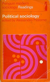
Armano has argued that his visualization is in fact meant to be a symbolic one, but the graphic's busy complexity, the use of data "points" and connecting lines (what is the function of the "points" if not to suggest chartlike qualities?), the inclusion of a "key" and the labeling of elements all suggest otherwise. If the designer were to accept that his graphic was being interpreted as a map of the true relationships between social networks, he might recognize Hurst's points as suggestions for improvement, and go back to the drawing board to create a graphic that is more consistent with the data, and which would be much improved by the change.
Posted by
Jeremiah McNichols
4
comments
![]()
Labels: infographics, propaganda, visualization
Friday, October 13, 2006
Thursday, October 12, 2006
An Intuitive Congressional Race Barometer
 Slate has a new infobox for Congressional races that clearly communicates potentially confusing layers of information in a wonderfully intuitive way. It showcases poll data (% likely to vote for candidate A/B) but also features an optional arrow noting the presence of a statistically meaningful trend (which could go towards any party) as well as a color bar representing the "lean" of the race, which simply designates whether the difference in percentages is significant when adjusted for the margin of error; a black bar is used instead of red, blue, or green (for independent - a category actually needed for the Lieberman vs. Lamont race) when the race is a toss-up.
Posted by
Jeremiah McNichols
0
comments
![]()
Labels: graphic design, visualization
David Lynch To Bypass Studios In Distributing "Inland Empire"
It's nice to have personal heroes who like to keep you guessing, and David Lynch is doing it again with his new film, Inland Empire. The director who was sacrificed at the altar of Dune, revolutionized the soap opera with Twin Peaks, proved he could make family fare with The Straight Story, and stunned critics who said he was washed up with Mulholland Drive "will work with theatrical and home video partners to launch his epic fever dream of a film, retaining all rights to the low-budget project in each deal," according to Reuters.
Posted by
Jeremiah McNichols
0
comments
![]()
Labels: animation/video/film/television
Wednesday, October 11, 2006
A Victory For Fair Use: The Trademark Dilution Revision Act of 2006
The Art Law Blog reports today on the fate of the Trademark Dilution Revision Act of 2006, which maintains fair use provisions in a wide variety of contexts. Art law whiz Donn Zaretsky reports:
There had been some concerns expressed about the possible narrowing, or even elimination, of fair use defenses in earlier drafts of the bill, but the final version broadly excludes from liability "any fair use, including a nominative or descriptive fair use ... other than as a designation of source for the person's own goods or services," including use in "identifying and parodying, criticizing, or commenting upon the famous mark owner or the goods or services of the famous mark owner."You can read more about it on his great blog.
The image above is a celebratory posting of Heidi Cody's "American Alphabet," an example of the kind of work that might not be legal under a stricter trademark law. Kids found almost all of these brands instantly recognizable from their selected letters. You can see a lot more art that subverts trademarks to criticize and satirize at the excellent Illegal Art site, another side project of none other than Stay Free! magazine.
Posted by
Jeremiah McNichols
0
comments
![]()
"Bumfights" vs. "60 Minutes"
The Stay Free! blog notes a bit of irony in a disturbing sequence of 60 Minutes stories that I happened to catch in the first five minutes of 60 Minutes I've seen in probably 10 years. Segment A is a shocker about the real-world attacks on the homeless that are on the rise thanks to the repulsive and quite popular "Bumfights" videos. Segment B is - well, I'll let them tell you:
...despite my loathing of the ["Bumfights" creator], I found the exchange kind of ironic considering that, in the same program, 60 Minutes ran a favorable story on a dubious new surgical procedure designed to treat depression. "Deep brain stimulation"- at least at this point in time - is highly risky and experimental (involves inserting electronic "nerve stimulators" in the brain) and yet 60 Minutes promoted it on national television, all but guaranteeing that people are going to start demanding it before it's been properly tested.Yikes! As odd as I find it to ally myself with Andy Rooney or Gary Gnu or whoever it is that hosts 60 Minutes these days, I feel compelled to mentally unwrap this little present. To anyone who can split-screen these two video documents and see a viable connection, I submit to you the following:
- Clinical research is not equal to exploitative, violent entertainment.
- Puffing up a questionable study does not exploit that study's subjects. It exploits the viewers of the newscast.
- Inciting violence against others is a far greater crime than leading a viewer to (attempt to) undergo unproven medical procedures.
Posted by
Jeremiah McNichols
0
comments
![]()
"Google For Educators" Needs Classroom Success Stories
The Google for Educators site, which launched today, attempts to help teachers visualize how they can use Google apps like Book Search, Google Maps, Google Video, Blogger, SketchUp and more in educational contexts. The basic applications of these tools are obvious, and so far, this site appears to be simply a placeholder and a hub to funnel user searches for educational web applications so they can hear the Google pitch.
These tools all have much more interesting "real-world" stories that can already be told, and it looks like Google is seeking out good classroom stories to flesh out the site. It's odd to see such an innovative company so consistently creates PR that is so static - Why not allow teachers to contribute and discuss applications on the site rather than simply invite them to email Google HQ? - and so provisional - How hard would it have been, and how much more immediate impact would this site have, if the Google team had pulled together a few solid case studies prior to launching the site, and presented profile pieces that will help inspire teachers and show that this stuff is being used? If Government Technology can do it with educational gaming, for goodness' sakes, why can't a $10B company - whoops, make that a $8.35B company - do the same in order to tell a very big story to an essential audience for its products?
Enough criticism. All the big things Google does so right make up for all the little things they do so badly. What matters here is that if you teach using Google's products, you can get a little publicity for your school and do Google a favor in the process by sharing your story with them via the Google for Educators website.
Extra: The Google lawyers are on the prowl. Logogle, which as recently as two days ago was spitting out mock Google logos with the text of your choice, has been shut down.
Posted by
Jeremiah McNichols
0
comments
![]()
Tuesday, October 10, 2006
Storytelling With Infographics
A travel story told using the infographics of the airport terminal.
[Via]
Posted by
Jeremiah McNichols
1 comments
![]()
Labels: graphic design, visualization
How Loud Is A Cicada?
 This elegant infographic meets all of the challenges of a good visual diagram for a daily newspaper: Its topic is accessible and of interest to readers, it clarifies information, it uses graph elements in a relevant way, it is timely, and it is drawn from solid research. Most news infographics fail on at least one of these counts.
From Arizona's East Valley Tribune.
Posted by
Jeremiah McNichols
0
comments
![]()
Labels: graphic design, visualization
Model Cities From Around The World

I wrote recently about the manipulation of viewer experiences in photography using false miniaturization (the "tilt-shift fake") and real miniatures. For a treasure trove of documentary images of scale models of cities, check out Tinselman's catalog [via] or photographer Andrew Currie's full set of photos of the model city of Shanghai. The photo above is one of Currie's Creative-Commons licensed images from his Flickr photostream.
Posted by
Jeremiah McNichols
0
comments
![]()
Labels: visualization
Monday, October 09, 2006
Google Buys YouTube For $1,650,000,000. Why?
It's official: Google has announced plans to buy YouTube for 1.65 billion in stock.
It is difficult to predict what this move will mean. Google's interface for browsing, sharing, and networking videos has been poor from the start, and YouTube has always had a safe harbor attitude towards copyrights. Google can certainly adopt many of YouTube's user interface features, but do they care? They could have done this already, easily, for free, and didn't. Google has also had a slow start in finding user-generated content; they're certainly buying plenty of that here, but YouTube needed to be bought because the company was a sitting duck for lawsuits and it needed a rescuer. The only way Google can rescue YouTube is by stripping out a lot of that illegal content and setting up stronger restrictions on uploads.
Good reads so far:
Blog Maverick (Mark Cuban eats crow)
Thomas Hawk
Google's Announcement
Ars Technica's pre-deal prognostication (thumbing its nose at TechCrunch's scoop)
Posted by
Jeremiah McNichols
2
comments
![]()

