
Visualization Versus Symbol In Mapping Social Networks
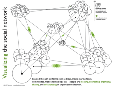
Data Mining's Matthew Hurst brought up an excellent point about data visualization in his critique of the above graphic, and Hurst's observations sparked an interesting debate with the image's creator, David Armano.
The graphic offers a "visualization" of relationships between social networks that bears little resemblance to their actual organization, and Hurst neatly dissects what is wrong with this image, and provides a classic example of why reference to data is imporant in constructing any visualization, however abstract its intentions. I encourage you to read their short discussion and think about what each of them is saying.
Any teacher can tell you that simplicity and accuracy are not mutually exclusive. On one level, we all know this. A statistical mean, for example, is not a falsehood; it is a simplification which is grounded in data and reflects it in a logical way. Describing a pencil eraser as having a length of 1 cm is not inaccurate if a measurement with calipers reveals that it is actually 12 mm; the former is an approximation which may be sufficient for its audience's needs. All good visualizations simplify in the sense that they render data more easily intelligible to the human mind, and the simpler they wish to be, the more careful they must be to ensure that their claims are consistent with the facts.
I produce teaching materials for 12- to 14-year-olds. It is a constant challenge when discussing topics like nuclear energy or virus replication to create diagrams, charts and graphics which avoid giving more detail than is of interest or use to a 12- to 14-year-old mind. But it is equally important to me to simplify information in ways that are still wholly consistent with the facts. To do otherwise would be to disregard one of the essential constraints that faces any interpretive art.
In criticizing Armano's graphic Hurst jumps in to a fray usually dominated by sites like Junk Charts, which regularly dissects visualizations which are poor communicators of the information they struggle to convey, but also occasionally highlight visualizations which have been streamlined and edited to the point where they have become symbolic objects (look, our stock price is skyrocketing) while still wearing the trappings of visualization. This is an interesting case in that I think Hurst has correctly identified that Armano managed to cross that line from the other direction.
In other words, I think that what Hurst uncovered in Armano's "visualization" is not a case of a diagram that betrays the facts but of a piece of graphic art which employs the language of visualization to lend authority to the informational context which surrounds it (be it a book, a public speaker, or a scholarly article). This is nothing new in graphic design, but it is often challenging in such cases to determine whether a content creator has crossed the line from symbolic representation and into false claims of accuracy.
I came across Joe Kral's wonderful Flickr photo set of old Penguin paperback covers not long after reading Hurst's critique, and the relationship between Armano's "truthy" diagram and many of the social science covers in Kral's collection seemed to me like a useful comparison. Many of these books utilized a design language which attempted to buttress the scientific underpinnings of works in sociology, a genre that was making a strong case for its status as the "new" science in the 1960s, and thus instructed readers in how to approach the work.
The above graphic represents both the tidy interlocking of elements of the book's subject and the way in which each element will be examined in isolation. The hexagonal blocking is also an obvious reference to the social organization of bees, which offers the comforting claim that human industrial organization is subject to an observable system of rigorous rules of behavior.
John Venn displayed the first Venn Diagram in a philosophical journal in 1880. Below is a nice graphical interpretation of this schematic which does not purport to contain any actual data.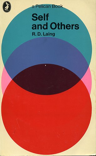
This next one is a bit of a stretch but I thought it functioned as a strange sort of chart.
Unfortunately, in the case of Armano's graphic, the language of visualization is employed to a degree that can easily fool audiences into believing that they are looking at a representation of reality which contains actual data, rather than a symbolic one. Where the examples above are merely suggestive, Armano's makes a visual claim to providing actual information as a "map" of a network. But even networks can be visualized in ways that do not manipulate viewers in this way.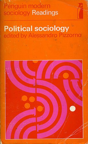
Armano has argued that his visualization is in fact meant to be a symbolic one, but the graphic's busy complexity, the use of data "points" and connecting lines (what is the function of the "points" if not to suggest chartlike qualities?), the inclusion of a "key" and the labeling of elements all suggest otherwise. If the designer were to accept that his graphic was being interpreted as a map of the true relationships between social networks, he might recognize Hurst's points as suggestions for improvement, and go back to the drawing board to create a graphic that is more consistent with the data, and which would be much improved by the change.
![]()


4 comments:
I fully understand Matt's points and yours, but don't think you aren't considering the full context of why the visual was created and the purpose it serves. You are getting hung up on the execution which plays off information design.
I created the visual as a way for me to express how I PERCIEVED the social network. This visual helped me talk through my own experiences amd thoughts about it. I never stated them as fact—but personal observation.
So, you can put this in the "propoganda catagory" if you like. My goal isn't to have the visual end up in some texbook somewhere. It's already served it's original purpose which was to help me express my own experiences with social media and it's pretty obvious that the visual isn't rooted in data.
Hi David!
I don't think it's a stretch to see your design as more than "playing with" the visual grammar of information design.
The key consideration in my category assignments is to create an engaging flow for readers who wish to browse through a thematically linked series of posts. Given the broad treatment the post gives towards graphic designers attempting to lend an air of "scientific" authority to their quite nonscientific observations, I thought it was a good fit.
Jeremiah,
As you probably know—information design and "scientific" authority are not the same thing though—they can be related. They can also be unrelated. I've worked along side newspaper designers who used the same visual grammer you elude to here and their visuals often times left out key details or were not always 100% accurate. That's because the core objective of a news graphic is to try to communicate certain concepts visually to a broad audience.
Even with news graphics, the end visual is still subjective—seen through the eyes of the designer. They make editorial decisions all the time. I did the same thing—except on a personal basis. And all I did as far as the execution goes was communicate via the language I feel comfortable in. What rubs me the wrong way with this type of analysis is that there is a subtle inference that I use the language of infomation design to willfully lend authority to my ideas.
That's overthinking things. I use visual language becuase it's my native vernacular. The people who view my graphics need to make up their own minds. Which most do.
Hmmm, maybe I should start adding disclaimers to the visuals? :-)
I see what your saying about this being a good fit for your post. Maybe you could do a follow up that analyzes the value of computer generated Data visualization? What do you think?
This conversation is getting interesting, and I appreciate your desire to sustain it. You sound like you have something fairly clear in mind as far as a critique. Would you be interested in writing a guest post? Perhaps a critique of computer-generated visualizations is too broad - a defense of the role of extreme subjectivity in visualization strategies would be most productive. I appreciate the spirit of your argument, but could not make it for you - when I look at your graphic I see faulty data. I am well aware that news graphics misrepresent, that there is a perspective represented by every infographic, etc., but I believe they should be held to the same standards.
I suspect there is an argument out there that could give me a deeper understanding of what you're trying to do. Can you make it?
Post a Comment