
[Via]
Showing posts with label propaganda. Show all posts
Showing posts with label propaganda. Show all posts
Tuesday, August 28, 2007
Wednesday, June 27, 2007
Werner Herzog Eats His Shoe
And does much more. This is a roughly six-minute excerpt from Les Blank's film of the same name, and in it Herzog discusses television (against which he advocates "real war"), the uneasy role of the filmmaker as "clown," and the lack of an "adequate language of images" in Western civilization.
Thursday, June 21, 2007
Fox and CBS: Condoms Safe, But Not Fun
 Fox and CBS have both rejected a new Trojan ad because they say that ads for contraceptives "must stress health-related uses rather than the prevention of pregnancy."
Supporters of the condom company were not surprised. The New York Times article has two standout quotes:
Mark Crispin Miller, media critic at New York University: "Let’s get real here. Fox and CBS and all of them are in the business of nonstop soft porn, but God forbid we should use a condom in the pursuit of sexual pleasure."
Carol Carrozza, VP of Marketing for Ansell Healthcare (LifeStyles condoms): "We always find it funny that you can use sex to sell jewelry and cars, but you can’t use sex to sell condoms."
You can watch the ad online here.
Friday, May 25, 2007
Tortured Metaphors

 "Kelly" contributes insanely inane and overwrought right-wing editorial cartoons to the Onion. I am a huge fan, but I guess it is no surprise that some people completely miss the joke. The cartoonist even portrays the creator seconding the rotten sentiments of the cartoons in the corner to reinforce the satire. The Grim Reaper is a frequent visitor, helpfully labeled with a placard designating what bogeyman he's standing in for. The Statue of Liberty appears, sometimes more than once, weeping tears of sadness or of joy. The running strip is a parody not just of angry, right-wing paranoia but of the manipulative and domineering act of editorial cartooning itself.
Tuesday, May 22, 2007
Visualizing Allied Hopes and Fears
 There's a great exhibit of British artwork and propaganda online, which accompanies an exhibit on display at the National Archives. I do find the way they categorize the works to be truly bizarre. Given the close ties between governments and media at times of war and the intense unity of purpose felt during WWII, how 90% of the images collected in the "Illustrations" and "Valour and Gallantry" sections are not also "Propaganda" is beyond me. [Via|Link]
Wednesday, May 16, 2007

Monday, May 14, 2007

Tuesday, May 08, 2007
Fake Ambush Marketing: When Ads Go All-Concept
Hot on the heels of this great example of ambush advertising, the ad blog How Advertising Spoiled Me sent out a post via RSS last night showing this image:
But the post has since been removed from the blog. I'm going to go out on a limb and guess it was a fake and that someone - the airline? - fooled our friend Arvind. It's always fun to see something you're not supposed to (ever seen a retracted post from Think in Pictures?) but that wouldn't be enough to merit pointing it out, so bear with me. I think this incident highlights one of the most overlooked aspects of our current media age, in which the Internet has pushed progressive advertising methods to be almost entirely conceptual. The actual audience for the physical work is secondary to the virtual audience who will consume it in a manner dictated by those who document the product. And this is a big change. Let me elaborate.
I noted a while back that tone of the main benefits of the Internet for non-permission-based public artists (i.e. graffiti artists) is that ephemeral works can be documented and shared far beyond the place they are created:
Illicit art created in the physical world now has the power to reach vast audiences through its documentation and dissemination via the Internet, and while some of the pleasure of discovery may be missing - imagine stumbling across that row of tanks in Basel versus seeing it here - the objects' poached presence in the real world, and the knowledge that many others have stumbled upon them, and others have walked by them without noticing them, is no less delicious. This accessibility is, of course, wildly divergent from artwork's context in the real world; there, the piece will soon be discovered and likely removed, if this has not happened already. In rare cases, citizens lobby and win the right for a piece of illicit art to be adopted and "legalized," but this requires organization, speed, and open-minded governance. On the web, however, the piece is available to all for as long as it is of interest, and can be passed around among viewers, reinvigorated by new discussion, and take on a virtual life of its own. This is one of the wonderful ways in which the Internet is not like the "real" world: Everyone has a wall to tag, paint, or advertise on, and the strength and relevance of one's message plays a much greater role in its successful infiltration of a virtual visitor's life than any other form of visual or written communication.But while this development allows graffiti art to live on and be a part of a conversation far broader than the local and temporary effect it used to have, it also has the effect of reducing the significance of place, that is, of making the obviousness or accessibility of the graffiti site far less important, because so much of the work's audience is virtual. This means that good, effective public displays may actually be less accessible, less productive, less meaningful for the human beings who interact with the work in the "real world."
Advertising has undergone the same transition. Take, for example, a work of conceptual advertising like the one Germany's BUND (Friends of the Earth) documented a few weeks ago [via Art Threat, which is getting better every week]:
 The balloon reads "The world can't take anymore [sic] CO2." When the car starts, it inflates, then bursts, surprising the automobile's driver and, presumably, briefly displaying its message to others before doing so. But as a live event, the action is an abject failure. Think about it:
- Balloon is surreptitiously affixed to tailpipe, and must not be seen by the driver.
- Balloon inflates, revealing tiny message that is too small to be legible.
- Balloon pops, alerting driver to something amiss.
- Driver checks tailpipe, finds obliterated balloon.
The most common critique, however, damns the guerrilla tactic as pointless, as it may be near impossible to read the message on the inflated balloon before it explodes. Given that the campaign has already generated a ton of media, discussion and debate, I think it's fair to say that these detractors have missed the point entirely...There is balance of power - akin to evolution, or to an arms race - between advertisers and their audiences that media critics rarely recognize. We do not simply absorb advertising, but critique, selectively acknowledge, and/or deflect it, and advertisers are always looking for new ways to work around or subvert audience barriers or defenses. I think what I find interesting about the developments in such "secondary" advertising methods (which have been around at least since the days of radio, but have been flourishing in the age of the Internet and digital photography) is that they are, in essence, advertising about advertising, and they utilize new forms of manipulation, against which audiences have not yet developed any successful defenses. As a result, we are all implicated and even enmeshed in these advertising efforts by our receptiveness to, or even our participation in creating, the fictional stories that complete them.
Take (again) the image above. What is true, and what is false? The concept survives whether the actual billboard was placed or not. The status of the advertiser as "trickster" only increases. They are also more likely to appear "Internet savvy," because someone in their organization knows how to doctor a photo, and is willing to do so. They get their advertising message out, and they save the expense of putting up a billboard, which might not even be possible at the site. So many questions remain. If the billboard were not in a prominent location (I have no idea where it is) and we learned that the number of viewers who saw the photo online far exceeded the number who saw it live, did Kingfisher waste their money putting up an actual billboard? Or is Kingfisher's physical counter-advertisement a necessary element of the set-up for GoAir's hoax?
More broadly, when real-world events are faked, simulated, or heavily enhanced, when and how do advertisers cross the line between advertising and straight propaganda?
Arvind's original post.
Monday, April 30, 2007
Famous Altered Photographs
Before

After
 Wired has a great image set of famous altered photographs, ranging from the recent (Lebanese bombing, U.S. military operations) to the historic. Above, Trotsky is "disappeared" from an event photograph (the man next to him in "Before," and next to a big gaping void in "After," is Lenin).
Wednesday, April 25, 2007


Monday, April 23, 2007
We Need A New Word For This. Let's See, What Should We Call It?
Artists are increasingly being "commissioned" to produce brand-friendly works of "art." From AdAge (registration required):
Agneessens takes an active role in the creative process, collaborating with brands on the vision for art projects as well as artists. "Ironically enough," he says, "I personally prefer to work on branded art projects than for galleries. Of course, there is the constraint of being close to the brand value in the content you generate, but if you select the right artist, this should come naturally." [Via|Link]All of the times you called an artist a "sellout" sound a little hollow now, don't they? The bands that signed with major labels. The artists who started repeating themselves for sales potential. Good times!
Don't you wish you could take it all back, so you could use the term now and it would really matter? No, we need a new word for this. Any suggestions?
We could do worse than looking to David Lynch, who was asked about a related topic in a recent interview: product placement in movies. Strong language alert!
Tuesday, April 10, 2007
Icons: Beijing Olympic Games
 From the official website:
[Via|Link]Designed to express the playful qualities of five little children who form an intimate circle of friends, Fuwa also embody the natural characteristics of four of China's most popular animals - the Fish, the Panda, the Tibetan Antelope, the Swallow - and the Olympic Flame.
Each of Fuwa has a rhyming two-syllable name - a traditional way of expressing affection for children in China. Beibei is the Fish, Jingjing is the Panda, Huanhuan is the Olympic Flame, Yingying is the Tibetan Antelope and Nini is the Swallow.
When you put their names together - Bei Jing Huan Ying Ni - they say "Welcome to Beijing," offering a warm invitation that reflects the mission of Fuwa as young ambassadors for the Olympic Games.
Fuwa also embody both the landscape and the dreams and aspirations of people from every part of the vast country of China. In their origins and their headpieces, you can see the five elements of nature - the sea, forest, fire, earth and sky - all stylistically rendered in ways that represent the deep traditional influences of Chinese folk art and ornamentation.
Monday, April 09, 2007
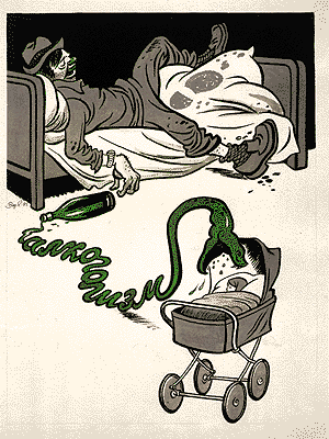
Good Morning, Meat Man. Why Hello, Cigarette Face!
From a series of images designed to illustrate the nutritive paucity of various "diets."

Tuesday, December 26, 2006
Soviet Anti-War Film In Stop-Motion Animation
I found some of the camera techniques to be a bit out of sync with the animation style, but this seven-minute-long film is well-worth watching through to the end and shows off some of the talents of Soyuzmultifilm's animators, circa 1986 (previously referenced in my blogging here).
Sunday, November 19, 2006

Wednesday, November 15, 2006

Tuesday, November 14, 2006


Thursday, October 26, 2006

Monday, October 16, 2006
Visualization Versus Symbol In Mapping Social Networks
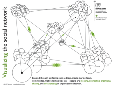
Data Mining's Matthew Hurst brought up an excellent point about data visualization in his critique of the above graphic, and Hurst's observations sparked an interesting debate with the image's creator, David Armano.
The graphic offers a "visualization" of relationships between social networks that bears little resemblance to their actual organization, and Hurst neatly dissects what is wrong with this image, and provides a classic example of why reference to data is imporant in constructing any visualization, however abstract its intentions. I encourage you to read their short discussion and think about what each of them is saying.
Any teacher can tell you that simplicity and accuracy are not mutually exclusive. On one level, we all know this. A statistical mean, for example, is not a falsehood; it is a simplification which is grounded in data and reflects it in a logical way. Describing a pencil eraser as having a length of 1 cm is not inaccurate if a measurement with calipers reveals that it is actually 12 mm; the former is an approximation which may be sufficient for its audience's needs. All good visualizations simplify in the sense that they render data more easily intelligible to the human mind, and the simpler they wish to be, the more careful they must be to ensure that their claims are consistent with the facts.
I produce teaching materials for 12- to 14-year-olds. It is a constant challenge when discussing topics like nuclear energy or virus replication to create diagrams, charts and graphics which avoid giving more detail than is of interest or use to a 12- to 14-year-old mind. But it is equally important to me to simplify information in ways that are still wholly consistent with the facts. To do otherwise would be to disregard one of the essential constraints that faces any interpretive art.
In criticizing Armano's graphic Hurst jumps in to a fray usually dominated by sites like Junk Charts, which regularly dissects visualizations which are poor communicators of the information they struggle to convey, but also occasionally highlight visualizations which have been streamlined and edited to the point where they have become symbolic objects (look, our stock price is skyrocketing) while still wearing the trappings of visualization. This is an interesting case in that I think Hurst has correctly identified that Armano managed to cross that line from the other direction.
In other words, I think that what Hurst uncovered in Armano's "visualization" is not a case of a diagram that betrays the facts but of a piece of graphic art which employs the language of visualization to lend authority to the informational context which surrounds it (be it a book, a public speaker, or a scholarly article). This is nothing new in graphic design, but it is often challenging in such cases to determine whether a content creator has crossed the line from symbolic representation and into false claims of accuracy.
I came across Joe Kral's wonderful Flickr photo set of old Penguin paperback covers not long after reading Hurst's critique, and the relationship between Armano's "truthy" diagram and many of the social science covers in Kral's collection seemed to me like a useful comparison. Many of these books utilized a design language which attempted to buttress the scientific underpinnings of works in sociology, a genre that was making a strong case for its status as the "new" science in the 1960s, and thus instructed readers in how to approach the work.
The above graphic represents both the tidy interlocking of elements of the book's subject and the way in which each element will be examined in isolation. The hexagonal blocking is also an obvious reference to the social organization of bees, which offers the comforting claim that human industrial organization is subject to an observable system of rigorous rules of behavior.
John Venn displayed the first Venn Diagram in a philosophical journal in 1880. Below is a nice graphical interpretation of this schematic which does not purport to contain any actual data.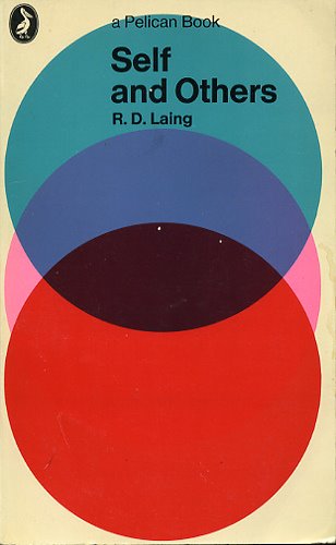
This next one is a bit of a stretch but I thought it functioned as a strange sort of chart.
Unfortunately, in the case of Armano's graphic, the language of visualization is employed to a degree that can easily fool audiences into believing that they are looking at a representation of reality which contains actual data, rather than a symbolic one. Where the examples above are merely suggestive, Armano's makes a visual claim to providing actual information as a "map" of a network. But even networks can be visualized in ways that do not manipulate viewers in this way.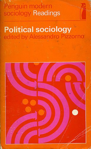
Armano has argued that his visualization is in fact meant to be a symbolic one, but the graphic's busy complexity, the use of data "points" and connecting lines (what is the function of the "points" if not to suggest chartlike qualities?), the inclusion of a "key" and the labeling of elements all suggest otherwise. If the designer were to accept that his graphic was being interpreted as a map of the true relationships between social networks, he might recognize Hurst's points as suggestions for improvement, and go back to the drawing board to create a graphic that is more consistent with the data, and which would be much improved by the change.
Subscribe to:
Posts (Atom)


