
Showing posts with label illustration. Show all posts
Showing posts with label illustration. Show all posts
Thursday, June 28, 2007

Tuesday, June 05, 2007
Fletcher Martin
 Fletcher Martin's life is as fascinating as his work. Read all about him on Today's Inspiration.
Tuesday, May 22, 2007
Visualizing Allied Hopes and Fears
 There's a great exhibit of British artwork and propaganda online, which accompanies an exhibit on display at the National Archives. I do find the way they categorize the works to be truly bizarre. Given the close ties between governments and media at times of war and the intense unity of purpose felt during WWII, how 90% of the images collected in the "Illustrations" and "Valour and Gallantry" sections are not also "Propaganda" is beyond me. [Via|Link]
Wednesday, April 18, 2007


Tuesday, April 17, 2007
Jim Woodring's Moleskines
 Artist Jim Woodring shows off some amazing moleskine pop-up books on his blog. [Via] Amazon has a surprise clearance sale on Moleskines. Dated 2007 materials are obviously going for bargain-basement prices ($6-7), but the rest of the Moleskine line is on sale, too, perhaps to generate buzz - the full range of non-dated Moleskine books is 50-66% off. Check it out here, while they last.
Friday, April 13, 2007
Dan Goodsell Interview
 There's a great interview with Dan Goodsell, the tireless artist behind Mr. Toast and his "immersive world," on Old Man Musings. I have admired Goodsell's work for a while, and included him in a recent post on Z Recommends about artists to collect for young children. So I was pleased to have the chance to learn more about him. In the interview he cites his influences:
My childhood heroes were Dick Bruna (Miffy books), Ed Emberley (drawing books) and Bill Peet. Dick Bruna gave me my love of line. Ed Emberley taught me about the creation of worlds and populating them. Bill Peet taught about story and context. I didn’t know I was learning these things when I read their books as a kid but looking back as adult these are the things I strive to accomplish in my work.All three have a ton of stuff online if you aren't yet familiar with them:


Goodsell later cites Harry Nilsson's film The Point as a major influence, which is a favorite of mine as well. The video segment from the film's song "Think About Your Troubles" was featured in Z Recommends' Toddler Arthouse Cinema last year in a set of music videos, along with videos for songs from Royksopp and Minilogue. You can watch them all here; the animation for the Nilsson film is brilliant. Who knew a decomposing whale could be so beautiful?
Visit Dan Goodsell's blog and website to see his unique work.
Thursday, April 12, 2007
Icons: One Laptop Per Child
 My only criticism is that the "child" icon looks, iconographically, like it should be negating something. I get the arms-and-legs intent, but the "x" is a bit too pure. Why not draw on the iconography of signs relating to children? Perhaps because the silhouette additions to a figure to denote a child (rather than an adult) are either to pair them with an adult or to use a culturally-specific referent - lunch box, baseball cap, balloon - and that the mens' and women's restroom style figure necessarily comes with gendered baggage. Is there any universal symbol of childhood that could be attached to a small person, and any way to strike a unisex chord as well? Perhaps not. And perhaps this can explain the magenta x we are greeted with. [Via|Link]
Wednesday, April 11, 2007


Tuesday, April 10, 2007
Icons: Beijing Olympic Games
 From the official website:
[Via|Link]Designed to express the playful qualities of five little children who form an intimate circle of friends, Fuwa also embody the natural characteristics of four of China's most popular animals - the Fish, the Panda, the Tibetan Antelope, the Swallow - and the Olympic Flame.
Each of Fuwa has a rhyming two-syllable name - a traditional way of expressing affection for children in China. Beibei is the Fish, Jingjing is the Panda, Huanhuan is the Olympic Flame, Yingying is the Tibetan Antelope and Nini is the Swallow.
When you put their names together - Bei Jing Huan Ying Ni - they say "Welcome to Beijing," offering a warm invitation that reflects the mission of Fuwa as young ambassadors for the Olympic Games.
Fuwa also embody both the landscape and the dreams and aspirations of people from every part of the vast country of China. In their origins and their headpieces, you can see the five elements of nature - the sea, forest, fire, earth and sky - all stylistically rendered in ways that represent the deep traditional influences of Chinese folk art and ornamentation.
Friday, March 23, 2007
Flickr Now Supporting Once-Ostracized Illustrators, Screenshot Uploaders
Flickr's wavering policies in the past regarding using Flickr as an illustration portfolio or to show off screen captures of software has been to restrict user accounts and block their images from being included in search functions. When some users responded negatively to these moves, others stepped in and aggressively defended Flickr's status as "for photos only." Flickr fumbled around for a while, sending some pretty mixed signals.
The "photo-sharing" site has finally come around to accept that new user bases are not a bad thing, and is now supporting search filtering for both of those robust types of content, which people have been putting up for years.
Good for Flickr.
[Via|Link]
Thursday, February 15, 2007
Winnie The Pooh In Russia
 My wife went to the Soviet Union six weeks before the military coup in 1991. While she was there, she bought a lot of books to bring back with her to the U.S. I discovered this one for myself recently while we were going through our bookshelves to thin out our stock. For some reason, for me Piglet was the first giveaway that these are characters from A.A. Milne's Winnie-the-Pooh.
The book is more of a booklet, 8 1/2 x 11" sheets that are folded and saddle-stitched (stapled). The paper is Bible-thin and the print quality is poor. The book's single spot color is brown, and all the pictures are brown, and look like they were generated on some sort of early computer or just run through one in the printing process. But they reflect a very different view of Winnie the Pooh than the one we are so familiar with in the United States. Looking at it - especially when being unable to read a word of it - is an interesting study in how visuals can come to seem embedded within the words, and how works of imagination can be taken over, wholly consumed, and stuffed and mounted by their copyright holders.
Potentiality and Actuality

The accretion that is Winnie the Pooh, built in my lifetime and just before it by Disney, wore out his welcome in my life long ago. For the past ten years or so he has stood simply as a logo for moms in sweats who wear the mark as a kind of visual cipher signifying Gemütlichkeit in the same way that Mickey Mouse apparel signifies Gemeinschaft.
If we rephrase the Wikipedia entries for these two Germanic terms, we could produce our own lexicon of Disney wear:
Mickey-wearers are broadly characterized by a moderate division of labor, strong personal relationships, strong families, and relatively simple social institutions. In such societies there is seldom a need to enforce social control externally, due to a collective sense of loyalty individuals feel for society. Historically, Mickey-wearing societies were racially and ethnically homogeneous.(Adapated from the Wikipedia entry for Gemeinschaft)
The underlying concept of Winnie-the-Pooh-cladding is that social tensions and certain environments can cause stress, resulting in a feeling of alienation. Winnie-the-Poohism is an active way of preventing such negative influences by going to places and/or meeting with people that are regarded to be Winnie-the-Pooh-ish. A Winnie-the-Pooher is one who takes part in this lifestyle and knows about the tensions he/she is able to cause, and thus tries to avoid these things actively. This way an agreement is established to make an "environmentally cosy" site (Heuriger, garden, cellar, backyard restaurant, living room...) "socially cosy." One characteristic of a Winnie-the-Pooh situation is that one could blind out everything else (past, future, other places and absent people) and yet everything would be fine (an eternal "now and here"). Winnie-the-Poohists describe that as "leaving everything at the doorstep" (though a Pooh-ish place doesn't necessarily have to be inside a house). (Adapated from the Wikipedia entry for Gemütlichkeit)
Even E.H. Shepard's illustrations from the original Milne feel refreshing after a lifetime of Disney.
 Pooh meets Tigger in The House At Pooh Corner.
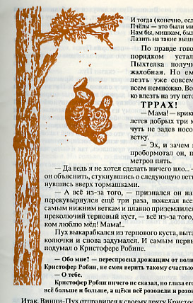 The Russian edition I've been browsing lately is now helping me reimagine Pooh even further, and got me wondering about how such characters become fixed in our minds in a certain style, and what it takes to break them out of that form and regain our perception of something more abstract which might truly interest us.
At left, Pooh is falling from the tree in the first chapter of the book, after using a balloon to attempt to get at their honey. This is also the first chapter of the English-language version of the book.
In the 1930s the image of Pooh was a fairly fluid thing. A variety of illustrators in the U.S. took a crack at him when the stories were serially published there, and although the subsequent book editions had been given a strong imprint by illustrator E.H. Shepard (the illustrations you will undoubtedly see today), Milne welcomed Pooh's exportation to children's theatre, sound recording of Pooh stories by Jimmy Stewart and Gene Kelly, in "early animated paper films" (Wikipedia's wording - I'd certainly like to see those!) and in adertising various goods and services.
Neither Milne nor Shepard considered these characters to be their legacy. Both were leading contributors to the political magazine Punch and felt their most significant work was done there. Shepard reportedly grew to "hate" Pooh, and Milne wished to be remembered as a playwright rather than as the author of "four trifles for the young."
This may help explain why Milne left the rights to Winnie the Pooh to four different groups, who became quite confused over how to best carve up this golden-egg-laying goose. Disney bought rights from one of those groups and has more or less won the slugfest over who can legally employ the characters.
Death and Rebirth
 Here, in the second story in the book, Rabbit entertains Pooh in his home prior to Pooh getting stuck in Rabbit's hole on the way out. In the Disney version of the stories all of the characters are heavily caricatured versions of those in the book, and the mean-spirited Rabbit takes to drawing on Pooh's rear end, if I remember correctly. In fact, this is one of the few Pooh stories (along with the bees and the balloon) used by Disney in the company's cartoons and videos.
The rest of the stories the Russian editor used appear to come from The House at Pooh Corner, Milne's second book of Pooh stories, which introduces Tigger (who became a leading character in Disney's cast) and which ends with Christopher Robin leaving Hundred Acre Wood forever, too old to play in the forest with stuffed animals. It's the perfect culmination to what is effectively an exercise in nostalgia. I mentioned earlier that parental influence helps suppress bad children's characters, but it also props up others artificially, like a welfare state's subsidized television stations might take the peaks and valleys out of a free market of popular expression. If you have any doubts about the role parents play in keeping children's books alive, you need only look to the persistence of nostalgia - a concept that is completely irrelevant to young children - as one of only a handful of the most influential themes in the history of children's literature. Sometimes this powerful source of inspiration, spoken by and largely to adults, is transformed into something of real, authentic relevance to young children. Sometimes it isn't. In the case of A. A. Milne's Winnie the Pooh, I can come down on either side of this question depending on my mood.
 The things which tend to push me towards a hatred of Pooh are the things that Disney has done to him. I am a friend of Gemütlichkeit and the idyll of comfort, love, and total understanding that it promises. Such moments and experiences do exist, and they can be among the most important experiences of our lives. But when such things are turned into commodities, things always get ugly. At left we have the most extreme caricature Disney has come up with, from the live-action children's show The House At Pooh Corner, which I remember watching with my little sister back in the 1980s. Back then, I was just bored. Now, I see things, tragic things, in Pooh's face. The pinched, pained face of Pooh in this show reminds me of the freakish, post-plastic surgery Catherine O'Hara in For Your Consideration. The weathering of Pooh's visage - the theatrical revues of the 1930s, the shared inheritance of rights among multiple, entrepreneurial parties, the sellouts to Disney, the lawsuits - these have all been washed away, leaving a horrific hybrid between product and product packaging. This expression, this grimace - it is a death mask. This is the face of a character trapped in a kind of living death. He is a frozen image, begging for release.
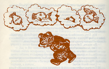 But I see this Russian Pooh, and I wonder if my hatred is misplaced.
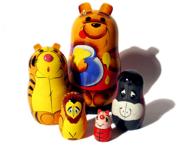 Winnie the Pooh has been quite popular in Russia. And unlike in the United States, no one exclusively owned the right to draw him. Above, Winnie the Pooh nesting dolls. Below, one of the popular Winnie the Pooh cartoons from Soviet animation powerhouse Soyuzmultfilm.
 But still, the Disney image remains. I can see these other figures while I look at them - examine them, even attempt to refresh my image of who Pooh might be by using them, following their lines, absorbing their colors. But when I turn away, this remains.
Characters can't always be brought back from the brink. Sometimes they should just be allowed to die. And when market forces prevent this from occurring - when there is still money to be made from the mask, from the shell of the creature that animates the books - the words, which bear no responsibility for the evolved image, suffer anyway. And we read, and try to forget.
Thursday, February 01, 2007
Contrast Draws The Eye

Temple of the Seven Golden Camels has a great breakdown of this image, focusing specific on areas of contrast and how they assist in composition. I love this blog.
Friday, January 26, 2007
Laura Ljungkvisk's "Follow the Line"
 Librarian and children's book literatus Elizabeth Bird reveals these gorgeous illustrations from what looks to be a gorgeous children's book. A single line in Laura Ljungkvisk's Follow the Line leads the eye on a twisted path through every page, defining and delineating the world as it goes. This is really the first relevant visual response to Harold and the Purple Crayon I've ever seen... and it only took fifty years! Head to Fuse #8 to see more.
Wednesday, December 20, 2006
Empire of Signs: Notes Towards An Archaeology of Clip Art

I am not lovingly gazing toward an Oriental essence - to me the Orient is a matter of indifference, merely providing a reserve of features whose manipulation - whose invented interplay - allows me to "entertain" the idea of an unheard-of symbolic system, one altogether detached from our own. What can be addressed, in the consideration of the Orient, are not other symbols, another metaphysics, another wisdom (though the latter might appear thoroughly desirable); it is the possibility of a difference, of a mutation, of a revolution in the propriety of symbolic systems.- Roland Barthes


The Microsoft Clip Art library (viewable online for non-Office users) includes six images tagged with the majority of these keywords: audio, audio equipment, digital audio player, digital audio players, earphones, entertainment, icons, leisure, listening, MP3, MP3 player, MP3 players, music, technologies. Only one of them is tagged with the term "digital audio player," and it, as well as three more of the six total images in this clustered category in the massive Microsoft Office clip art library, is unmistakably an iPod.
 There are obvious discrepancies - the artist saw fit to add an eardrum-endangering volume slide and "Go" and "Stop" buttons for visual effect. But the combination of the click-wheel and the iconic white body and matching earbud headphones are clear indicators of the brand in the early days of the player when Jobs, taking a cue from Henry Ford, offered the iPod in every color, as long as it was white, and when there was no such thing as the Zune, or even any plans for Microsoft to get into the music-player market.
Number of clip-art results for "Santa": 317
Number of clip-art results for "Jesus": 19
Number of clip-art results for "Beatles": 0
Number of clip-art results for "Devil": 36
Number of clip-art results for "Buddha": 9
For "Muhammed/Mohammed/Muhamet": 0
Number of clip-art results for "Jesus": 19
Number of clip-art results for "Beatles": 0
Number of clip-art results for "Devil": 36
Number of clip-art results for "Buddha": 9
For "Muhammed/Mohammed/Muhamet": 0
Clip-art makes its own formaldehyde; since materials produced for use as clip-art are thought of as contributions to a stockpile, and I suppose also because most of it is junk on day one, no one ever seems to establish any criteria for excising anything from a clip-art library, and it all sits there forever, waiting to be discovered. I'm frequently tempted to try to date "periods" in Microsoft clip-art by its content, despite the fact that it comes from a multitude of contracted sources who may or may not be swayed by faddish trends in spot illustration or by facts of immediate contemporary relevance which will cause images to date themselves due to their unspoken assumptions.
"Ten Commandments": 19
"Constitution" and "Bill of Rights" (combined total): 3
"Constitution" and "Bill of Rights" (combined total): 3
In the case of the iPod, a wildly successful product release from one of Microsoft's biggest rivals, I would guess that the "digital audio player" was drawn and uploaded in 2001 or 2002, when Apple's players truly had competitor-free iconic status and when conflicts between Microsoft and Apple were at a relative lull, with Microsoft having no direct interest in the music market and iTunes still available only for the Mac platform. No one questioned its continued availability in preparations for the rollout of Office 2003. Will it appear in Office 2007, or will it have been replaced by a clip-art image of the Zune player?
"Contraceptives": 7
Fraction of "contraceptives" results featuring birth control pills: 6/7
Fraction of "contraceptives" results featuring condoms: 1/7
Fraction of "contraceptives" results featuring birth control pills: 6/7
Fraction of "contraceptives" results featuring condoms: 1/7
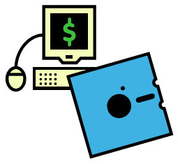 If past behavior is any indication, the unnamed iPod will stay. You don't have to look far to find other examples of clip art that would be retired if they were the product of any other medium. Many of these not only incorporate outdated technologies, like the illustration at right , but also a clear sense of style and even of attitude has been superseded and is no longer of use to anyone aware of the current culture. It is of another time, one we have lost direct contact with but can infer from the historical record. How often do these symbols represent ideas that have also lost their lustre? One axis of clip-art organization is its "Style," and all clip-art images are categorized using numeric codes. Can a style of clip-art, like a style of painting, itself embody a set of beliefs which can become culturally dated? How does a clip-art artist's view of the world, and their view of their audiences, relate to the true nature of their audiences, and to those who are not in their audiences, that is, to the world at large?
Number of clip-art results for "birth": 119
Number of "birth" images featuring mothers: 14
Number of "birth" images featuring storks: 22
Number of "birth" images featuring a birth (delivery): 1
Percentage of "birth" images suggesting delivery via Cesarean: 0
Percentage of U.S. babies delivered via Cesarean: 30
Percentage of U.S. babies delivered via stork: 0
Of course, PowerPoint - and digital clip-art in general - will say far more about us to future generations, when precise dating becomes less important and a broader interpretation of who we are (were) can be made of the whole corpus of digitally-produced clip-art we have accumulated since the early 1990s. Someone will have the tedious task of digging through the digital detritus of our age's business presentations to try to find a way to report back to us on what it all meant. For now, it's all pure speculation; that is, anything we have to say about the meaning of clip-art may say more about us as individuals than it says about our culture.
Then again, maybe not.
Subscribe to:
Posts (Atom)


