B Is For Blogged: Steve Mack's Alphabet Book
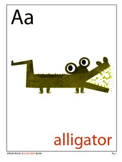
 Freelance illustrator Steve Mack has been posting his way through the production of a gorgeous alphabet book on his Spot Illustration blog, and just posted his "Z" illustration. Mack, who has illustrated childrens' books, designed greeting cards for the major card companies, and contributed illustrations for magazines and books, lives in Canada with his wife Erin and son Alex, and was kind enough to agree not only to do an email interview with Think In Pictures but to send along the above "b-side" drawing for his "L" page, which was replaced by this lion. ("I felt it was too simple. Still a cute image though.")
I loved the idea almost as much as its execution; producing and publishing an alphabet book in serial blog form seems very natural to blogging, and is a great example of how artists can engage viewers by offering free access to their creative work in ways that old-school publishers might assume would dilute a copyright. Mack will soon have a print edition of the book available for purchase through eprinter Lulu.com. If you're interested in buying one, don't worry - I'll remind you!
TiP: There's a very strong historic style that comes through in your work. Can you break that down for me? As an illustrator, what are the features that give it that look we recognize and can unconsciously place?
Mack: I have deep respect for the illustration and design of many illustrators from the 1940s-1960s. A lot of illustration from that period was handled with a keen eye on simplicity of design, form and color. I think those are obviously timeless qualities people recognize and are the ones I focus on mostly in my works.
TiP: Tell me about your illustration influences. Can you name specific people whose work has really inspired you?
Mack: I am influenced by illustrators like Jim Flora, Alice and Martin Provenson, Alain Gree, J.P. Miller, Aliki, Bernice Myers, Aurelius Battaglia, Eric Carle, Art Seiden, Ed Emberly, Harry McNaught, Janet LaSalle, Leonard Weisgard, Mary Blair, Robert Louis Stevenson, Ruth Ruhman, Ryohei Yanagihara, Sasek, Tom Oreb, Tom Eckersley I could go on and on!
Designers like Paul Rand, Saul bass, Alex Steinweiss. I like designers who think in contradictory scale, bold images and limited color palettes.
TiP: I respect that your modifications for Adobe Illustrator are trade secrets, but let's speak more generally about that process. How would you advise young illustrators looking for a textural or "handmade" look to go about developing their own tools?
Mack: Well, we all have our processes and Adobe Illustrator is just another tool. Like paint brush or a pencil. I would tell young illustrators not to let the computer dictate your style. You can bend and pull the software in any direction you like. It just takes a lot of experimenting. Heck! I still experiment every day! That’s the fun of illustrating! If I wasn’t trying new things or if it was some "plug-in" I applied it would be a rather dull existence. I need to feel like I am crafting something not just clacking keys.
As for developing tools to look handmade I would suggest studying natural media. Look at old illustrators work and try and replicate that in Adobe Illustrator by any means necessary. There are hundreds of ways to provide texture in you digital work. It just takes a little bit of experimentation.
TiP: A lot of so-called Modern art emphasized the need for an art form to reveal the essential nature of its medium, but postmodernism seems to have broken up that particular cartel. Would you care to philosophize on the aesthetic of the "fake handmade" - i.e. creating something that is meant to look handmade or textured but is computer-generated and produced using entirely digital means?
Mack: I think that need is just created out of our medium of interaction. As an illustrator I sit down in my home studio and I converse with art directors spanning the globe. I can be in NYC in an instant revising a layout for a book and in the next instant I can ftp greeting cards to art directors in Cleveland then I can reply to a request from Japan. That is pretty amazing magic in my books. Handmade work will never go out of fashion and the computer brings immediacy to any project on many levels. Marrying tradition and technological is getting the best of two worlds for many.
TiP: What did you like best about your alphabet project? What did you find most difficult about it?
Mack: My alphabet project gave me a chance to experiment, have fun and come away with a printed book. I achieved all of those goals and hope it was entertaining. The best part is always reading people's comments. Some of the illustrations I liked lest got some of the best reactions. Funny how that is and I really enjoy when that happens.
I don't think anything was difficult. I completely enjoyed myself!
TiP: Do you have favorite illustrations from the set? Why are they your favorites?
Mack: Sure, I thought alligator was a good one for the textures I used and the boldness of the alligator's shape. I liked O as well for the odd way I colored the tentacles. I like when I do stuff that doesn’t make much sense other than to please my inner designer. That’s the beauty of being your own art director!
 That being said I hate B … I got carried away with that one. I lost focus and tried to include too many B objects. I find it breaks format and will be replaced for the published book. So that is an internet exclusive. The replacement will be a surprise for the people who get the book.
TiP: Do you have kids? If so, how old? How much do they engage with your illustration work?
Mack: Yes sir! I have Alex who just turned two and is a ball of sunshine! And my wife and I are pleased to announce we have another bun in the oven.
Being that Alex is only two he doesn’t really get the whole idea of what his daddy is doing. I do get involved with him while he’s coloring at his little desk but I don’t push any art stuff at him at this point.
TiP: The alphabet seems like a great superstructure to hang a lot of visual ideas off of - it gives you a discipline and a very clear direction and goal. Have you thought ahead to any other children's book projects that would give you the same kind of framework for a project? If not, will you miss it?
Mack: Yes, I have some more ideas for other projects based on the blog style of communication. The project was fun so yes, I will miss it.
I read a great quote from Eric Carle once that said: "When I start a book it’s a lot of fun. After a while it is work, then it becomes labor. Towards the end it feels like slavery! After I have delivered the finished illustrations to the publisher, I become sad. But when I see the printed book, I am happy again!" That sums it up nicely!


No comments:
Post a Comment