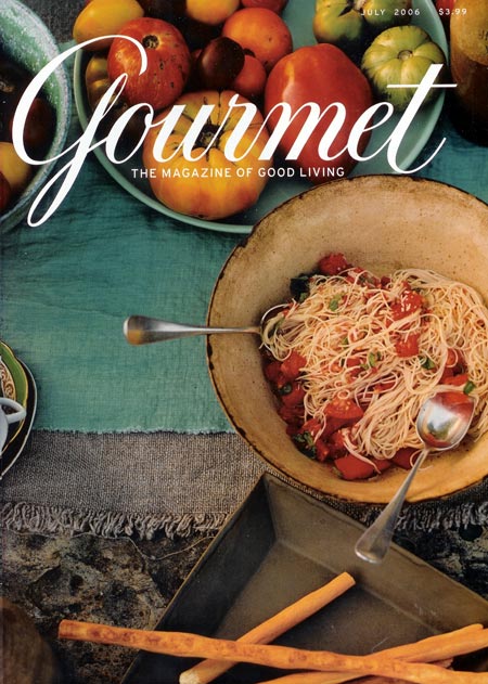
The Tangled Spaghetti Of Our Contemporary Faith In The Handcrafted
 Major web publications only rarely feature ridiculously hyperanalytical design studies without heading into dreamland and never coming back, but Slate does it with aplomb. I recently wandered into this magazine cover review from July that I had previously missed, by Seattle magazine's eat/drink editor Sarah Dickerman:
This being 2006, the spaghetti on July's cover is not styled in a neat spiral, as you might have found in 1984, but purposely tangled—a signifier of our contemporary faith in the handcrafted—and the flowers have been replaced by a bowl of heirloom tomatoes to indicate that fresh ingredients are the ultimate signifiers of good food judgment.That's the meat of it, so to speak, but there's much more if you missed this gem too.
Without totally abandoning selective focus, Gourmet and other magazines have been searching for a new photographic vocabulary. (Saveur, most notably, went through a recent redesign and adopted crisper, nearly overhead shots on its covers, too.) As depressive as Gourmet's recent covers have seemed, it has been mildly refreshing to see shadows and gravity return to still-food photography after years of sunny, horizonless shots.


1 comment:
Good article. I am encouraged to see narratives about food that encourage cooking and eating as part of a communal activity, verses the development of a product for presentation and consumption. Some friends of ours invite us over for dinner and it's never prepared yet, we just fix it together. I think this is the only way to cook nowadays! People have no time to cook, so why not make it social, enjoyable to do with others? Fold it into the social experience and all of a sudden there's time for cooking again! The new photographic style, particularly the photo you highlighted in your blog, suggests such a narrative.
Post a Comment