Thinking Small: The "False Illusion" In Contemporary Photography
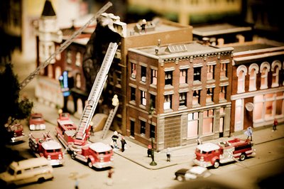
Illusions of scale are fun when you can see through them, or think you can; once the mental puzzle is solved, however quickly, I find it easy to grow fond of an image if its trick is visually interesting. Photography as a medium has an uncanny ability to portray these illusions in a convincing and unsettling way, whether deliberately or through a disorganized conspiracy of its elements. (Far less fun, to me, are those illusions which they eye cannot unravel without external sources of information - museum labels, biographies, exposes, and other elements of backstory.) Digital photographer Thomas Hawk got me thinking about this again over the past month or so after posting a string of photographs of miniatures from a display at the Alameda County Fairgrounds in the SF Bay Area.
Above is "Arsonist," a photo Hawk took and presumably enhanced in-camera or in Photoshop with a subtle painterly effect. It is a very well-thought-out photograph, requiring more than a quick glance to take it all in and offering something in return to those who do so. The yellow cast over the photograph, offset only by daubs of red of the fire engines and the encroaching darkness at the photograph's edges, gives it a feeling of age that is obviously false, and that darkness gives both the sensation of the viewer as voyeur and criminal (the arsonist watching the effects of his or her crimes from a hidden location) and of destruction (edges licked and damaged by fire). But it harbors no illusion.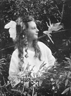
History is full of stories of people trying to fool other people with doctored photographs, and some of these involved illusions of scale as well, although generally utilizing darkroom techniques rather than in-camera effects or subject staging. Edward Gardner's famous Cottingley photographs are a prime example. They can be seen in the larger context of early twentieth-century spirit photographs that capitalized on viewers' relative naivete regarding the reality of a photographic image, and how that reality can be compromised.
But pretending to fool us, and inviting us to play along, is a newer phenomenon, one borne of experience, and one of the many quite obvious things that elevate photography to the level of art despite its mechanical component. It reminds us that cameras capture reality, but it takes a human to frame it. This relationship is at risk of being wholly consumed by the film industry, which has invested it with a level of passionate commitment that serious still photography has been reluctant to address.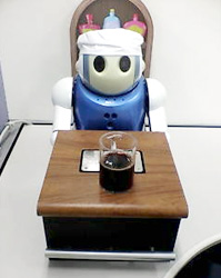 "False illusions" like Hawk's above owe a lot to our wariness at photography's power to fool us - perhaps it is for this reason that we can take such pleasure in demonstrating our ability to deconstruct such a puzzle using only subconscious, intuitive, reflexive effort. It is (for now, anyway) what still distinguishes our perception as uniquely human - artificial intelligence can categorize, but it is easy to fool it by stepping just beyond the boundaries of its classification system. Case in point: the wine-sniffing robot who grazed a human hand with its sensor and declared it prosciutto.
Most of the other photographs in Hawk's series of miniatures lend weight to this observation by their counterexample. These miniatures, for Hawk, are all about story - the story he imposes on his isolated subject, and how haunting they can become if framed properly. "She's Leaving Home," below, is a good example of this.
Despite its suggestively dark title, there is not much to this photograph beyond the warmth of its color and the contrasting depth of fields that wash over the viewer; there is nothing here that David Levinthal did not show us a long time ago. And there is no mystery.
I may be overstating the case for ease of interpretation; perhaps what is essential is that we can tell that something is amiss, even if we can't easily resolve it. The photograph below, one of NASA's recent Photos of the Day, has the bizarre look of a miniature and absolutely captivated my attention as a result. Were it not for the tail of ignited fuel and the known context of the photograph, I would argue that the photo looks like something shot on a model railroad. What makes that launch gear look so... tiny?
One clue to this mystery might be found in the "tilt-shift fake," a now-popular Photoshopping technique for making real things look fake. Flickr member electrospray, for example, turned this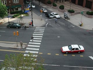
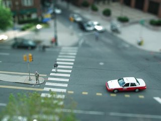
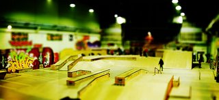
for instant miniaturization that can be quite convincing if one is not aware of the technique. If Gardner were alive today, he would likely be doing just this sort of thing (either that, or haunting Worth1000.com); it's just another opportunity for photographers to fool viewers who have not quite caught up with their methods. Seen in isolation, what would you assume the photograph below (also by electrospray) was a picture of?
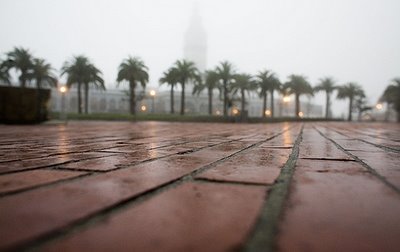
Contrast this with "Several Times I've Wished Everything Would Slip Into A Void," a photograph of the ferry terminal building and palm trees lining the Embarcadero in San Francisco. This photograph (below) offers a wonderful illusion of scale that is so simple and so quickly unlocked it is hardly a puzzle at all. It is actually almost easier to view this photograph correctly than incorrectly, but it is composed in a way that allows us to toggle between the two views with ease once we recognize their possibilities, and I feel an unalloyed pleasure in doing this which is, I think, at the heart of the playful type of illusion I am trying to get my head around in this post.
There are many wonderful photographs that take this distinction between simple and complex illusions as a challenge, and work to break down the division between the two. One of my favorite examples of this is by photographer Jennifer McNichols (obvious disclosure: my wife, blogging partner, and all-around muse) who took a series of photographs at Madurodam, a bizarre Dutch microcosm that fetishizes all things Netherlandish via miniaturization. Her "Madurodam (February 2003)" offers a wonderful double-take that has failed with no one who has seen the image.
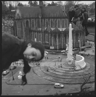
Jennifer had me release the shutter on this photo while she bent over at the waist and leaned in from outside of the frame, creating a strongly suggestive illusion in that simple move that she were in the correct position to be in a "real" scene - hanging over some balcony and lending the blurred street scene (the Dam, the old central square and original "dam" of Amsterdam) a realistic context. But the illusion is quickly broken by a reference to the actual scale of things on the other side of the photograph (a process of discovery aided by the fact that this image reads naturally from foreground to back, and supports our Western preference for reading from left to right). The illusion is so quickly posited and broken (all in-camera, as Jennifer would doubtless point out) in a heightened form of what all of these successful "false illusions" offer to viewers: the chance to see a staged reality shatter and reconstruct before their eyes. Somewhere between the vulnerability of being fooled and the transparency of honest photography, the deliberate telling of "bad lies" in art can remind us both of how manipulative photography can be and of how far we, as viewers, have come.


2 comments:
There's something phony about "The Arsonist," however. I don't think that eerie voyeur feeling comes unless you know the title. Without that, it's just a semi-pleasant hometown scene of firemen doing their jobs in a burning building. Other interesting art, like "Madurodam February 2003", speaks for itself just on looking at it.
On Labor Day weekend the cover of the Stranger here in Seattle featured an elevated view of the Seattle Center(looking at the space needle from about an angle of about 45 degrees in height). It looked like a model - I showed it to a lot of people, marvelling at the model-like qualities of the photo that I was convinced was real. I noted that the top and bottom of the photo were blurry - as if the depth of field were limited, as when you take a close-up of a flower, and the stem and apex of the stamen are out of focux. Only now do I realize that this is a standard technique for making the real seem fake!
Anyway, I enjoyed the photo in the context of the Stranger's cover, as it was in celebration of the music and arts festival at Seattle Center, a festival which has so many "perfect day" associations for so many people. Turning it into a little precious thing seemed an interesting commentary to me. It walked that fine line of loving something while also teasing one's self for loving it. Like the complex feelings hidden inside a good giggle.
Post a Comment