SHOW ME

Tuesday, July 31, 2007

Layer By Layer: The Graffiti Archaeology Project

John Nack writes:

The Graffiti Archaelogy project uses a Flash interface to let visitors navigate to different heavily tagged spots (links at left), then see the work at various stages (links at bottom). Using the M & N keys to cruise back and forth in time, I'm reminded of watching time lapses of plant life exploding on a surface, dying, and being reborn. [Via|Link]

Ugly Architecture and Ugly Product Design

Todd Lappin of Telstar Logistics on SF's new highrise at One Rincon:

The problem isn't the scale or the height; as a friend of Progress and Industry, Telstar Logistics welcomes high-rise construction in San Francisco's downtown area. No, the problem is the exterior curtain wall designed by architects at Chicago's Solomon Cordwell Buenz. The curtain wall achieves a remarkable effect: The more finished One Rincon gets, the less interesting the building becomes. [Link]

Infographic: The Urban Population

"Humanity will make the historic transition from a rural to an urban species some time in the next year, according to the latest UN population figures. The shift will be led by Africa and Asia, which are expected to add 1.6 billion people to their cities over the next 25 years. Read more."

Creative Customer Feedback

Frustrated would-be patrons at a Pittsburgh lunch counter express themselves:

Infographic: Indies vs. Majors in Music Webcasts

Monday, July 30, 2007

Advertising Battles

Wang Qingsong is bang on:

My new work "Commercial War" focuses on the power of ads and the misconceptions that ads can create. For this photo work, I constructed a chaotic backdrop where over 20 people are depicted in a frenzy of competition with some even fist fighting while jostling for ad positioning on a huge billboard advertisement; this struggle for the most optimal outdoor ad placement is perceived as inevitably bringing power and influence. The struggle for ad placement in public space in China is not unlike a battlefield strewn with casualties after a pitched battle for power. Today one brand wins. The next day, its competitor will replace it with better positioning on public spaces. Every day, new ads go up, and old ones fall down, scattered in pieces, and discarded on the ground under newly erected billboard advertisements. [Link]

Eating With Your Eyes


Interesting post on food illusions over at collision detection.

Human, But Not Too Human


From the New York Times:
If a robot had features that made it seem, say, 50 percent human, 50 percent machine, according to this view, we would be willing to fill in the blanks and presume a certain kind of nearly human status. That is why robots like Domo and Mertz are interpreted by our brains as creaturelike. But if a robot has features that make it appear 99 percent human, the uncanny-valley theory holds that our brains get stuck on that missing 1 percent: the eyes that gaze but have no spark, the arms that move with just a little too much stiffness. This response might be akin to an adaptive revulsion at the sight of corpses. A too-human robot looks distressingly like a corpse that moves. [Via|Link]

The Energy Line


From Behance:

At any given point in time there are a few projects that are urgent, some that are just important, a few that need to be kept moving, and others that are idle. How much of your time are you spending on what? Are you focused on the right things? Amidst the everyday craziness of a creative enterprise, it is hard to keep energy in perspective.

The Energy Line is a simple mechanism to graphically display energy allocation. A simple line starting at "Idle" and going up to "Extreme" is drawn along a cork or dry erase board. Then write the names of all of your major projects on small cards. Place the cards along the energy line according to how much focus they should get. Be realistic and make the tough decisions on what projects need to live on low energy for a while. [Link]

Photosynth: Visually Tagging The World

Amazing Demonstration of Photosynth by Blaise Aguera y Arcas.


Photosynth Website.

Saturday, July 28, 2007

TiP Abroad

I finally made good on a promise to Fagistani president Joshua Gibson to contribute a piece to his blog. Gibson's foul-mouthed and always insightful commentary has been on my short list of must-reads since I discovered his blog a year ago, and he has contributed here more than once. You can read my piece, which concerns an egregious bit of journalistic mumbo-jumbo on display at the Huffington Post, here.

Friday, July 27, 2007

200 Bad Comics

Thursday, July 26, 2007

The Alphabet Of Horror


Alphabet of horror by Jared von Hindman

For more cute and scary stuff visit who killed bambi?

For just merely cute, and a kick up the backside of website designers all over the world, look at this.

Wednesday, July 25, 2007

New Suggestions For CSU-Long Beach's Art 110 Class

Back in April I reported on an art appreciation class at CSU-Long Beach which features the fantastic assignment of painting reenactment. I suggested a few works for the fall semester - Washington Crossing the Delaware, a painting of John Brown, and a Botticelli Annunciation, which is basically the ecumenical inverse of that scene in Nightmare On Elm Street III when Freddy Krueger is leading Johnny Depp around by his tendons. I think I'd be equally frightened by either scenario, wouldn't you? Someone write me an essay on the role of horror films as an existential response to ecstatic experience in a post-religious culture, stat!

Anyway, I was thrilled when instructor Glenn Zucman found the post and basically shot all my ideas down. Well, not exactly. As it happens, works need to be on permanent display in Los Angeles in order to be considered, because the students have to go look at the actual artwork, not just some crappy photos on a website somewhere. The gall! But he invited me to come up with some alternatives. I had a lot of fun browsing the LACMA permanent collection online, and have come up with a bunch of options that may or may not be on display at any given moment.

The following selections have been made based on their intrinsic beauty, compositional complexity, pathos, aeronautics, or other challenges.

Leonard Bramer (Holland, 1596 - 1674)
The Liberation of Saint Peter, circa 1625
Getting the lighting right here could be a challenge. This picture has always looked demonic to me. All those blacks and browns.

Jean-Hippolyte Flandrin (French, 1809 - 1864)
The Sacrifice of Isaac, 1860
Man, that color!

Rutilio Manetti (Italy, 1571 - 1639)
Dido and Aeneas, circa 1630
Selected for pathos, and for having so many faces in such different relationships and layers.

Charles-Joseph Natoire (French., 1700 - 1777)
Psyche Obtaining the Elixir of Beauty from Proserpine, circa 1735
How would you represent that dragon? No teddy bears allowed!

Carlo Saraceni (Italy, 1579 - 1620)
The Martyrdom of St. Cecilia, circa 1610
Beautiful and hard to do!

Joseph Marie Vien (French, 1716 - 1809)
Venus Emerging from the Sea, circa 1754-1755
Venus and the mermaid are permitted to wear bikinis, but I'd like to see them pull off that arc of fabric and the diving cherub!

By the way, if you haven't been to Glenn's Art 110 wiki lately, check out their great selection of photos of students striking poses with or near museum security guards!

Bugs Bunny Does Opera: Notes On Adaptation and Censorship in Musical Storytelling

Over on Z Recommends today we reviewed Music Tales, an album of drawn-and-quartetered versions of classical compositions used to sound-illustrate fairy tales and children's stories. A subsequent interview led us briefly to Warner Brothers' fantastic operatic adaptations, "The Long-Haired Hare" and "What's Opera, Doc?" which have Rossini and Wagner spinning in their graves to this day.

What strikes me as most interesting about the comparison has hit me only in hindsight. In our review I gently criticized the album for its inclusion of moments of graphic violence in some of the stories, elements that have been easily and deftly removed by other authors; in Tomie de Paola's Favorite Nursery Tales, for example, the story of the Three Little Pigs is no worse off for having the wolf give up and go home rather than being "boiled to bits" in the pigs' pot.

I missed the Bugs Bunny connection from the outset when I asked the group's violinist if their "mashups" had any antecedents in the modern era, so I'm grateful she mentioned the cartoons. But even then I didn't recognize the other parallel, which is their willingness to display violence. Fairy tales may contain more visceral violence than classic cartoons, but the thread certainly runs through them both, and some fairy tales have been so thoroughly sanitized that some critics are beginning to welcome the reintroduction of at least a touch of violence in stories old and new. I'll stand by my criticism, though, to the extent that I'm talking about a toddler audience, not one of older children. When our daughter Z is a bit older we will enjoy the old Bugs Bunny cartoons together. At three, not a chance!

Apparently some networks took their concern about cartoon violence even further when it came to "The Long-Haired Hare." From Wikipedia:

The ABC version of this cartoon cuts the entire sequence where Bugs is dressed as a bobby-soxer looking for Giovanni Jones's autograph and gives him a dynamite stick disguised as a pen.

The CBS version of this cartoon is a little more heavily edited (as the censors hated the cartoon due to its violence). Not only is the bobby-soxer sequence that was cut from ABC also cut here, but also the scenes where Giovanni Jones beats Bugs up every time he ruins his singing lessons (i.e., Jones breaking, then smashing Bugs' banjo over his head; Jones slamming Bugs' harp on his neck; Jones pulling Bugs from the tuba, tying his ears to a tree branch, and pulling his body back so it'll snap back and have his head hit the branch).
Most websites don't list the cartoon titles included in Looney Tunes collections, but after a lot of digging I confirmed that "Long-Haired Hare" is included in Looney Tunes' Golden Collection Vol. 1. I couldn't find the studio's lesser-known Wagnerian masterpiece mentioned as being included in any collection - if you know where to purchase it, let me know in the comments!

Both cartoons can currently be viewed on YouTube, so why not settle in to watch a couple of hilarious, not to mention history-making cartoons?

Long-Haired Hare


What's Opera Doc

A Brief and Partial History of Tainted Love

Cy Twombly, Untitled, 1961. Not the painting.

From the wires:
A woman has been arrested on suspicion of kissing a painting by American artist Cy Twombly and smudging the bone-white canvas with her lipstick, French judicial officials said Saturday.

Police said they arrested the woman after she kissed the work on Thursday. She is to be tried in a court in the southern city of Avignon on Aug. 16 for "damage to a work of art," judicial officials said.

The painting, which is worth an estimated $2 million, was on display at the Museum of Contemporary Art in Avignon. It is part of an exhibition slated to run at the museum through Sept. 30. Officials did not provide further details on the painting.

Jake and Dinos Chapman, from "Insult to Injury," 2003.

And, ages ago (2003), from the Guardian....
Two years ago, the Chapmans bought a complete set of what has become the most revered series of prints in existence, Goya's Disasters of War. It is a first-rate, mint condition set of 80 etchings printed from the artist's plates. In terms of print connoisseurship, in terms of art history, in any terms, this is a treasure - and they have vandalised it.

"We had it sitting around for a couple of years, every so often taking it out and having a look at it," says Dinos, until they were quite sure what they wanted to do. "We always had the intention of rectifying it, to take that nice word from The Shining, when the butler's trying to encourage Jack Nicholson to kill his family - to rectify the situation," interrupts Jake.

"So we've gone very systematically through the entire 80 etchings," continues Dinos, "and changed all the visible victims' heads to clowns' heads and puppies' heads."

The "new" work is called Insult to Injury. The exhibition in which it will be shown for the first time, at Modern Art Oxford, is called The Rape of Creativity.

Far muddier are the conflicting reports that Patricia Cornwell, in her obsession to prove that painter Walter Sickert was Jack the Ripper, destroyed some of Sickert's paintings to test her theory. The merits of Cornwell's arguments notwithstanding (even reader-reviewers on Amazon largely hold the book in contempt), a CBC article in 2003 paraphrased a curator asserting that Cornwell had destroyed "up to thirty paintings," "tearing them apart" in her search for evidence. Once Cornwell donated 82 works by Sickert to the Fogg Art Museum at Harvard, however, the Art Newspaper did slightly better, quietly paring the tally down to one work which "it is said" (unattributed) was destroyed, and also does Cornwell the service of mentioning that she denies having done it.

Tuesday, July 24, 2007

Extending Rapid Game Development with Post-Release Fan Programming

Crayon Physics is one of a series of monthly, deadline-driven game development exercises by Finnish game developer Petri Purho. Purho releases a new game every month which can be downloaded and played on PCs running Windows.

If you don't run Windows or would prefer to watch a spoiler video to remove the possibility of getting addicted to game you don't have time to play, here it is:


I find it particularly interesting that the platform Purho uses allows fans to creating their own levels for the game, which Purho then shares with other readers. They can even stray from the game's look and feel, and often crib from other game designs in their own development.

To learn more about rapid game development, visit the Ad Lib Game Development Society's home page. Their site includes a great list of strategies and tips that can be applied to many other team-based creative activities.

Friday, July 20, 2007

Divine Secrets of the Yahya Brotherhood

Harun Yahya has been sending a lavish and highly amusing anti-evolutionary coffee-table book to research scientists and educators around the world. From the New York Times:

At 11 x 17 inches and 12 pounds, with a bright red cover and almost 800 glossy pages, most of them lavishly illustrated, Atlas of Creation is probably the largest and most beautiful creationist challenge yet to Darwin’s theory, which Mr. Yahya calls a feeble and perverted ideology contradicted by the Koran. ....

[UC Berkeley evolutionary biologist Kevin Padian] said people who had received copies were "just astounded at its size and production values and equally astonished at what a load of crap it is."

"If he sees a picture of an old fossil crab or something, he says, 'See, it looks just like a regular crab, there's no evolution,'" Dr. Padian said. "Extinction does not seem to bother him. He does not really have any sense of what we know about how things change through time."

My very favorite thing about the book is its visuals. Yahya uses images of evolution, most of them likely to have been cribbed from other texts, and slaps a red "X" with the word "FALSE" splayed across it. Take that, science!


Others he probably had created especially for the book - for example, this image of an alligator "evolving" into a chipmunk! Clearly FALSE!


To celebrate this highly entertaining rhetorical technique and its astonishing implications, I've developed some merchandise you can use to refute the existence of just about anything that is bothering you - your morning cup of coffee, your laptop or car, even yourself! Make a statement to the world that you do not believe what might appear obvious to them - tell them it's FALSE!

The clothing and other merch is all being sold to benefit the American Association for the Advancement of Science, with all proceeds being donated to them. Check out what we have in the store and help support an organization that works every day to spread knowledge and understanding.

Harry Potter Leak: EXIF Is Not A Smoking Gun

Much has been made of the Harry Potter torrent and the fact that the digital images available contain data that can be used to trace the images back to the camera if it has been serviced. What no one seems to recognize in this discussion is that EXIF data is easily edited if you know it's there. Programs which allow you to do so and even facilitate EXIF editing of 314 of the 355 EXIF fields are priced from cheap to free.

EXIF data in digital images offers a wealth of data storage - not just date, time, and camera information but everything from GPS info (that's what makes photo geotagging possible) to information about the camera settings when the photograph was taken to all kinds of custom fields that can be edited to help protect copyrights (image credits, license terms, etc.). Virtually all of these fields can be edited with the exception of date and timestamps. (View a PDF guide to EXIF fields.)

Not many people make use of EXIF data to edit it but it is perfectly legal to do so, at least when it isn't covering up a crime, and there is no way of knowing with certainty that the author of the Potter photos now circulating on the Pirate Bay did not edit the photos' EXIF data.

If they didn't, law enforcement is in luck, and of course any EXIF data is a place to start in tracking down the culprit, especially one with such horrible carpeting. But news outlets are treating EXIF data as the equivalent of a DNA test, which is only true if you could change your own DNA with a freeware computer program.

Timeline of Artifacts

Shared by Flickr user argybarg, who also offers detail shots of the timeline like the one below.


Thursday, July 19, 2007

New Painted Film Stills By Rebecca Whipple

Rebecca Whipple has completed animation for a new piece entitled "Steve Martin On The Loose a.k.a. The Big ShaBang." The piece is 4:55 and the stills she sent me to post as a sneak peek are gorgeous.


Music is being composed by Benito Meza. Here's a clip with him playing (he's the clarinetist):


You can read/view previous coverage of Rebecca Whipple on TiP here and here, or view more work on her website.

The Intricate Makeshift Signs of Mr. Sato

"If, over the past several years, you have had the privilege of joining the 3.3 million people that pass through Tokyo's Shinjuku station each day, you may have observed the work of Mr. Sato. A construction worker by trade, Sato uses strips of adhesive tape to create elaborate makeshift signs that help people navigate the temporary chaos of ongoing renovation work at Shinjuku station. Sato's signs, which feature a peculiarly attractive gothic font, are the focus of a 15-minute documentary video put together by TrioFour, a small group of independent filmmakers. The video, which can be seen in two parts here (part 1, part 2), consists mainly of a long interview with Sato, entirely in Japanese (no subtitles), but it also shows lots of photos of his work from 2004."


Via pink tentacle, with more at the link.

Wednesday, July 18, 2007

Clothespin Order Tracking

"I had dim sum here this morning (was average) and I ordered four to-go entrees; when I checked my food at home, I was missing one entree and one of my containers had a clothespin in the food...."
- Review of The Kitchen restaurant, Millbrae, CA

Shared on Flickr by icathing

Free Preview


Movie theatres in Mumbai frequently entice viewers to pay for entrance by allowing them to glimpse/watch the film through a small window in the screening room door. Apparently they know something the RIAA doesn't... [Link]

Tuesday, July 17, 2007

Top-Grossing Movie Color Chart

A visualization showing the dominant color schemes of top-grossing U.S. films (uncorrected for inflation, unfortunately), sorted by MPAA rating.

Created by the amazing Armin at Speak Up - follow the link for color schemes for the individual movies. Great stuff. [Link]

Obama's New Look

Click the image to enlarge, and read the photo caption.

[Via]

Monday, July 16, 2007

Control Your TV With Hand Movements

Thursday, July 12, 2007

Better Than The Original: Sending Up Hirst's "For the Love of God" Skull


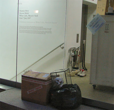
The following display was placed outside the White Cube Masons Yard late Sunday night. The gallery is hosting Damien Hirst's "For the Love of God," a diamond-encrusted skull valued at somewhere between sixteen and twenty million dollars. Artist Laura mocked it up using more than six thousand Swarovski crystals; I estimate it easily cost her under $300 to make.

Wooster Collective, thinking small as usual, calls it a prank. I call it art. And although "Love" is the best thing Hirst has done in years, this is still better than the original it comments on. By a long shot.

Wednesday, July 11, 2007

R.I.P. Ladybird Johnson

No. 8, from the series "Life Sized," by Jennifer L.F. McNichols

[Obit]

DIY Slide Projector


[Via]

Happy Fair Use Day

Incidentally, today is Fair Use Day, which I have nothing interesting to say about. Just to be a jerk about it, I will point out that the Electronic Frontier Foundation doesn't know a good soapbox from a bad one - give them one, however rickety, and they'll stand on it and start crowing.

"Disrespectful, shameful, and outrageous" indeed - I disagree with the broader position on copyright that Web Sheriff and the labels employing the company represent as much as anyone at the EFF, but what von Lohmann castigates Web Sheriff for is simply a company trying to be more personable in enforcing an unpopular law with some small measure of sensitivity. The post, and the argument, is a credibility-squanderer - unless, of course, you are another of those people already so blind to opposing views on the issue that the mere whiff of blood will get you thrashing around.

Colorization of Popeye Cartoons

John Kricfalusi has an interesting post up today about a new DVD set of Popeye cartoons. After pointing out the many great things about Popeye and plaintively asking why they are off the air* he starts picking at the color palette of the few color cartoons on the disc, comparing the colors of the Popeye "Ali Baba" and "Sinbad" cartoons. See if you can tell which one is "very rich with lots of subtleties" and which one is the "My Little Pony version."


Head over to John K.'s blog and let him show you how great Popeye was and is. [Link]

* In my opinion, it's the violence between human characters that did Popeye in. You can only get away with cartoonish violence as a major plot device when you are dealing with animals, i.e. Tom and Jerry.