SHOW ME

Tuesday, December 26, 2006

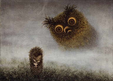
Soviet Anti-War Film In Stop-Motion Animation

I found some of the camera techniques to be a bit out of sync with the animation style, but this seven-minute-long film is well-worth watching through to the end and shows off some of the talents of Soyuzmultifilm's animators, circa 1986 (previously referenced in my blogging here).

Friday, December 22, 2006

Bizarre International Animation From ZRecs' Toddler Animation Week

Toddler Animation Week comes to a close at ZRecs today with three music videos young kids will love: Royksopp's "Remind Me," Minilogue's "Hitchhiker's Choice," and Harry Nilsson's "Think About Your Troubles." Head over to ZRecs and you can also check out our entries on Art Clokey's bizarre Gumbasia, Canadian Norman McLaren's film etching, Czech animator Jiri Trnka's cut-paper Merry Circus, and Yuriy Norshteyn's multimedia masterpiece, Hedgehog In the Fog. All videos are YouTube-embedded for easy viewing.

Thursday, December 21, 2006

Carl Sagan's Cosmic Calendar

The history of the universe in one year. Here is the month of December:


The first second of New Year's Day is the last 500 years.

[Link|Via]

The Seventh Harry Potter Title

Fuse #8 reports on the availability of the title of the seventh Harry Potter book on J.K. Rowling's website. Title aside, I like the publisher's use of the site as a promotional vehicle. It takes several mysterious steps to get to the underwhelming title, and there are other goodies on the site as well. My favorite is the "Rubbish" section, accessible from the main desktop by clicking on the pencil sharpener; the trash can contains responses to critics of the Harry Potter books and debunkings of various myths surrouding the series or its author.

I'm guessing a lot of kids will be pretty jazzed at having the opportunity to find out the title through mysterious means, so I won't give it away here. But Fuse #8 can tell you the steps to take to find it.

Open Letter To All The People Who Come To Think In Pictures In Hopes of Scoring Some Rankin & Bass Desktop Wallpaper

At some point this afternoon, forty-one of the most recent 100 visitors to this blog arrived by searching for something and following a link to a Think In Pictures post in their search results. This is what they were looking for when they found TiP:

  • uranium fission animation download
  • the land of make believe poster
  • moebius wallpaper
  • picasa web album
  • annunciation paintings middle ages
  • picasa image resolution
  • christmas notes animation
  • the land of make believe jaro hess
  • animated christmas pics
  • jaro hess land of make believe
  • chess helper
  • graffiti artist meaning
  • sparkline font
  • pictures of animated frosty the snowman
  • jill greenberg prints
  • channel 9 news story los angeles december 18 p
  • godhead pictures
  • people outraged at pictures of crying babies
  • karolina sobecka
  • graffiti arts
  • short way tofree pics
  • jill greenberg effect
  • fiji water
  • texas art teacher
  • ballet terms and visuals
  • fiji water not good
  • retro desktop backgrounds
  • ppt animations of a
  • hacking powerpoint, custom elements
  • frank rich hoepker
  • open source eye-tracking
  • keith olbermann on colbert report
  • encoding for youtube
  • find a portrait studio that takes pictur
  • nyc blueprint for the arts
  • texas nude teacher photos
  • rankin & bass wallpaper
  • stop motion animation whiteboard
  • wallpaper spore the game
  • xmas education animated
Astute or obsessive readers may have noticed that there are only forty lines in that list. That is because there was one search which was quite disturbing and which contained the words "pictures" and "children" and undoubtedly led a web surfer to one of my posts about Jill Greenberg, but which I have deleted from the above list for the sake of decorum.

In any given day, approximately 20% of people coming to Think In Pictures are following a link from somewhere on the Internet to my writings on Jill Greenberg, and most of them stay to read something else. Another 10% come to read what I have written about graffiti, and are likewise lured to the main blog page or to some other post. Another 10% appear to be feed subscribers. The rest - a full 60% (approximately) of site visitors - wander through old incoming links and web searches like the ones above.

They do not always find what they are looking for. Case in point: For some reason I get several hits almost every day from people who are looking for Rankin & Bass wallpaper. I have written about Rankin & Bass' Frosty the Snowman, once, but I have never uttered as much as a whisper about related wallpaper, real or virtual. There seems to be an insatiable hunger on the Internet for Rankin & Bass desktop wallpaper.

Despite this fact, "Rankin & Bass wallpaper" does not generate enough hits to register on Google Trends' web search tracker. Google Trends can tell us some interesting things about the quest for "desktop wallpaper," however. The collective desire for desktop wallpaper has declined by roughly 50% since the beginning of 2004. That is a very serious decline, and should give pause to anyone in the business of supplying desktop wallpapers. In fact, I am currently downgrading my recommendation for any and all desktop wallpaper stocks from HOLD to SELL. You heard it here first. I am sorry to say that the market for desktop backgrounds, while substantially more robust than that of desktop wallpaper, has experienced a similar decline.

You can find some cute Rankin & Bass desktop wallpaper here. Okay?

The Best K-12 Visualization Blog On the Web Made the Edublog Awards' 2006 Finalists, And I Couldn't Be Happier

"Quiet Indoor Voices," by DeepEllen

One of my original reasons for creating Think In Pictures was to try to link up the topics of education and visualization. The educational blogging community is very tight-knit a community and does not seem to have as strong a connection to outside influences regarding how to promote visual learning as they do in other areas. My ideas for this blog have evolved considerably in the seven months this blog has been online, and I have moved from working in K-12 curriculum design to adult curriculum design and from the graphics side back to an emphasis on writing, so that early emphasis may be less apparent than it once was. But my primary goal of thinking about visuals in an eclectic way has persisted throughout that time, and has influenced my other creative work as well, in ways I will be able to describe someday if things go as planned.

Math & Mondrian project, photo by Bisse

Visual schedule for autistic children by MNicoleM

If you like thinking outside the box on visualization with people who don't bother to use ridiculous terms like "thinking outside the box," you should keep up with the Classroom Displays blog. It's one of those sites that can help graphic and information designers out of a rut and provide some grassroots inspiration. Education bloggers recently named it one of the top four "audio and/or visual" blogs currently online in the 2006 Edublog Awards. To my mind, the fact that Edublogs decided that a joint category for podcasts and images was the way to go is the best sign that a blog like Think In Pictures, as it was originally conceived, is still a good idea.

I have never had a real or virtual conversation with the blogger behind the Classroom Displays blog, but I know from her sourcing that Linda Hartley works overtime to get good work up on her blog. She is a heavy Flickr user, organizing submissions through a Classroom Displays Flickr pool and running a related wiki to boot, and is always scouring Flickr for good contributors. The fact that she holds a degree in Learning, Technology and Research and chose to investigate displays made of construction paper and crayons is an inspiring example of where you can end up when you think creatively and openly about visualization.

Smoke Like the Flintstones


[Via]

Wednesday, December 20, 2006

Empire of Signs: Notes Towards An Archaeology of Clip Art

I am not lovingly gazing toward an Oriental essence - to me the Orient is a matter of indifference, merely providing a reserve of features whose manipulation - whose invented interplay - allows me to "entertain" the idea of an unheard-of symbolic system, one altogether detached from our own. What can be addressed, in the consideration of the Orient, are not other symbols, another metaphysics, another wisdom (though the latter might appear thoroughly desirable); it is the possibility of a difference, of a mutation, of a revolution in the propriety of symbolic systems.
- Roland Barthes
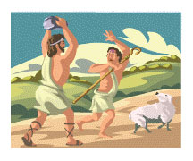
Complete Microsoft Clip-Art Library search results for "murder"


The Microsoft Clip Art library (viewable online for non-Office users) includes six images tagged with the majority of these keywords: audio, audio equipment, digital audio player, digital audio players, earphones, entertainment, icons, leisure, listening, MP3, MP3 player, MP3 players, music, technologies. Only one of them is tagged with the term "digital audio player," and it, as well as three more of the six total images in this clustered category in the massive Microsoft Office clip art library, is unmistakably an iPod.
There are obvious discrepancies - the artist saw fit to add an eardrum-endangering volume slide and "Go" and "Stop" buttons for visual effect. But the combination of the click-wheel and the iconic white body and matching earbud headphones are clear indicators of the brand in the early days of the player when Jobs, taking a cue from Henry Ford, offered the iPod in every color, as long as it was white, and when there was no such thing as the Zune, or even any plans for Microsoft to get into the music-player market.

Number of clip-art results for "Santa": 317
Number of clip-art results for "Jesus": 19
Number of clip-art results for "Beatles": 0
Number of clip-art results for "Devil": 36
Number of clip-art results for "Buddha": 9
For "Muhammed/Mohammed/Muhamet": 0

Clip-art makes its own formaldehyde; since materials produced for use as clip-art are thought of as contributions to a stockpile, and I suppose also because most of it is junk on day one, no one ever seems to establish any criteria for excising anything from a clip-art library, and it all sits there forever, waiting to be discovered. I'm frequently tempted to try to date "periods" in Microsoft clip-art by its content, despite the fact that it comes from a multitude of contracted sources who may or may not be swayed by faddish trends in spot illustration or by facts of immediate contemporary relevance which will cause images to date themselves due to their unspoken assumptions.

"Ten Commandments": 19
"Constitution" and "Bill of Rights" (combined total): 3

In the case of the iPod, a wildly successful product release from one of Microsoft's biggest rivals, I would guess that the "digital audio player" was drawn and uploaded in 2001 or 2002, when Apple's players truly had competitor-free iconic status and when conflicts between Microsoft and Apple were at a relative lull, with Microsoft having no direct interest in the music market and iTunes still available only for the Mac platform. No one questioned its continued availability in preparations for the rollout of Office 2003. Will it appear in Office 2007, or will it have been replaced by a clip-art image of the Zune player?

"Contraceptives": 7
Fraction of "contraceptives" results featuring birth control pills: 6/7
Fraction of "contraceptives" results featuring condoms: 1/7

If past behavior is any indication, the unnamed iPod will stay. You don't have to look far to find other examples of clip art that would be retired if they were the product of any other medium. Many of these not only incorporate outdated technologies, like the illustration at right , but also a clear sense of style and even of attitude has been superseded and is no longer of use to anyone aware of the current culture. It is of another time, one we have lost direct contact with but can infer from the historical record. How often do these symbols represent ideas that have also lost their lustre? One axis of clip-art organization is its "Style," and all clip-art images are categorized using numeric codes. Can a style of clip-art, like a style of painting, itself embody a set of beliefs which can become culturally dated? How does a clip-art artist's view of the world, and their view of their audiences, relate to the true nature of their audiences, and to those who are not in their audiences, that is, to the world at large?

Number of clip-art results for "birth": 119
Number of "birth" images featuring mothers: 14
Number of "birth" images featuring storks: 22
Number of "birth" images featuring a birth (delivery): 1
Percentage of "birth" images suggesting delivery via Cesarean: 0
Percentage of U.S. babies delivered via Cesarean: 30
Percentage of U.S. babies delivered via stork: 0

Of course, PowerPoint - and digital clip-art in general - will say far more about us to future generations, when precise dating becomes less important and a broader interpretation of who we are (were) can be made of the whole corpus of digitally-produced clip-art we have accumulated since the early 1990s. Someone will have the tedious task of digging through the digital detritus of our age's business presentations to try to find a way to report back to us on what it all meant. For now, it's all pure speculation; that is, anything we have to say about the meaning of clip-art may say more about us as individuals than it says about our culture.

Then again, maybe not.

Tuesday, December 19, 2006

Smash-Up Derby Commercial

Dancing Cigarettes and Cigars


Joe Barbera, 1911-2006


Drawn! passes on the report that Joe Barbera died yesterday.

Hanna-Barbera made many of my least favorite cartoons and many of my favorites as well. A lot of that was timing. The studio put out a lot of low-budget fare, and although story was their emphasis (as opposed to Disney cartoons, which emphasized character) the stories were often very formulaic. But there was also a wildness to a lot of their best work that made some H-B cartoons very fun for a kid to watch.

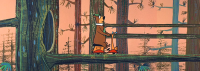
John Kricfalusi wrote of the best critiques I have read about a Hanna-Barbera cartoon. It's about the painting of the backgrounds in Yogi Bear cartoons. Read it here.

Action Painting With The Wii


Photos by Zac Bentz.

Notes On Linerider Machinima

If you haven't tried Linerider yet, you're missing a treat in free Flash games. If you have tried Linerider, you'll know that the below represents countless hours of work and the tireless quest to perfect a profoundly useless craft.


One form of purity in this craft is the unity of purpose we associate with great works of visual art, in which every stroke of the digital pen serves an essential function, where every ramp seems to comes just in time and at the impossibly right place. These are my favorite, a dance between sled and line that has all of the drama of dance because we can only judge its shape as it creates that shape in front of us. (Woe to the Linerider artists who screendrag through their entire course before launching us into it; the loss of agency, confusion, and anticipation a viewer feels when watching these films are half the fun.) Another, less graceful use of the medium leaves all strokes intact, creating a narrowing band of evolved intention that provides an interesting window on the development process. An amusing course design is the primary plank of a good Linerider movie, but if the designer sticks to a visual style, there is also a curiously authentic authorial voice that can be felt in this trivial pursuit.

I was also excited to see how this game has progressed since I first played it. In its previous version you had to download it, something I am rarely willing to do, and could only play it on a PC, not a Mac - suffice to say that it was only due to the impassioned chatter of its players that I went through the trouble. Now you can play it online, and you can erase lines, a "feature" that either the first version didn't have or I just never figured out how to use. I really don't have time to mess around with this game, but apparently I do have time to watch videos of "rides" other players create. Keep 'em coming!

UPDATE: Among the many great YouTubed entries to a Linerider contest is this brilliant "Cave Adventure":


Here's one where Linerider is quickly ejected from his sled and the two bounce around independently in a lurching, pinball-style course before mercifully coming to rest.

Monday, December 18, 2006

Fish

Animation Week: Innovative Filmmakers Who Will Blow Kids' Minds


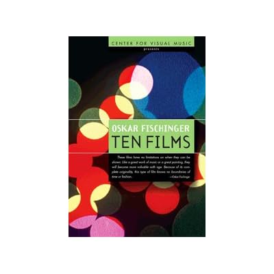
A recent post on parenting blog DaddyTypes noted that a video of innovative abstract films by Oskar Fischinger might be of interest to young kids. Fischinger was a German-born filmmaker and painter active from the 1930s to 1950s who had little popular success in his lifetime due to various setbacks and his own uncompromising vision of the role of abstraction in film.

Finding "adult" content that engages both parent and child introduces the idea of shared passions into your relationship with your kid, something that children whose TV time is dominated by Barney and the Teletubbies will never have. So the Daddytypes post got me wondering what other "arthouse" filmmakers' work might go over well with young audiences. This was not exactly the right question to ask, because some visionary filmmakers found animating for children to be a liberating experience - they faced an audience with fresh eyes, few preconceptions, a short attention span and a great tolerance for new techniques paired with a demand for clear communication strategies.

I found a lot of great stuff, and decided to post a series of recommendations of innovative animated films you probably haven't seen which are appropriate for young children. The filmmakers are American, Soviet, Czech, and Canadian; their techniques range from cel and stop-motion animation to film etching and live-action sequences. What they all have in common is the ability to dazzle toddlers with their beauty, mystery, and urgency in a way that is very much like the effect they are intended to have on adults, which makes watching these films with your child a much richer experience than snuggling up with yet another episode of some lame PBS cartoon. Although the content I will recommend amounts to a handful specific recommendations spread out over a week, many of these suggestions can lead interested viewers to a much larger field of possibilities.

I just posted my first recommendation, Yuriy Norshteyn's Hedgehog In the Fog, at Z Recommends. You can watch the film and read about it there. I will be publish a new film highlight there each day for the rest of the week, all of them with embedded film content from YouTube.

For more of my thoughts on YouTube and its role in toddler education, click here.

Friday, December 15, 2006

Cutting Out Editing Software In Digital Video Production

Internet video creators can now stream digital video to YouTube as it's shot, although no editing is possible once the video is captured. Gotuit now allows for anyone to clip a segment of online video from any source to create a separate embedding tag for use in blogs and websites which appears to avoid copyright violations by linking to the existing video rather than copying it. Can you see where this is headed? Come, sweet convergence...

Necco Wafer Christmas Ad


[Via]

One Weekend Only: Wooster's 11 Spring Graffiti Project

The Wooster Collective often rubs me the wrong way. From their refusal to critically discuss works of graffiti art to the deafening silence of readers in their comment-disabled blog, the efforts of the graffiti art movement's leading proponent in the blogosphere leave much to be desired. But Marc and Sara Schiller, the couple behind Wooster, have done an amazing thing. Here's hoping they do many more amazing things in the future.

It will be interesting to see how many of the future inhabitants of the condos of 11 Spring St. will recover/uncover the works the developer will be covering up in the renovations. I would be surprised if they could not find ways to sell units with sections of the artwork still intact and uncovered. This graffiti art has the makings of accent walls for the NYC glitterati - profoundly hip, and with a story to tell; a conversation piece about the history of contemporary New York.

Thursday, December 14, 2006

Patent Searching Goes Google

Google has rewritten patent search. If you have ever tried to use the U.S. Patent Office's own patent search portal, you will understand how nice this is for both casual Internet meanderers and serious inventors.

One of the worst features of the U.S. Patent Office's application is its handling of images. Whenever you load one it is a roll of the dice whether you'll actually get it or not. The massive database relies on some outdated version of Quicktime that half the computers I have ever been on do not have and are unable to download. Then if you do have the "right" plugin it still screws up on the image loading (just tried it from a new computer and it loads about 1/5 of the page before getting stuck and giving up).
Compare them yourself: Google Patents | U.S. Patent Office

Chalk another one up for the technocrats.

Wednesday, December 13, 2006

Sao Paolo Bans All Outdoor Advertising

From the New York Times:

Imagine a modern metropolis with no outdoor advertising: no billboards, no flashing neon signs, no electronic panels with messages crawling along the bottom. Come the new year, this city of 11 million, overwhelmed by what the authorities call visual pollution, plans to press the “delete all” button and offer its residents an unimpeded view of their surroundings.
[Link]

Tuesday, December 12, 2006

Crayon Art

Pete Goldlust [Via|Link]
Diem Chau [Via|Link]

plus

Cereal-Box Character Adventure Comic: "The Last Good Morning"


Think Justice League meets your childhood Saturday morning commercials. Truly surreal, and also very exciting. Creator Brendan Douglas Jones does his best to send up the genre and always makes the most of character casting and their delicious introductions. There is even a tight and complex storyline and mystery to keep you turning pages after the initial humor has worn off. Highly recommended - join the crowds. [Via|Link]

Saturday, December 09, 2006

Kick-Starting An Art Collection

Book Cover

I received a copy of The Intrepid Art Collector in the mail a few weeks ago and have been enjoying it immensely. Anyone looking for a last-minute gift for an art-lover intimidated by the art market but interested in owning and cherishing works of art would do well to consider it.

I found one of the most interesting sections of the book to be Lisa Hunter's coverage of African art, which faces some issues in terms of ascertaining its value, quality, and relevance than traditional Western or Eastern styles and forms. The Art Law Blog has a great piece on this very issue. African art also seems to be an interesting field in that there are a lot of opportunities for someone who educates themselves on the market to establish a strong collection.

I also interviewed the author of The Intrepid Art Collector, Lisa Hunter, for this blog in the fall. You can read that interview here.

Thursday, December 07, 2006

Notes on Early Animated Christmas Specials

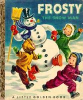
You may be familiar with the 1969 Rankin/Bass holiday special Frosty the Snowman (produced by the same lead director and producer of the 1964 Rudolph the Red-Nosed Reindeer and many other holiday specials). What many people don't know is that this wasn't the first animated version to hit television.

The 1950s were an interesting time in television animation. Walt Disney was the strongest force in the industry and there was no competing with the levels of realism that his techniques had achieved. Other animators were beginning to wonder if Disney's obsession with heightened realism were limiting animation, and explored more "cartoonish" styles. In 1951, United Productions of America had their first success with Gerald McBoing-Boing, an adaptation of an adaptation - a story by Dr. Seuss that had been made into a record already in 1950. It's the story (in Seussian rhyme, of course) of a boy who speaks in sound effects instead of words.


Another record that came out in 1950 was the first recorded version of "Frosty the Snowman," by Gene Autrey. He had already had a big success with "Rudolph the Red-Nosed Reindeer" and "Here Comes Santa Claus" in an era when songwriters, fresh from writing love songs for WWII soldiers and their honeys back home, were finding that there was a big market for new, secular holiday music. The genre had pretty much been invented by Irving Berlin with "White Christmas" 1940 and several songs had been big seasonal successes throughout the war years thanks to the soldiers on the front who were missing their families and communities in the USA. My grandmother still tells the story of how my grandfather wrote her the lyrics from the record "I'll Be Home For Christmas" in a winter letter in 1943, and how she had gotten so excited that she didn't read the last line - "If only in my dreams" - and was devastated when she realized he wasn't coming home yet. The miracle of Christmas, as far as 1950s Hollywood was concerned, was its proof that American pop culture was capable of producing media products that crossed over between adults and children, or, rather, that adults could be made to consume products designed for children.

UPA went on to produce a "music video" for "Frosty the Snowman" in 1954. It's a lot of fun to watch if you have seen the Rankin/Bass version too many times, of which I have never been a big fan. [Via]


Book CoverI get tired of cartoons aimed at little kids which always seem to have to have a villain and major drama. Children have the natural capacity to appreciate the same kind of subtle tension and drama that adults enjoy - the issues and concerns are just different, and thus the sources of drama must be different. But young children are also happy experiencing things which are not plotted in the same conflict/resolution format as stories produced for adults.

This is one of the reason I've never been a huge fan of the 1960s' Frosty. But I also personally get tired of their animation style very fast; I think their stop-motion work in Rudolph and other animated specials has held up much better. The form is reminiscent to me of old cereal box characters, which look great on cereal boxes but there I don't have to stare at them for half an hour at a time. There is something that is way too basic about them to hold my interest, and the plots are usually wholly consistent with that simplicity.

Book CoverIt took Chuck Jones to help usher in a new level of artistry in holiday movies that showcased a signature style with an intensity and subtlety that a cereal box can't encompass. From How the Grinch Stole Christmas to the amazing Raggedy Ann and Andy Great Christmas Caper (Brother-and-sister rag dolls vs. Wile E. Coyote? Have I died and gone to heaven?) Compare the Grinch and Professor Hinkle. Could you just see Professor Hinckle and Hocus Pocus shilling for some wheatieo cereal with marshmallow top hats?


Book CoverThe Snowman is a perfect example of the kinds of story young kids can enjoy following. Where's the villain there? Where's the conflict? For young children, adventures can often be encompassed by exploring a new idea or vision. When the vision has been explored, the adventure ends. It's my daughter's holiday favorite for the year, for sure. (Click here to visit her blog.) I will show her the 1954 Frosty the Snowman on this blog, but that's plenty for this year - I'll wait a few more years before inflicting the Rankin/Bass version on myself.

Announcing The First Ever Think In Pictures Artist Calendar Contest

Think In Pictures is now accepting submissions (links only, please) of calendars which feature the work of living, non-media-saturated artists in any medium. You are welcome - nay, encouraged! - to nominate your own calendar, or that of someone you know personally. The judges (and there will be several) will give preference, but not overwhelming preference, to calendars which are self-published by emerging artists, and no demerits are given for calendars published through print-on-demand services, or for calendars which are hastily put together only after reading this call. We welcome submissions which feature reproductions of any art form.

Please do not recommend or send links to calendars which meet any of the following criteria:

  • Straight landscape photography (you know who you are)
  • Straight nature photography (you know who you are)
  • Photographs which might be confused with PowerPoint backgrounds
  • Photographs of children who are all smiling
  • Photographs of children who are all crying
  • Photographs of children who are all in your living room
  • Photographs of babies by Anne Geddes
  • Calendars commissioned or sponsored by a public utility
  • Hand-tinted black-and-white photographs
  • Photographs paired with poems
  • Calendars which are not available for purchase for 2007
  • Calendars which even you would get tired of looking at
Nominations will be accepted through midnight, December 31. The most interesting 2007 Calendars we find, through nominations or our own tireless search, will be featured in a post on Think In Pictures in early January 2007.

Submit nominations to calendarcontest [at] gmail [dot] com.

Additionally, please consider posting a link to or recapping this information in any place on the Internet - photography message boards, blogs, websites, whatever - where you think artists who produce calendars might congregate to scheme and plot their calendrical activities. You and I may think that everyone in the world reads this blog, but we are wrong.

Wednesday, December 06, 2006

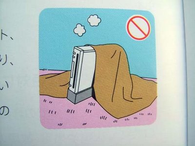
Mock Wii Safety Warning Illustrations


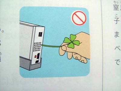
The folks at IconFactory (who, incidentally, make the world's greatest desktop icons) have posted a wonderful illustration set to Flickr which carry the message of the Japanese Wii safety warnings to their logical and illogical conclusions. Download the desktop wallpaper versions here.

Demonstration 1


Photo by Alper Tecer. All rights reserved.

Octopi Houdini


From the uploader's description:

Octopuses have an amazing ability to squeeze through tiny crevices, cracks and holes. My fall BIOS independent studies student, Raymond Deckel is investigating just how small a hole Octopus macropus can fit through as well as how long it takes them to squeeze through different sizes of holes. CAABS intern Rowena Day, NSF-REU intern Jared Kibele as well as teaching assistant Abel Valdivia help wrangle the 232 g octopus, Ray times its escape through a one-inch hole while I shot video clips for later analysis. Location: Whalebone Bay, St. George’s, Bermuda.

Tuesday, December 05, 2006

Safety Warnings from the Wii Japanese Manual

Someone at Gizmodo noticed the oddness of the warnings in the Japanese version of the manual for the new Wii gaming system and posted them online.


These are funny if you think about them as representatives of actual actions that might be performed by an idiotic or drug-tripping user of the new Wii.


They are brilliant if you think of them as attempts to break through years of built-up apathy with regards to reading any kind of safety literature for consumer products.


They are iconic because we already know not to do these things; they are reminders that attempt to do something different so that their message might actually make it through to us. They take the warnings to the next level of abstraction. They are, in effect, drawings of those original, basic warnings - which were themselves drawings of imaginary actions. The imagined reality becomes a dream about what had already been, in the strictest sense, fiction.


Okay, except this one. The sign reads "Burnable Garbage." The spirit of play is making itself apparent...


Okay, and this one too. Those Japanese game designers are just crazy!

[Link to even more|Thanks, Matthew!]

Saturday, December 02, 2006

I just posted a classic public-domain film by master stop-motion animator Ray Harryhausen on YouTube. A series of four animated nursery rhymes, it was the first piece of animation the young Harryhausen made after returning from WWII with the leftover film stock he had been assigned while producing military training films.

The movie is embedded below and now available on YouTube.

Friday, December 01, 2006

Now On Z Recommends: Creative Photography With Kids

"Grace" by Ann Texter

We interviewed photographer Ann Texter for our second installment of or advanced arts & crafts profiles on the blog for all things kids, Z Recommends. Her five-year-old daughter, Grace, is active as a digital photographer and also makes Polaroid transfers and cyanotypes with her mother.

You can view Ann's photos on Flickr and on her website, www.anntexter.com.