SHOW ME

Thursday, August 31, 2006

Tech and Board Gaming Worlds To (Finally) Collide


Philips is showing off its "Entertaible" at the Internationale Funkausstellung in Berlin. From their press release:

Entertaible uses proprietary digital shape recognition and multi-touch sensing (patent pending) to interpret the moves of several players simultaneously. This generates a highly interactive, intense gaming experience where speed and clever tactics are essential to win. The simultaneous tracking encourages players to make their moves in real-time by dispensing with the need to wait for their turn, and allows participants – with practice - to plan moves in advance and react immediately to the actions of the other players. The use of physical objects like pawns and bats to directly manipulate the virtual world enhances the sense of magic.

The platform supports products for social gaming as well as for other markets like infotainment services and educational applications in both the professional as well as the consumer domain. Philips Entertaible is initially targeting social gaming away from home in locations such as pubs, bars, hotels or restaurants and plans pilot testing at several partner locations in Q4 2006.

As far as the general idea is concerned - a digital playspace that can be used in the tabletop format so suitable for group gameplay - this has been a long time coming, anticipated by research from many hardworking graduate students the world over. As for Philips' interests, apparently they are hard at work on a patent for "multi-touch sensing," the feature of this gamespace that will allow for simultaneous turn-taking in board gaming. It is interesting to contemplate what kinds of games will evolve for this new space, but in the long term this kind of technology can also be used to great effect in traditional board games as well. Imagine a Monopoly "improvement" that does not consist of a debit card reader you type info into but a board that automatically manages your financial portfolio while you play. Of course, there truly are great opportunities for educational game development in this space as well.

Wednesday, August 30, 2006

Notes On The Prehistory of Speech Balloons

Above: Phillipe Pareno's "Cartoon Bubbles." [Via]

One of my favorite blogs, Drawn!, recently pointed to cartoonist Andy Bleck's great "Evolution of Speech Balloons," just one of the many interesting sections of Bleck's website. The page is a great introduction to the concept that speech balloons as we know them evolved over centuries, and from other forms which lack the explicit structure but serve the same purpose, namely strings of text emerging from people's mouths (since the Middle Ages) and scrolls and banners which serve the same purpose. Bleck does a good job tracing the rough contours of this development, but the site reminded me of a couple of related artifacts which I think can broaden the discussion of what speech balloons are and where they came from.

I. Text Scrolls and Magical Writing

In the Western art tradition, there is an interesting gap between how speech has been rendered in images prior to and after the dawning of the Enlightenment in Europe. With the widening distribution of the printing press in the sixteenth century, newspapers flourished, and visuals were a powerful way to increase the density of information in a picture, which often was used instead of a written text. Such images can capture a whole host of its creator's observations on the web of interests and perspectives or of simple facts about an event that would otherwise be offered, far less efficiently, in a block of text.


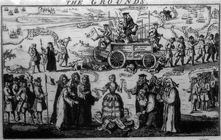
The above 1741 illustration by Nathanial Parr (taken from Bleck's own History), offers a chaotic hint of both the rise of an age of information - of the cataloguing and indexing and reporting that would permeate the public sphere and digitize itself by the late 20th-century - and of the 18th-century rise of the modern novel, with its emphasis on multiple characters and on their perspectives and role in events. But more than anything, it's the former that strikes me; illustrations like the one above remind me more of survey results, bar charts, and other data visualizations than of a proper comic panel, more like a newspaper infographic or one of Harper's information-rich Annotations than today's comic strips. True, the text is ascribed to individual voices, but the field is a landscape in which to make an argument, not a vehicle for telling a story.

A dramatic rise in literacy rates over the previous century had prepared audiences for the use of text as an explicit and direct source of such information, and the Enlightenment use of extensive text in cartoon form represented the full domestication of written text that accompanies such a change.

For this reason, I find pre-Enlightenment examples of speech balloons, or their various permutations, to be even more interesting than the modern form. In the centuries leading up to those first balloons, much of Europe was non-literate, and the many examples of text scrolls and banners emerging from the mouths or hands of figures from Renaissance and earlier artworks addressed a population with miniscule levels of literacy. The question is, were artists speaking to that tiny privileged class which possessed the ability to read, if not write, simple declarations, or were they somehow speaking through their use of words to a public that could not read what they had written?


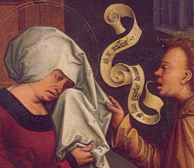
Above is one of the many quite gorgeous examples of scroll speech that Bleck highlights on his site. I don't remember the artist, but I do know that it is a painting of St. Anne, and I probably would not be wrong in guessing that she is being told something very important by the figure next to her, and that that figure is an angel. If I were wrong in that guess, I would be right most of the time under similar circumstances - it is frequently angels who do the talking in such paintings, and they are usually announcing something very important to a human, who is highly unlikely to have a response displayed unless they are a saint. I have seen many annunciation scenes - images that depict the Biblical announcement the angel Gabriel gave to Mary during her pregnancy with Jesus of Nazareth - in which Mary responds with statements attributed to her in the Biblical account.

This brings up a highly relevant, if obvious point regarding such paintings' effect on a nonliterate audience: If they couldn't read the text in the painting (and most of them could not), they couldn't read the book the text came from, either. The use of scrolls in this context, which are repeated again and again throughout these periods' religious artworks that depict man's intersection with the divine, reference not just words but the textuality of those words (that is, their printed nature) in almost every instance. It is almost as though the words are being transcribed for all time as they are spoken - or, to look at it another way, it makes the case that cultural stories which were shared orally, written down, amended, adjudicated, and copied over the course of centuries were preserved with absolute reportorial accuracy. I believe this is not a claim peculiar to the Catholic church or to religion, but reflects a pre-Modern (primitive?) cultural understanding of history. Further, as much as the dominance of images in Church teaching allowed for the illiterate masses to understand and appreciate stories from a book they could not read, the presence of text in such images preserved a crucial interpretive role for the priest and reminded viewers of the significance of the text from which their priest's orders and invocations were handed down.

But the uses of text in such imagery gets even more interesting. While briefly living in Paris several years ago I was in the habit of carrying a journal with me as I visited many of the city's astoundingly good museums, and one of my favorite haunts was the Musee de Cluny, Paris' civic storehouse of all things Medieval. The collection includes old capitals from at least one Romanesque church that was destroyed, which feature wonderfully deep relief and a slight wraparound style that links four related scenes together in a four-panel Romanesque "comic strip." Here is one from the excellent Cluny website; some of the best ones, though, don't have panel dividers like the column here, but actually have figures from one scene rubbing elbows with ones from the next:

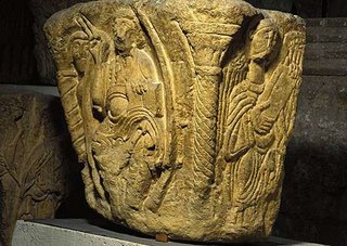
One piece in this collection contributed to major changes in my thinking regarding both the degree of personal artistic expression in Romanesque sculpture and in the quality of visionary experience. I am very glad now that I sketched it, because in preparing for this post I could not find a photograph of it anywhere, so the sketch below will guide us here.


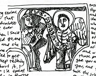
It is an annunciation, and I first took note of it because the angel's scroll is emerging in an interesting, parlor-trick sort of way from his left hand, rather than from his mouth; I suspect this was a convenience of the small "canvas" of the capital face more than anything else. But as I began drawing it I discovered the most fascinating thing about this relief, an interpretation I have seen hinted at a couple of times but never again this directly: The scroll declared by the angel is feeding directly into Mary's head, like a fax machine or a mail slot.

My interest in this aspect of the carving was twofold: First, it represents very skillfully the position that Mary was a passive recipient of information passed to her by an angel, in whose presence she was presumably in awe. Second, it alludes to the annunciation explicitly as a "voice in the head," a vision which to a contemporary viewer could be interpreted as a purely psychological experience. In an age that is both postmodern and post-Mulholland Drive, the blurred line between what is experienced on a personal level and what is corporeal is easy to appreciate, and the distinction less than crucial. Why, one might argue, would a diety who wished to communicate with a human need to visit them in the flesh, when its total control over human perception could allow it to do the same on a non-physical plane? The difference can only matter to an outside observer, not to the recipient of the vision.

I have seen very interesting descriptions of the ways artists have customized speech balloons to communicate specific things to their audiences. (Wikipedia has a great section in their Speech Balloon entry that offers many examples.) It is interesting to reflect on how artists were doing this even a thousand years ago through religious art, as well as on how our culture continues to label things in site-specific and context-rich ways to similar effect.

II. Pre-Columbian Speech Balloons

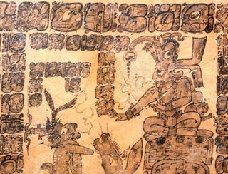
Another area that Bleck's history could address if it attempted to catalogue instances more than trace an evolutionary path would be the use of proto-speech balloons in pre-Columbian America. The Mayans (and others, I'm sure) used wispy tails to link ideograms to speakers; I don't read the stuff, so can't determine whether this reflects conversation or merely authoritative authorship. (Anyone?)


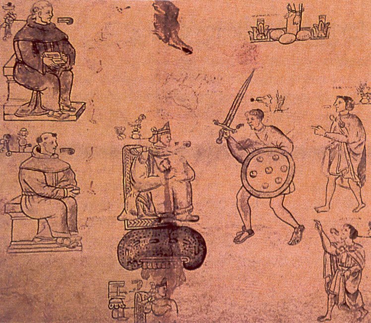
The Aztecs had a lovely tradition of using small "commas" of breath to designate speakers. In this case, ideograms are positioned outside of the picture, so I'm not sure if the ideograms are thusly tied to a speaker, or if it simply describes events (most of such documents are historical or mythic) with the speaker's speech being an important part of the action. It's an interesting solution to the problem of large-scale scenes with many actors rendered in a simple style that must recognize the importance of speech as an event or action that plays an important role in a story - with the content of the speech detailed elsewhere or perhaps not at all, the speaking itself being of primary importance (in the context of intertribal negotiations, for example, where any diplomat can tell you that the important thing is to get and keep enemies talking).

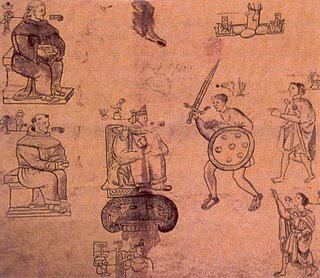
In looking at some images from the Codex Mendoza recently, however, I noticed that such "breaths" are also used in images that show the appearance of a godhead from an altar:

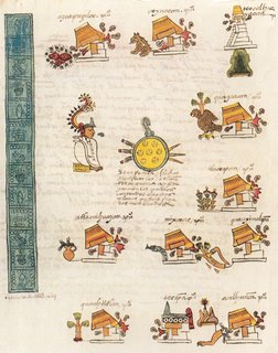
Does this mean that the "breath" indicates merely sound, or that the appearance of the god is accompanied by commands, instructions, or other statements from the godhead? Any guidance from knowledgable readers would be welcome.

Friday, August 25, 2006

Catching Up With The Solar System

CNet reports on how Pluto's demotion to non-planetary status will be felt in public schools. It's an interesting angle on a popular story:

No matter how quickly a publisher can roll out new editions of its earth science, astronomy, or general science texts, tight state educational budgets complicate the situation. A state's department of education will typically order new course materials every five or six years, said David Hakensen, vice president of public relations at Pearson Education. Since Pearson has no plans to offer physical updates to its existing texts--such as stickers or supplemental pages--the states that ordered new science textbooks for the impending academic year most likely won't be getting new, eight-planet versions for another half decade.
Wikis, websites, and other online media, the article points out, are much more nimble in absorbing such information. "With few other options, textbook publishers are also leaning on the Internet to deal with the Pluto demotion through online lesson plans and course supplements."

Aimee Weber's Second Life-created Tour of the Solar System is a great example of how new media can be used to communicate information in the sciences. Weber, a graphic artist who has designed SL clothes, the much-publicized virtual American Apparel storefront, and many other SL projects and has recently become something of an SL activist, created the video using virtual props set up in a model solar system layout, then filming her creation as she moved through it.

Seen On The Streets of Seattle: Notes on Graffiti Knitting

Knitta is a Houston-based group of knitting graffiti artists. I saw this piece at the Frye Art Museum in Seattle after seeing an interesting exhibit of Henry Darger's Vivian Girls drawings, and had a few thoughts on it.


The pieces seem to be generally made for standard-sized objects like this guardrail - they also make sleeves for car antennas, scarves for light poles, and hats for fire hydrants. The pieces are knitted in advance and zip-tied to their host objects.


On the simplest level, the artists are playing with the tension between the domestic connotations of knitting and the public perception of graffiti as an antisocial and radical act, and this may be the group's main purpose. The Stranger (a Seattle weekly, which I used to freelance for when I lived in Seattle) wrote a straightforward piece about Knitta's visit and basically took this position.

Personally, I think this work is a direct descendent of the '90s soft-punk movements (Riotgrrl, emo) and the subsequent '00s punk-craft movement, and in this sense is actually quite unsubversive - especially against the backdrop of a city like Seattle, which, along with Olympia, Portland, and the rest of the Northwest, gave birth to most of the above. For the casual viewer, it does not seem obvious that this should be compared to graffiti, and thus really challenges no one's assumptions. Ironically, their ingratiating and playful form exclude them from the class of objects they hope to parody, comment on, or contribute to, as far as the "audience" of non-graffiti-thinking folks is concerned, which is why I think the Stranger's view misses the point here.

The works are a little more subversive seen from the perspective of graffiti writers and their fans. Knitta's practices violate one guideline of the medium and highlights another in an interesting light.

In terms of contrasts, almost all graffiti is created on-site, and in that sense is both site-specific and a story of its own creation. Knitta's works, while carefully hand-crafted using methods that involve great skill (like good graffiti writing), are not created on-site and appear to be created as a stockpile of materials to be applied to found surfaces and objects. In this sense, Knitta's work is similar to the wheatpaste graffiti art movement, which uses pre-printed posters cut into the shapes of drawn creations, and which have faced challenges by some in the graffiti writing community as thus not qualifying as true graffiti writing, but as simple "tags" - marks that someone has been there and made their mark, but not in a thoughtful way. One argument has been that they do not demonstrate comparable skills, but I think it is equally important to recognize that most of them are not inspired by, that is, drawn out of, a space, but are applied to a space that meets the artwork's preestablished criteria. (Some of the best wheatpaste graffiti works are an exception to this rule, and are clearly site-specific.) In this sense, Knitta pieces suggest some of the strengths of each of these graffiti formats while being very different from each of them.

Wheatpastes also lack some of the excitement of painted graffiti writing because they are relatively quick to put up. A graffiti mural shows off the artist's willingness to take a substantial risk by hanging out somewhere and creating something complex in an illicit context. A wheatpaste takes as long to put up as a poster.

But knitted graffiti speaks to the medium in its acknowledgment of the fragility and short-lived nature of graffiti artworks. Murals are painted in depressed or inaccessible locations in hopes of lasting a while, but with the full knowledge that they might be painted over the next day. A viewer does not see this, however, and without a familiarity with this context the piece may suggest a permanence that it does not enjoy. Knitta's works, however, feel fragile and very temporary. They capture for a casual viewer something of the privilege of spotting something worth looking at, which clearly might not be there tomorrow or the next day. Anyone could come along with a pair of scissors and remove it.

The Stranger also reports that Knitta will be back in Seattle for the music fest Bumbershoot 2oo6:

Along with Knitta—who will be hitting some very big (think landmark-sized) Seattle targets on their Labor Day return—artists like Australia's Brett Alexander, London's Craig Fisher, and New Yorker Orly Cogan will confront preconceptions about the applied arts, via everything from subversive candy making to soft-sculpture weaponry. And on the evening of Saturday, September 2, the Knitta crew will host a workshop. The plan is to offer instructions for making some of their basic tags, like car antennae sleeves.
I look forward to seeing some Christo-like knitted objects, but again, I bet it won't look like graffiti to casual viewers. Knitta, prove me wrong!

This Is Not An IQ Test

The ducks scroll quickly from right to left. The clock at lower left counts down. The man on the horse gallops past calves. Meanwhile, a lonely web surfer attempts to prove to Tickle.com that he is secretly a genius.

This is not an IQ test. It's an ADD test. If it weren't for my paralyzing fear of malware, I would have established my disorder with flying colors.

If you need any proof that these games are really, really not fun - or, more specifically, that they are not games at all, even when played after stripping them of their link to some webjunk or other - visit the Sucker-Punch Saloon.

I Think I Just Cost Apple Twelve Million Dollars

Apple has recalled 1.8 million laptop batteries. You can check your serial numbers here or just skim this paragraph from ABC News:

The affected notebooks include the 12-inch iBook G4, the 12-inch PowerBook G4, and the 15-inch PowerBook G4. The model number of the iBook is A1061, with battery serial numbers including ZZ338 through ZZ427, 3K429 through 3K611, and 6C510 through 6C626. For the 12-inch PowerBook G4, the model number is A1079, with the affected battery numbers listed as ZZ411 through ZZ427 and 3K428 through 3K611. For the 15-inch PowerBook G4, the affected models are the A1078 and the A1148l, with the battery numbers listed as 3K425 through 3K601, 6N530 through 6N551, and 6N601.
About the recall, AP writes:
The manufacturing process of lithium-ion batteries at the Sony plant introduced metal particles into battery cells. Makers of battery cells strive to minimize the presence of such particles, which can cause the overheating, but it's nearly impossible to eliminate the metal dust.

Sony said the Dell and Apple batteries were configured in slightly different ways. In a statement, it said the problems arise "on rare occasions" when microscopic metal particles hit other parts of the battery cell and lead to a short circuit.

Apple said Thursday it has received nine reports of battery packs overheating, including two cases in which users suffered minor burns and some involving minor property damage.

I submitted one of those nine reports (nope, no burns here). When Apple did its last battery recall, I was very frustrated that my PowerBook G4 battery was not included in the narrow serial number range (128,000 batteries were recalled), because mine gets very, very hot, so I submitted an Incident Report to the Consumer Product Safety Commission. If nine reports of dangerous batteries are enough to spur a recall, apparently this can be quite effective under the right circumstances. Dell's recent recall of 4.1 million batteries got one cost estimate of $246 million; that works out to $60 per battery. For Apple's 1.8 million batteries, a similar cost per battery would make $108 million dollars. If we laid responsibility for the recall on the nine filed incident reports (Dell's previous recall notwithstanding) that would mean that each report came with a $12 million price tag.

If your battery overheats but was not included in this recall, I encourage you to report the problem to the CPSC. If the battery gave you the feeling of being burned in any non-financial way, make sure to mention that, too.

Dell's willingness to be the first to issue a massive recall of these batteries should not be overlooked. Would we have had an iPod Nano screen-scratch recall if the music-player market was more like the laptop market? Of course, Apple deserves some credit, too. Other laptop makers have come forward to express confidence in their own laptop batteries, despite their being made in the same factory under the same conditions, and offer up no information to the public regarding how many bad battery reports they've received.

I myself will eagerly await a replacement battery to learn whether a new battery will keep my G3-era power supply from overheating when I use it with my G4 laptop. Now that thing gets hot. (If I should be using a special G4 power supply with a G4 notebook, feel free to jump in and let me know before I kill myself.) If the new battery doesn't do the trick, I'll be sure to report the power supply as well.

Note: Some users have reported that the recall site isn't working for them. I submitted a request with no problem and am just waiting for the email follow-up. If you do have problems with the web form, you can always just call Apple at (800) 275-2273 between 8 a.m. and 8 p.m. CT any day of the week to request the new battery.

Thursday, August 24, 2006

Tapes


A gallery of cassette tapes. [via|link]

Wednesday, August 23, 2006

Inflammatory Portraits

Americans United for Separation of Church and State, which I might well join, sent me an inflammatory flyer on the "Religious Right Top Ten Who's Who" while I was on vacation. The goal of the mailing was to communicate the level of influence of the religious right's media and publishing empire in rolling back the Constitution's division between religious and civic life. The facts are what they are, and I find them to be pretty compelling. But what really interested me were the photographs.

All ten of them are cropped in this way - tight all around with an emphasis on cropping out the hair and part of the forehead - and a few are cropped very tightly to one side as well, eliminating an ear and even part of the face up to the edge of an eye. In the case of James Dobson, pictured at top, the photograph can easily be compared with the original portrait they cropped it from. The portrait below is used on Dobson's own website.

The technique AU used (which is a consistent feature of their mailout but strangely absent from their web publication of the same information) has several effects which work towards their goal. First, it communicates a sense of claustrophobia and unease. The photographs violate our imagined personal space with their subject's aggressive closeness, a feeling which can't help but contribute to our discomfort with their aggressive stands on the issues AU discusses. Second, it suggests that the organization is putting the subjects "under the microscope" and offering the close scrutiny that allows you to see them as they really are. Of course, these two aims are somewhat contradictory, but they peacefully coexist here in one of our age's many comfortable political contradictions.

In addition to their cropping technique, there is an implied violence in their numbering system and color choice which is very effective. The numbers cut into the frame and intrude upon their subjects in an agressive red gesture that reflects the deep frustration organizations like this, and presumably their supporters, feel when faced with these right-wing icons.

It is telling to me that AU would adopt the red spot color of the Republican Party rather than the blue of the Democratic wing for this publication, and I have noticed this issue arise frequently in political mailings. Activists on the left and right tap into frustrations with the opposing party's leadership and political culture to drum up enthusiasm for their own causes, and in this context using the other party's colors to discuss them might make sense. But stripped of its context, blue is naturally soothing and red is naturally agitating, so in practice this means that the left often uses red to discuss the vagaries of the right, but the right sticks with red, too. You can't make people too angry looking at blue, at least not by the conventions of tabloid journalism, which always aims to inflame its audience. On the other hand, the color blue connotes moderation and considered thought - a "cool head." This works well for Democrats as the party very much out of power, but when Democrats are in power, Republicans still stick with red, even when discussing their opposition. Draw your own conclusions.

Tuesday, August 15, 2006

Announcing A New Sister Blog: "Darkroomers: Building An Analog Color Darkroom"

In Darkroomers, photographer Jennifer McNichols and I will document the process of building an analog color darkroom. We start from a position of total naivete, and are planning on having a professional-quality color darkroom within six months, so we thought it would be an interesting process to document!

Posting will be irregular, with major updates that provide a lot of detail for others interested in doing the same thing, or simply in building a darkroom vicariously through us. If you've ever wondered why so few artists print in color with film, this blog could go a long way towards explaining why - and if you've ever wondered how you might take your own analog (i.e. non-digital) photography to the next level beyond the bathroom black-and-white darkroom, we have the goods.

This should be a fun blog for us to post our personal stories about the design, building and troubleshooting process and will document the challenges as well as any mistakes so that others can benefit from our experience, and we'll also post links to interesting analog photography projects as well as samples of some of Jenni's own work.

Our most recent post shows off the kit building we'll be using, as well as architectural renderings of our planned modifications and interior layout.

You can visit the new blog here. For now, anyone who donates $3 or more to the project can get a complimentary test strip from Jenni's impending photo printing trip to Seattle - see the plaintive links on the sidebar at Darkroomers!

Five Things I Pray the New Blogger Upgrade Will Fix

The recent news that Blogger is launching a major upgrade has me crossing my fingers hoping that they will resolve some of the biggest issues I see with the service. I have been preparing to start up a new kids' products blog, and was dead set on hosting it elsewhere based on the issue of Blogger's lack of tagging alone. But I've been reluctant to switch to a competitor because I love what Google has been doing the last few years, and the anticipated integration of more of their services will make Blogger a great place to be. Now I'll wait and see what the upgrade looks like; I'd love to stay with Blogger, which in many ways is very easy to use, and as a part of the Googleplex has so much potential.

Here are some issues I hope and pray will be resolved with the release:

1. Buggy HTML. The HTML builder behind the WYSIWYG editor in Blogger routinely screws up your post HTML when you do anything beyond typing in a text block. For example, Blogger routinely strips the closing < / embed > tags off of video content embed code (including code copy-pasted from Google Video!) and then refusing to upload because the tag is not closed. Adding the tag back in works if you are going to post that second, but go back to Compose mode, or post and then return to edit your post, and it strips it out again. It also has a problem handling multiple font calls, and will strip out a closing font tag and then force you to hunt through dozens of font tags in your post to locate the problem and add the tag back. On more than one occasion I've had to copy long posts into a text editor and strip out all of the font tags before pasting it back into Blogger and carefully reapplying font labels.

2. A "smart" HTML editor. None of these things would be awful if the HTML editor could tell you where it saw a problem, or even just allow you to search through the content in the text box. If a service is going to write buggy code and expect you to fix it by hand, the least it can do is help a user identify the problem area so they can fix it quickly.

3. Blog organization. We need tags. Looks like we're getting them!

4. Layout tools. Ditto, and ditto! I want to be able to edit my blog aesthetics in simple ways without hand-coding. A service that is the easiest and most intuitive to use in other ways should have this to brag about, too.

5. Expiration dates. I'm tired of seeing dead blogs everywhere. If someone doesn't post in a year, cancel their blog. This is a problem not only for random blog browsing (a great feature of Blogger) but also is becoming a haven for squatters - I have found several blog names I wanted that were attached to blogs that had not been posted to in three years.

I will follow up on this when I've been invited to upgrade my blogs.

Colin Zelt's Mesmerizing Urban Landscapes


I spoke with Rice University earth sciences professor and photographer Colin Zelt at the Houston Center for Photography's annual print sale last month, where I bought a print of his View from Elysian Overpass, pictured above. Colin was nice enough to send me a high-resolution photograph of the photo to reproduce here with his permission; click on the image above to view it at a larger size, or click here to visit his website and see a lot more of his very interesting work. Colin takes most of his photographs in his own industrial neighborhood in Houston, and also has a great series of photographs taken at Sea Arama, once an aquarium-amusement park in the oceanside tourist town of Galveston and now a city of concrete ruins and graffiti.

Colin's urban landscapes differentiate themselves in from postcard scenes in their color and lighting, as well as in the starkness of the scenery he chooses to capture. He frequently shoots multiple, bracketed exposures of scenes under challenging lighting conditions. He then combines them seamlessly in Photoshop to create crisp images of floodlit no-man's-lands between and within a major port city's industrial core, where train tracks meet the blank stares and broken windows of dilapidated warehouses and factories. In the View above, he explained, he used the sky from one exposure, the factory at left from a second, and the rest of the scene from a third, combining them to even out his lighting and capture the best face of each part of the scene.

The quality of color and sharpness of detail he captures in that hollow between twilight and darkness is even more stunning in his actual prints than in his web portfolio; I had only seen them online prior to the sale, and wanted one then, but seeing them in person sealed the deal.

The real-world viewing also made immediately clear to me what, exactly, I found so attractive about many of his photographs of Houston. This had eluded me previously only because I usually pay little attention to photographs of downtown skylines or urban landscapes, and have never found Houston to be an exciting city. Standing with a couple of matted prints in hand I quickly recognized that despite all of the grim features of the photographs' setting and subject, the cast of blue-black nightfall that suggests coldness even when nights may be hot, there is an essential calm in Colin's openness to seeing what he sees and working so painstakingly to recapture what he sees there. In my experience, this type of calm is frequently claimed for photographers but is often a mere ratification of that objectivity imposed by the medium itself, and feeds into many fine art photographers' work in ways that do not complement their subject or their author. But I find myself influenced by the calm in Colin's industrial landscapes and invited to view the world with an objective, inquiring, and patient eye, taking in all that is around me and acknowledging the beauty even in ugly circumstances.

"Some people would call it manipulation, to use Photoshop in that way," he
said in a later email correspondence. "I think it's just recapturing something that is closer to what was really there. Film or a digital sensor is limited in what it can see under those conditions. By bracketing and then combining images in Photoshop, I can better approximate what the eye is actually taking in at that moment. Alternatively, you can use this approach to interpret the scene in a subjective way to achieve an image that best represents how the real scene made you feel at the time, as opposed to what the real scene might have looked like."

Monday, August 14, 2006

The Future of Airline Reading?

Boing-Boing has an interesting original post on bypassing UK-to-US airline restrictions that prohibit passengers from bringing books and magazines on planes: Create "wearable" reading material using iron-on transfers. It is, of course, as much an act of protest at the absurdity of the current climate (from either side of the security debate) as it is a practical way to provide yourself with something to do under bizarrely boring conditions.

As for myself, I fly in two days from Houston to Seattle, and will have the finished first draft of a novel in my lap rather than my usual laptop. I will bring the digital file on a flash drive, knowing that only slightly less-convenient computers await me at my destination. I'm at the point where a paper edit is essential, and I found such pleasure in the idea of going laptop-free on a cramped flight that I plan to stick with it despite the daily loosening of carry-on restrictions for in-country flights.

Saturday, August 12, 2006

Chess Helper

Brilliant.

[via|link]

Friday, August 11, 2006

Map Windshield Projection

1. Screen capture
2. Flip horizontally in an image-editing program
3. Print

Result: DIY Heads-Up Display.

[via|link]

Children's Book Illustrations from the Age of Psychedelia


Originally uploaded by oange.
"Eye Candy," the Flickr group currently putting up scads of illustrations from color-saturated, whimsically-drawn illustrations from 1970s children's books, is aptly named. This stuff is delicious, and too much of it can rot your teeth. [via|link]

Karolina Sobecka's Projected Fantasies

We Make Money Not Art reports:

Artist Karolina Sobecka gave me a ride in her car yesterday, which she is driving around as part of her performative installation Wildlife. On the backseat of the car there is a powerful projector which is beaming a tiger on whatever happens to be parallel to the car. The animation of the cat is directly linked to the speed of the car, so when Karolina hits the throttle, the tiger starts running along as if on a leash, leaving behind baffled pedestrians. There are also sensors for cars that pull up in direct proximity which will also be represented by smaller animals.
I find the resonance of her previous driving-projection project, "Chase," to be even more interesting. (A still from her video of the project is shown above; visit Sobecka's website to view the video footage and her other projects.) Pointing out the displacement of the wild in the care and feeding of modern civilizations is true but not very interesting when done in a direct and symbolic way, because (as far as the symbolism goes) it's something we can all agree on - you, me, Walt Disney, and Diane Feinstein - and it has lost its power to be nonspecifically critical; the mourning for what has been lost is already owned by those who benefit from mourning as a form of expression because it is conclusive and thus beyond blame. This, to my mind, runs counter to what is inherently subversive in the form of expression Sobecka has chosen for the project.

In contrast, Sobecka proves with "Chase" that there is still something taboo about discussing media and violence in a very public way, even if cartoon violence has been thoroughly criticized and beautifully parodied, because she clearly outlines a vision of cartoon violence as a symptom, not a cause, of what ails us. There is something so secretive about Sobecka's "Chase" project - its silence, its drive towards a goal that will never be achieved - that a dark street becomes a silent witness, and the passing scene a benediction.

Thursday, August 10, 2006

When Satellite Images Collide

Houston meets Escher. [link]

Anyone else spotting these?

______________

Addendum: Flickr user Si1very found this one of Dallas:

and commented on it here.

Kris, who runs a network security/wireless tech blog, found this wormhole in Washington, D.C. The effect is subtle, but the skewed perspective on the construction cranes makes it look like they are falling, pirouetting, or swooning:

[map link] Thanks Kris!

Wednesday, August 09, 2006

Bait and Switch: A Dance Critic Runs Amok


L.A. Times dance critic Lewis Segal took aim at ballet and its supporters in his Saturday "Critic's Notebook" in an acrid piece that drew a weak critique from New York Times dance critic John Rockwell. My wife, the photographer Jennifer McNichols, was a dancer in her own misspent youth and had some interesting things to say about Segal's article which I suggested she shape into a formal response.

_____________________

Ballet companies, along with symphonies and museums around the country, are struggling. Is it the fault of the symphonies that audiences are dwindling? Of museums? Of ballet companies? How visible is any "high art" in the mass media? I'd argue that little that Andy Warhol considered pop is addressed or given a second look in the mass media these days beyond the "Life and Arts" page of most major papers.

It's ironic, then, that L.A. Times critic Lewis Segal would spend several of his fifteen minutes attempting to discourage readers from taking an interest in an art form he presumes they are not interested in. Much of his commentary is laughable, but the attack reflects a variety of misunderstandings about ballet's place in contemporary dance that are worth addressing. Oddly, a New York Times piece published yesterday failed to address any but the most obvious of these - that contemporary ballet encompasses much in dance that is, well, contemporary - and leaves the impression that Segal's broader criticisms about ballet's relationship with its audience, its sense of its own history, and its disgraceful effects on the youth of America represent a meaningful critique.

The "Intimidation Factor": High Art and its Discontents

Segal's claim that ballet is uniquely situated in terms of its "intimidation factor" is astonishingly naive. Isn't this the same complaint people leveled at modern or postmodern or even conceptual art? It's very easy to dismiss something by saying it has an "intimidation factor" or it's too "elitist," but the only evidence Segal offers that ballet has gone to great lengths to "cultivate" audience intimidation is that audiences have dwindled.

One institution Segal would be unlikely to take issue with is the gallery and museum system for displaying visual art, and this offers an interesting counterpoint to his broad attack on the ballet. Can you say that the art museum, with its echo chambers which almost require you to speak in hushed tones, its security guards, and its artwork that requires (a) copious explanatory material, (b) an art degree or (c) both to properly appreciate it don't also "cultivate an intimidation factor?" Or is this "intimidation" really just a self-consciouness on the part of the viewer? As far as ballet goes, most of us know most of the stories that the most popular ballets are based on, and have known them since childhood, because they're fairy tales. When did fairy tales become sources of intimidation for anyone but art critics with an ax to grind?

The Tower of Babble: Why An Art Form is Art + Form

Segal fleshes out his case against ballet by declaring that the form "falsifies its past" and offers a "bait and switch" of "forgeries, fake antiques," and "compromises between the look of then and the technique of now." It is difficult to draw any recommendations from this sound and fury. Which is it that he wants - old or new? Or shall we abandon the past completely and write only new ballets from now on? A ballet is not a movie to be seen once and then discarded. Appreciation grows each time you see a given ballet, and each choreographer and each new principal dancer offers their own interpretation of the role.

It seems to me that Segal's claim for "falsification" rests on a discomfort with the nature of authorship in ballet. Ballet has been in many ways an oral tradition, and this fact has played a critical role in the history of all dance choreography prior to the advent of the video camera, and much of it since. When choreographers die, principal dancers have often been left to preserve the vision - that is, their interpretation of it - which is passed down to other dancers, choreographers, and so on. To credit the original choreographer of the work even if you put your own spin on the production is thus a natural, if imperfect, position to take: It is ballet's conservative - that is to say, deferential - answer to the question of appropriation. You take it and interpret it but the basic structure and design is still (often) the work of the original choreographer, so that's who gets the credit.

Segal is in rare form when he treats us to a comparison between ballet and film:
When we talk about the finest young actors of the moment, we see how they balance commercial and artistic priorities in their careers - doing a studio action film followed by a risky independent drama, for instance, or maybe a stage project. But what recent star dancer has thought the same way other than Argentine firebrand Julio Bocca, who performed conservative rep for ABT in the U.S. throughout his career, then subsidized very different contemporary projects back home in Buenos Aires. Does any star these days lobby artistic directors for better choreography or dare to say, "I just don't want to be seen in that 'Swan Lake' "? Does responsibility to the art and audience extend beyond dancing well?
And thus Segal reveals how little he knows about ballet. I can't speak with complete confidence about modern dance companies, but from my understanding of the authority structure of ballet companies, the dance world simply doesn't function like Hollywood does. In ballet, for example, a dancer can't say to his or her company, "Hey, I'm the star and I just did a more commercial production, so you should mount a risky piece for me" - there are 30 other dancers that the company has to consider. It's the equivalent of saying, "Okay, now that we, the cast of Mission Impossible III, have completed this movie we'll all move en masse to a risky independent drama." It doesn't work that way. And dancers can't shop around companies for the next dance they'd prefer to do. One thing dance and film do have in common is that there are leaders in each medium - directors in film, and artistic directors and choreographers in ballet - who are open to input from their "stars," and some that aren't.

And Ballet Causes Global Warming, Too...

Segal's crowning glory is his complaint that ballet is "a system that denies young people any real choices in their lives," alluding to long mentorships beginning at an early age, the grueling discipline of ballet's athleticism, and the "unexamined existence" they lead by focusing so blindly on their craft. To the extent that this is true, it certainly is not a problem unique to ballet - it represents a change in our entire culture's way of viewing kids and in the meaning of a "successful" child.

Segal argues that the ballet "turns out obedient classical athletes by imposing rules about where to be, what to do, how much to eat, whom to believe in and when self-esteem is deserved or not" and sheds a tear for performers "who don't really know themselves but have learned how to move skillfully and energetically while thinking critically about how they're doing, not what" - could as easily be inserted into diatribes against gymnastics, ice skating, pop music, beauty pageants, and cheerleading, even to the kids whose parents shuffle them between after-school activities and never give them the opportunity to discover who they are or want to be. And there are whole books written (mostly for adults) that are trying to re-teach us how to live an examined life. So to set this all on the feet of ballet without addressing or even acknowledging that this is a cultural epidemic? Come on.
Because this system works like an assembly line, automatic and unyielding, it also breeds choreographers skating over the contours of major scores as if only half-listening, along with ridiculously expensive high-culture events that speak more about the burnout of an art than anything else.
I'd be surprised if Segal had not heard of "American Idol" or Britney Spears, both products of a culture that champions the production of high-profile "assembly-line" stars in media with far greater influence than the ballet. Is Segal really expecting us to swallow the idea that the prevalence of monotonous, uncreative work is a symptom of an art form's utter bankruptcy? Is the existence of "American Idol" a sign of what pop music "breeds" in musicians and performers? Is Oprah's Book Club a symptom of the cancer that is American literature? Are Hollywood blockbusters a giveaway of film's essential "copycat" nature? Of course not. You'll find this kind of backwards criticism in any medium, especially when critics are looking to make a few waves. Look a little deeper and you'll also find the standouts. It's these, not the support or rejection of critics, that explain a medium's centuries-long staying power.

Advanced PowerPoint: Animating with Tabbed Layers (With .PPT Download)

A couple of weeks ago I posted a video of a sample PowerPoint animation inspired by the 1953 edufilm "A Is for Atom." I have been waiting for the right platform to serve files from so I could offer downloadable .ppt files for others to examine. Last week Google added several file types to its free Google Base, so you can now go there to download example files of my PowerPoint animations. Google Base offers a nice "hub" where I can store multiple files, so that page will become more of a resource as I get more materials up there.

The first PowerPoint I'll post here, my "F For Fission" PowerPoint (click the link at the bottom of this post to view the YouTube video of the animation), illustrates how useful it can be to peek under the hood of a complex PowerPoint animation. Each slide in the animation contains many animated steps of different types, and the ways in which they are combined can sometimes make it difficult to intuit their construction from their outward effects. All of these are custom animations, not animation schemes; for advanced animations, animation schemes basically useless except for very specific applications.

A complex animation can often take dozens of steps to complete, and PowerPoint isn't exactly designed for the kinds of things I want to do with it. As a result, in the process of "hacking" PowerPoint to create complex educational animations I've come up with several techniques for managing the many layers of activity. What I'd like to draw attention to in this example is a technique I developed for dealing with large amounts of visual material that needs to coexist on a single slide, often layered or intermingled in such a way that many components are difficult to access and manipulate. It's a simple method, but I think it's a new one: Tabbed layers.

The process is simple.

  1. Group all elements together that PowerPoint will apply the same effect to at the same time.
  2. Create an Autoshape rectangle about 1/2"x1" and position it beyond the slide edge like a file folder tab. Give the tab a name or number. I use numbers combined with relevant colors for convenience's sake, but you could use short text tags if you created your shapes at 1"x1/2" and then rotated them 90 degrees counter-clockwise. Copy-paste this tab several times to give yourself some extras.
  3. Group the combined to-be-animated elements with the tab.
  4. Apply the animation.
  5. Repeat.
Order of operations is important here, because once you've grouped items and applied an animation command to them, ungrouping or building a larger group will strip the group of its animation. Of course, the tab will be animated with the other elements in the group, and this precludes certain types of animation - a spin, for example, will not only shift the axis away form the center of your intended group but also show the tab in-slide unless you place it well beyond convenient reach - but for fade-in effects, effects of emphasis, and many exit and motion path effects, it works fine. The goal here is to give you something to click on that is not obscured by another in-slide object, allowing you to drag the step out of the slide for tinkering, or to bring it forward or send it back as needed. Screen captures of slides 1 and 2 are shown below to illustrate; you can of course view these yourself by downloading the PowerPoint file.

Slide 1: Motion path (accelerated particle) and two layer explosion with two layers of atoms.

Slide 2: Extended explosion sequence in six layers.

It's also important in advanced PowerPoint animation to consider your stage to include large areas of the off-slide canvas. In the case of this presentation's chain reaction sequence, a long grouped object representing the previously shown sequence involved in the splitting of a uranium atom pans across the screen. Once the pan is complete, certain parts are invisibly replaced using subtle exit and entrance effects so that the free electrons at the end of the pan can be animated independently. (This is preferable to attempting a pan of several elements across the slide at once - it is difficult to align their speeds to make them look like they are moving together.)

Tuesday, August 08, 2006

Visualizing... Clean Hands


SquidSoap uses an inkpad at the top of a soap dispenser to "mark" hands with an ink that disappears after washing vigorously for 15-20 seconds. [via|link]

Bush Frames His Own Photographs

Reuters has been under fire recently for multiple doctored photos that have come across the news wires and been published. One freelancer seems to be the source of most of the fraudulent work, but the agency tripped again last week when it published a photo which seemed to be a puerile jab at President Bush.

I think critics are right that the photo was inappropriate. The lure of the "behind-the-scenes" aspect of the photo is overshadowed by the "look who has to wee-wee!" humor not because photogs have consistently painted George Bush as a child, but because he frequently acts like one, and has earned countless votes with a deliberately anti-intellectual strategy. Good photo editors recognize this social context - there would be no "bias" without it - and keep such work from publication, effectively shielding those in power from reaping what they have sown.

That Reuters is now defending the photo is silly but understandable; given the more serious gaffs they have admitted to in the last weeks, they probably think they can just sweep this one under the carpet, and they have done their best to make amends. But when critiquing the picture, please remember that Bush frames it himself on a weekly basis.

The Path of Least Resistance: PBS' Firing of Melanie Martinez


Melanie Martinez, host of the nightly PBS "Good Night Show" for toddlers, was fired on July 14 for videos made seven years earlier that spoofed government-sponsored teen abstinence PSAs and had been removed from the website technicalvirgin.com two years ago. The videos had resurfaced on YouTube, Google Video, and other locations, and PBS Kids Sprout, a joint venture between PBS, Hit Entertainment, and the Sesame Workshop, stated that "the dialogue in this video is inappropriate for her role as a preschool program host and may undermine her character’s credibility with our audience." What's most interesting is the intense scrutiny this decision has faced among parents, who have largely rallied to support her and petition for her reinstatement.

The New York Times took pains to point out that the videos were not pornographic, which may seem irrelevant to free-speech advocates but is significant to parents. Instead, the two 30-second films were moderately crude attempts at satirizing abstinence policies by applying standards of "technical virginity" through the advocacy of alternative sexual behaviors. (You can watch the two videos here and here.) Parents also pointed out that the videos were made several years ago, that they had been voluntarily taken off the internet when she took the position with PBS, and that the audience the network was purportedly protecting was highly unlikely to encounter her other work and thus lose confidence in her character's "credibility." Indeed, it seems far more important to parents that Martinez was good at her job and helped her kids get ready to go to bed; as a practical matter, many parents wondered aloud what they would have to tell their children now that she had disappeared from their nightly bedtime ritual. PBS says they plan to have the show back on in a few months with a new host, and that reinstatement is not an option.

I have never seen the show, and personally find a television tuck-you-in to be a bit galling. But I do understand the significance of ritual in helping a child prepare for the long, dark night that interrupts personal freedom and contact with a toddler's loved ones. Melanie Martinez was one guide across that River Styx, just as a nightly reading of her favorite books is for my own daughter.

The firing has many people wondering about the integrity of PBS' recent promise to stand up to government censorship. The network recently announced aggressive plans to shield viewers from obscenities in nonfiction programming by digitally obscuring the mouths of speakers in addition to clipping the sound channel. With the firing of Martinez, the network, which has a seat on the PBS Kids Sprout board and unspoken additional influence as the broadcaster of the partnership's offerings, seems to be thinking very strategically about which battles it wishes to fight, and which it fears will blow up in the network's faces. Had Martinez been kept on, her position would undoubtedly have become that much more cannon fodder for those who would sink the ship of public television for good.

As for the "public" in public television, most of us have been through this before. When NPR fired "Morning Edition" host Bob Edwards back in 2004, listeners unleashed a torrent of protest. The "public" institution hunkered down and sat it out, declaring that Edwards would be a frequent commentator and giving him an official "dinosaur" send-off by having him report on the legacy of World War II the day after he stepped down. As far as I can recall, we never heard from Bob Edwards on NPR again after that. PBS plans to do the same thing here. They figure that whatever they're suffering now, however unexpected the outcry, is better coming from devoted viewers than from those who already hate them. Viewers like you may withhold donations, but conservatives who see public television as a last bastion of big government - well, they call their congressmen. It's a curious way to pander, but there it is.

Melanie Martinez is not alone: The internet puts us all between a rock and a hard place. On one side is anonymity, which requires us to withhold our name from our opinions but diminishes their weight. On the other is the permanent record that the World Wide Web keeps of everything you say that has your name attached to it. Everyone has something they wish they had not written or said, and the web makes thoughtless words impossible to escape; the irony is that many who choose anonymity online are thus emboldened to say things that no one would say if they knew it could be linked to them personally. Even worse than a rash opinion coming back to haunt you is a clear error in judgment (see Thomas Hawk's post yesterday on photographer K3v1n C0ra22a for a fine example). [Ed. note: K3v1n has moved on with his life and doesn't deserve to be saddled with this post's high position in Google search results. I have preserved his name encoded here for the sake of posterity - call it the historian in me - but you won't find it that way through Google search anymore.] That said, I see no real reason why Martinez should regret racy satire she did seven years ago, except that it has now cost her a role she clearly loved.

The PBS ombudsman has some good (if belated) commentary on this issue, including a discussion of the question of Martinez's rights as an actress. If you'd like to comment to someone on this situation, I'd suggest Sandy Wax, head of PBS Kids Sprout. Faxes, phone calls, and letters are better than email.

Sandy Wax
President
PBS Kids Sprout
2000 Market Street, 20th Floor
Philadelphia, PA 19103
Phone: 215-667-2750
Fax: 215-667-2701
email: sandy_wax@comcast.com

Worried Monkey Stays Home

For anyone who has been taking art-investment advice from Modern Art Obsession, I submit the following for consideration:

One (1) primate portrait from Jill Greenberg's "Monkey Portraits" series

offered for sale last week with a description that read, in part:

This is a framed Digital Photographic Print of "Worried" from Jill Greenberg's famed and highly regarded 2004 series entitled Monkey Portraits. This is Edition 4 of 10. I am the original owner. I purchased this directly from Paul Kopeikin Gallery. ...

Jill Greenberg is currently receiving a lot of press from the controversy about her new series called End Times that depicts crying children.

This is a unique opportunity to own one of her pieces.

I have the original receipt and the catalogue of the series.

The work was offered for auction, with a hidden reserve price, no doubt inflated by what we shall henceforth call MAO's Law - namely, that criticizing an artist's method is guaranteed to increase an artist's market value - and its necessary corollaries, MAO's Constants - that passion is no match for irony, and that all art must be viewed as a proposal of fashion.

The reserve price the seller hoped to earn remains a mystery, but we can see that the auction's sole bidder offered $4,000 - a curt $500 below the stated gallery "starting at" selling price. It should come as no surprise that the current owner hoped to do well with such a timely sale - MAO's Law is seductively simple in that way. It may not apply to you or me directly - I don't buy art to get rich off it someday, I buy it because I think it's beautiful and important, because it speaks to me and I want others to see what I see in it. You probably do this too. But that's us. What about them? They want to get in on the ground floor. They want to flip art like it's real estate. And if a bunch of bloggers get an artist's face on all of the news channels, where she can sit and explain her larger purpose, where they will show her artwork and allow her to justify its existence, well, that's all that matters to them, right? The stock goes up. It just make sense... doesn't it?

As for this auction, the sole bid came from a man who hoped to purchase the work for less than what the current owner had paid the Paul Kopeikin Gallery to acquire it. "Monographman." Also known as:

Business is business.

Saturday, August 05, 2006

Fan Fiction: I've Been Wrong Before

I realized recently that my I Art Video Games: Nostalgia vs. Cinemania post had a major flaw: It contrasts works that reference early arcade-style games with others made using MMORPGs and other contemporary computer games in a way that suggests that the creators involved were working toward the same purpose: the creation of an artistic statement. In fact, much of the "nostalgic" work I showcased might be better categorized as "fan fiction" - works created to celebrate the subject rather than critique it. I won't push that distinction too far, because both types of work explore the subject/style on a personal level and may contribute meaning to viewers beyond what the original provides. All I'm saying is that this commonality is less significant than what divides these two types of work, and I may have been comparing apples to oranges and then declaring the oranges less apple-like.

This realization came to me when, after playing around a bit making desktop wallpapers using the real wallpaper patterns I found here thanks to the Drawn! blog, I started reading Wikipedia's wonderful "List of video games considered the worst ever." (A screenshot from the 1983 game E.T.: The Extraterrestrial is shown at left.) The article has copious references and covers a broad spectrum of offenses ranging from sheer unplayability to explicit homophobia or racism, but its cavalier attitude and confident tone have earned it a dispute flag for its questionable neutrality - in other words, it may disappear after the wiki editors have their wiki way, so read it while you can.

Some of the titles reminded me of my own long-forgotten favorites, and I suddenly started seeing game levels in many of the wallpaper patterns I was already rifling through, so I decided to make some "homage" pieces to some of my favorite old video games. If my pre-teen and teenage gaming experience were a Go-Bot, it would be built out of a Texas Instruments Home Computer, an IBM PC clone capable of running Sierra and early Electronic Arts games for thirty-six hours straight, numerous friends' Nintendo Entertainment Systems, and a mineshaft's worth of quarters spent in arcades and convenience stores during my largely wasted youth. As a memento mori to those days from someone who now owns a Mac and can't even be bothered to find out if Spore will be released on my adopted platform, the collages below were fun, pointless, and deeply satisfying: the essence of fandom. Below are the fruits of my labors.


________________

Screwed

The Gauntlet II gamespace is 2-D, but I remembered it in three. This level is sort of a Moebius strip, I guess. This game had an impressive square footprint at the arcade and ate my quarters like Smarties.


________________

Pitfall In Paradise

I found this game very frustrating to play on my Texas Instruments Home Computer. Never could get the rhythm down with those vines. Free idea for an entrepreneur: Video game theme park. Let us live out our 80s video games in a live-action format and we will pay you handsomely. All you need for this one is some ropes, a log, a shovel and a scorpion.


________________

Frogger: Contagion

The big red things will eat you whole. The rest of the stuff just poisons you slowly.


________________

Contra


Here are a couple I didn't make:

Hunt the Wumpus
(cut apart shapes and piece together partial map with red dots, bat, etc.)

QBert
(placement of creatures makes field look comically 2.5-D)


Digg this | Post to del.icio.us | Post to Furl

Friday, August 04, 2006

Fresh 1950s-1970s Desktop Wallpapers

The Drawn! blog led me to this great German site that sells rolls of vintage wallpapers from the 1950s, 1960s and 1970s. I figured some of this physical wallpaper would make great virtual wallpaper, and by scanning in the patterns the friendly salespeople had done half the work for me.

I cropped the patterns down to their irreducible core, in some cases layering the provided swatch to create the full section, and provide them here as distracting and disturbingly retro desktop backgrounds. Just right-click on the image, Save As, and place as a tiled desktop background. Enjoy!

Flowers
_______________


The Bends
_______________


D Was A Duck
_______________


Vegetable Invasion
______________________

Wikimania 2006 Award Nominees

CNet has a slideshow of images nominated for "original image" awards at the Wikimania conference. Most are distributed under GNU public licenses. Above, a diagram of a worker ant by Mariana Ruiz Villareal for the German Wikipedia.

Chart Of The Week


From Ray Fenwick's brilliant "Hall of Best Knowledge" series. Visit his Flickr photostream for more, or his beautiful website to see more of his work. [Via Drawn!]

Thursday, August 03, 2006

Serious Games


The New York Times ran a pretty good article last week about so-called "serious games" - Peacemaker (try to solve the Middle East crisis), Darfur is Dying (plight of villagers in Sudan), and others. I think they make two important points:

  1. Games are systems, and systems reflect ideologies; and
  2. Even serious games must remain intellectually engaging, and in that broadest sense, fun.
I haven't played Peacemaker and didn't much care for Darfur is Dying as a game, but there is a great future ahead for games like this. One of my own recent favorites, which may not have been "serious" enough for the NYT reporter but which I think shows a lot of the medium's potential, is Disaffected, in which the player (or two, in a two-player game) attempts to function as a FedEx-Kinko's employee, navigating through a customer relations experience in which those you deal with are perpetually impatient because you are doomed to do a bad job. If the low morale doesn't get you (employees, even ones you control, can "forget" what they're doing or fall into an "I-don't-feel-like-working" stupor), the fact that the other employee in the game space is disorganizing everyone's orders as you work probably will.

The game's creators, Persuasive Games, have also developed a game that explores the inconveniences of airport security, a game to help Cold Stone Creamery trainees learn to control their portion sizes (commissioned by the company) and an arcade-style game to help middle-grade students learn the periodic table.

It's even more exciting to hear about teachers using complex but not explicitly "educational" games in an instructional context, especially open-ended games. Educators have already descended on the virtual world Second Life, which now contains libraries and education centers and even sells private, off-the-map land which can be used for "sheltered" experiences within the game. High-school teacher Dave McDivitt has used Civilization in history classes before, and has been floating ideas this summer about using The Sims for his sociology class; he now has an implementation plan, and I couldn't be more excited about this use of gaming technology: it prompts collaboration, helps students apply direct instruction as well as helping to introduce topics important to students, orients students towards shared goals, and provides an "experimental" and technological dimension that can help bring a highly relevant topic to life. I'm looking forward to hearing about his experiences as the semester progresses.