
Inflammatory Portraits
Americans United for Separation of Church and State, which I might well join, sent me an inflammatory flyer on the "Religious Right Top Ten Who's Who" while I was on vacation. The goal of the mailing was to communicate the level of influence of the religious right's media and publishing empire in rolling back the Constitution's division between religious and civic life. The facts are what they are, and I find them to be pretty compelling. But what really interested me were the photographs.
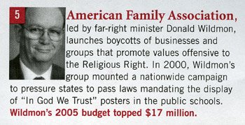 All ten of them are cropped in this way - tight all around with an emphasis on cropping out the hair and part of the forehead - and a few are cropped very tightly to one side as well, eliminating an ear and even part of the face up to the edge of an eye. In the case of James Dobson, pictured at top, the photograph can easily be compared with the original portrait they cropped it from. The portrait below is used on Dobson's own website.
 The technique AU used (which is a consistent feature of their mailout but strangely absent from their web publication of the same information) has several effects which work towards their goal. First, it communicates a sense of claustrophobia and unease. The photographs violate our imagined personal space with their subject's aggressive closeness, a feeling which can't help but contribute to our discomfort with their aggressive stands on the issues AU discusses. Second, it suggests that the organization is putting the subjects "under the microscope" and offering the close scrutiny that allows you to see them as they really are. Of course, these two aims are somewhat contradictory, but they peacefully coexist here in one of our age's many comfortable political contradictions.
In addition to their cropping technique, there is an implied violence in their numbering system and color choice which is very effective. The numbers cut into the frame and intrude upon their subjects in an agressive red gesture that reflects the deep frustration organizations like this, and presumably their supporters, feel when faced with these right-wing icons.
It is telling to me that AU would adopt the red spot color of the Republican Party rather than the blue of the Democratic wing for this publication, and I have noticed this issue arise frequently in political mailings. Activists on the left and right tap into frustrations with the opposing party's leadership and political culture to drum up enthusiasm for their own causes, and in this context using the other party's colors to discuss them might make sense. But stripped of its context, blue is naturally soothing and red is naturally agitating, so in practice this means that the left often uses red to discuss the vagaries of the right, but the right sticks with red, too. You can't make people too angry looking at blue, at least not by the conventions of tabloid journalism, which always aims to inflame its audience. On the other hand, the color blue connotes moderation and considered thought - a "cool head." This works well for Democrats as the party very much out of power, but when Democrats are in power, Republicans still stick with red, even when discussing their opposition. Draw your own conclusions.
![]()


No comments:
Post a Comment