SHOW ME

Friday, June 30, 2006

Reimagining the Computer Desktop

University of Toronto student Anand Agarawala has reimagined the computer desktop in a way that reflects the "fuzzy" way we deal with information, taking its inspiration from the messy realities of the physical desktop but building in organizational aids we could only dream of doing with paper. Watch the video below to see how he brings these two worlds together in an enlightening experiment in the future of our visual interface.


From Information Aesthetics.

The Frosted Cereal That Never Was

Designer and collector Dan Goodsell has posted original concept artwork from "Fantastic Frosties," a 1960s superheroed cereal that never got out of Post's marketing department, on his blog A Sampler of Things. The sketches are accompanied by pages ripped from Marvel Comics with poses circled for the artists' reference.

I can almost picture Frost-O wrestling Tony the Tiger to the ground while Quick Draw McGraw pulls out his piece...

Wednesday, June 28, 2006

Mark Up Google Maps "By Hand" With QuikMaps

QuikMaps is a new web app that allows users to annotate Google maps "by hand" using an editor that supports drawing and tagging. You can draw and attach various labels directly to the mapping space and they'll stick there, and the map itself has the basic zooming and grab-and-pan features of Google Maps. Here's an example of a map I created using QuikMaps.

(Your browser or blogging software's handling of iframe content may pose problems with embedding your maps on a website or blog. Posting in Blogger using the Firefox browser, I've found that the maps will post but that the post "breaks" the WYSIWYG editor and makes it impossible to edit a post that includes the QuikMaps code. This is definitely Blogger's problem, and only one of many bugs in their software; the iFrame content works fine in my wiki and no doubt elsewhere on the web as well, including on Tim Lauer's blog, where I learned about QuikMaps.)

This is an interesting approach to mapping that breaks out of the search model of most current mapping servers, where you type in search data that is correlated with data layers in the map (looking up addresses or suggesting travel routes, for example). Great benefits of Quikmaps' system include:

  • Tracing a travel route by writing it on the map. Any mapping service sometimes gives you a bad route, and if you're trying to create directions for someone else, the traditional model completely breaks down under those circumstances.
  • Labeling things you already know the location of, instead of using the Google Maps interface to look it up (which sometimes Google can't find).
  • Using approximate rather than exact markers. This is a corollary of the previous point, but it allows you to designate an area when a precise marker is not relevant or is unavailable (general area you liked when viewing homes for sale, range in which your lost cat has been seen, street a store you liked was on when you can't remember its name and don't know its address).
  • Labeling many things on the same map (although other mashups do this too).
A couple of additional features or fixes would be very valuable:
  • Drawing in multiple colors. This would allow you to create multiple, color-coded routes. For example, I recently led a teacher training workshop in PowerPoint and curriculum integration in Temple, Texas, and took somewhat different routes each way. If I wanted to show these routes to someone else or label them for my own future reference (see this map I made), having at least two colors to choose from in drawing lines would make this feasible. {Update: Good news! QuikMaps creator Ken Hoetmer emailed me to tell me this was already on his to-do list.}
  • Better location scouting from the search bar. When I said I wanted to go to San Francisco, California, I was dropped in Santa Clarita (down near Santa Barbara) and had to navigate my way north. Whoops!
  • Custom sizing of inline frames for displaying the map on your own site. Simply changing the pixel dimensions in the iframe code doesn't work, and the column widths of most blogs are too narrow for the default iframe. {Update: Ken kindly pointed out that this is indeed possible, and the method is explained on the site. Thanks, Ken!}
This is such a great little app, and the Quikmaps blog is humble enough not to take the mashup too seriously at this early stage. But this application would be a tremendous addition to the regular features of Google Maps if the two could be integrated together within the search-based bias. This is one of those occasions where a buyout seems like an obvious and satisfying solution - Google should pull out the checkbook and start talking to QuikMaps about a quick acquisition and integration into the Google Maps engine so we can have the best of both worlds.

Tuesday, June 27, 2006

Reader Challenge: Fill In the Blanks

I will be posting periodic visual "daisy chains" with an invitation to blog readers to fill in gaps in a visual record. This first one was inspired by the final image.

What image or images should go in position 4? Post or find one or more photos somewhere online and drop me a link in the comments to this post, along with whatever commentary you deem necessary (I have tried to keep my own to a minimum, offering just enough to reveal my train of thought). I will create a final post in a week that summarizes the best submissions.

Take a few minutes to take a crack at this art-historical exercise.

1.


St. Peters Basilica, Rome. Classical, abstract.

2.


Correggio's Assumption of the Virgin. Theatrical (Baroque), impassioned.

3.


Cortona's Triumph of Divine Providence (featuring the papal Barberini family's celestial VIP status), Palazzo Barberini. Political.

4.


5.


[via] Link.

Putting Things In Perspective


A very effective visualization of the relative size of planets and stars that takes a "Powers of 10" approach, beginning with our solar system (above) and allowing us to watch our sun shift from the big bully of our galaxy to a tiny speck when compared to larger stars. An animated application is easy to imagine, but this is also surprisingly effective as a series of still photos. [Via Information Aesthetics]

NYC's "Blueprint" for Arts Integration: Or, A Textbook Case of PowerPoint Abuse

An interesting article in the New York Times Monday discusses NYC's "renewed push" for funding and innovative thinking in arts integration in the schools based on the city's 2004 "Blueprint for Teaching and Learning in the Arts."

The story covers a lot of bases, but I wanted to highlight an interesting point that Edward Morgano, the regional arts supervisor for Region 5, made in the article. The article was describing Morgano's thinking regarding his priorities in disbursing funds.

"When a school in his region asked to take students to see a Broadway show, for example, he said: 'My initial response was, "No, that's not O.K." I need to know if this is a culminating experience. Have they studied theater? Do they know what downstage right and stage left means? For kids who are just going to get it as a one-shot, that's not acceptable.'"
Could this guy do double-duty holding the purse strings for technology funding as well?

Showing its old-media roots, the NYT fails to link to the blueprint itself, but I'll leave observations about newspapers' web failures to the experts, and note that the City's dissemination of this material proves that you can be technologically very modern and yet very backwards at the same time. The report is offered to the general public (and, presumably, to teachers and administrators who must interpret these guidelines) in PowerPoint slide form - a total of more than 150 slides (an estimate) broken into twenty-two topical sections. The format used is almost ideally suited to minimize the blueprint's readership.

Ironically, I faced all of these problems when attempting to blog about them. On the road presenting a teacher training workshop and working from a work-provided laptop with a limited palette of applications, I found myself working with the web equivalent of a flint knife to try to capture a graphic to demonstrate what the NYC Department of Education considers a wise dissemination method for extremely important information that needs to get into as many hands as possible. Since my work laptop lacks Photoshop, I went through a couple of GIMPshop mirrors looking for that great freeware app, and came up with only corrupted downloads. I ended up doing a screen capture of the PDF page I wanted to display, pasting it into Microsoft Paint, and marveling at that programs total lack of a functional cropping tool. Guess I just should have posted the PDF for download. Ah, the wonders of a ubiquitous document format!


Let's go through the many notable features of the PowerPoint-PDF method NYC-DOE chose to use for this important information.
  • The created slides emphasize complex arrays of highly detailed information, making them impractical for presentation purposes - note the predominance of 12-point text (and 4.5-point captions!)
  • The slides are not downloadable in slide format, but only as PDFs - making this literally impossible to view in its native format, PowerPoint, or to present to a group from this website.
  • Slides are in rich color, preventing any practical paper distribution.
  • No alternate print version (in standard document format) is anywhere to be found.
  • No web (HTML) version is available, which means that search engines cannot find and index the content, and the information fails to meet basic accessability requirements.
Has anyone made a When Not to Use PowerPoint PowerPoint slide? This is the kind of stuff that makes Edward Tufte's anti-PPT tirade sound reasonable; thank goodness for moderators of the cultural bloodlust like Elizabeth Lane Lawley. Let's adapt a mantra from the NRA, folks: PowerPoint doesn't kill ideas; people kill ideas. Of course, if there was a gun on the desk of every white-collar worker in America tomorrow, we probably would repeal the Second Amendment the next day.

Monday, June 26, 2006

Infantainment: Yumiko Tankada's "Plable"

Remember when babies were expected to be entertained by this?

If artists like Yumiko Tankada had their way, the future might look something more like this:


Tankada's engaging videos of three designs, two of them quite innovative and all of them charming, can be viewed here.

Maxis' Beautiful Spore: Science and Social Studies Classes Will Never Be the Same

Will Wright and Maxis have once again reinvented the open-ended educational video game.

Don't miss this video demonstration of Spore, which leads players through the development and evolution of life from bacterium through space exploration, with everything imaginable in between. I have watched the progress of educational games for a while from a distance, especially from the perspective of the brave teachers like Dave McDivitt who experiment with them in the classroom. Science and social studies teachers, get ready: This is the game you should let your students play from age 12 on to enhance their understanding of evolution, the study of cultures, and astronomy. Don't believe me; watch the gameplay video below from the Game Developers Conference 2006. Then play the game yourself and put yourself in your students' shoes. A game like this can't teach your kids these concepts, but it can bring them to life in ways only a video games can. Leave your worries at the doorstep (read Henry Jenkins' lucid "Fun vs. Engagement" post on his blog if you need help with this) and dive in.

Sunday, June 25, 2006

A Free App for Time-Lapse/Split Screen Video, and How To Donate A Buck To Earn Instant Karma

Just yesterday I reviewed Chris Wahl's wonderful illustrating blog along with two other "inside the artist's studio" webspaces. After praising him for posting video of his computer screen during a sketching session, I mentioned that "someday" someone would be able to easily pair two camera images without any hassle so an artist could show us their hands at work on keyboard and tablet as well as the screen view. Today I came across Phil Piwonka's Mac-app Gawker, which does just that and much more - its primary purpose is to enable the easy creation of time-lapse video. [Addendum, 7/15/06: Piwonka has a Gawker-centric blog - which I somehow missed the first time around - and is now accepting donations via PayPal. Since I haven't had any takers for my own pay-it-forward project (see below), I hope he has better luck!]

I'm out of town to present a teacher training workshop and am using a work-provided PC, so I haven't had a chance to play with this yet. But it looks like there are multiple replay speeds to choose from, making this an ideal (and free) application for science-class data collection. The last You Tube video I posted here seemed to precipitate a couple of early posts' untimely retirement into the archives, and the examples provided are far less interesting than what your students will think up.

If I had $70, I'd buy Chris Wahl a webcam so he could do this. In fact, I'd buy him the webcam at left, the Logitech Quick-Cam Pro 4000, highly rated by Epinions users.

What if we leveraged the Power Of The Internet to make this happen?

If you're a fan of Chris' work or of any young artist who benefits from people like him taking the time to make their skills available to aspiring illustrators, consider a donation today using the link below. I will personally buy Chris the webcam and have it shipped to his home in Sydney, Australia, and will refund anyone who donates after we've already reached our goal (did I mention I'm an optimist?). If we don't reach the price + shipping, I'll still pass on what readers have ponied up so he can start his own webcam fund, and if we get close I'll finish the job myself.


This is not a joke, and I do not know and have never met Chris Wahl. I'm not even that into comics - to be honest, I haven't been much of a collector of anything since my pre-teen years when a sizeable investment in Gregg Jeffries baseball cards left me high and dry back in the late '80s. Click the above link to help send a webcam to a very surprised comic book artist in Australia who is reaching out to young illustrators! (Just don't tell him yet, you'll spoil the surprise.) You don't have to have a Paypal account to send a donation.

While I'm PC-bound, I'll be taking the PowerPoint 2007 beta for a test drive, along with logging some novel-writing time. Stay tuned for a report on the former; for the latter, we'll all have to wait a bit. [Addendum, 7/15/06: You can do this yourself, thanks to Microsoft's excellent new online test drive, a great intermediate step for those willing to play with a beta version and those who just want to know a little about the software.]

Saturday, June 24, 2006

Unplanned Obsolescence: Firefox Measure-It Ruins My Programming Career

I've been wanting to post an update on the Picasa Web Albums image resizing bug I discovered during a beta test last week, for several reasons:

  1. I felt bad about posting a bug when the site is, after all, in beta testing,
  2. the software team was quick to acknowledge that this was a bug, not a feature, and
  3. Google has been taking a lot of hits more generally for the program's non-wowing feature set, a problem which will be much harder to fix than any bug the beta-testers are turning up.

But the problem hasn't been fixed to date, so I'm itching to bang the gong a bit to make sure it's taken seriously. Thanks to Kevin Freitas I can roll my own bug report up in a tasty Firefox extension. (If the FLOOD WATCH 2007-type weather reports were this useful, we'd all be glued to our sets - how to right an inverted umbrella, etc. etc.)

It looks like my browser-measuring mod will be headed back for the desk drawer. Using the fantastic Measure-It Firefox extension, I was able to precisely calculate the extent of Picasa's image-resizing. The extension drops a toggle on/off button in the bottom lefthand corner of your screen that changes your mouse pointer to a crosshairs for drag-out measurements.


Measure-It gave me a reading of 512 pixels wide, and it looks square, so I didn't bother measuring the height. The actual image size, as provided to Picasa, is 441x441 pixels, which means that Picasa Web Albums bumps it up by about 16%, well over my nicey-nice estimate of 10%, the outside limit of what lazy (overworked!) designers consider to be the "safe" upsizing limit. Google, fix this bug!

If this sounds like big-G bashing, I'll be posting some love for Google next week to demonstrate my undying affection for the Google universe. Right now I'm playing with SketchUp and dreaming of the educational possibilities, complete with language arts integration! If you have ideas of your own to share regarding how SketchUp might be used in the classroom, post them in the comments below and I'll be sure to incorporate them.

Into the Artist's Studio with Blogs and Photostreams

I came across three sites this week - all of which happen to point to the rapidly diminishing value of the term "website" - that can each offer students a different insight into the creative process. All are spaces that young artists will want to return to again and again.

First up is the Flickr-based daily sketchbook by designer and illustrator Rich Rawlyk, who, the blog Drawn! reports, started the daily discipline after speaking to some middle-school students about the importance of drawing every day. Rawlyk's daily posts blend computer and hand drawing with photography, collage, and vector-based design.

For more on technique, a young artist would do well to stop by Chris Wahl's blog, where the comic book artist has been producing how-to text, drawing samples, step-by-step snapshots, and now video to what started out as a way to showcase some of his unpublished "back catalogue" back in March. The blog focuses on software-based techniques and is a great site for tutorials and casual discussion with a working comic book artist. Here's one of Wahl's video tutorials, this demonstrating his black-and-white drawing technique. (Note: Wahl mentions in his blog that he frequently flips the canvas horizontally to catch errors and see the picture from a different perspective - sort of like reading an important piece of writing backwards to check the spelling in the days before spellcheck.)


It's interesting to see how the transition to computer-based illustration techniques has made it so easy to produce and distribute this kind of material, in which the viewer has as good a view as the artist. One simple improvement would be the addition of voice-over narration; another possibility, this one waiting for the right home video-editing software, would involve a split-screen with the rendering matched with a webcam shot of the artist working on their tablet and keyboard.


When it comes to the story behind the story, nothing beats Toronto-based comic book artist Bryan Lee O'Malley's Annotated Scott Pilgrim, in which he lovingly details all of the locations, story background, and character sources for his Scott Pilgrim series (pictured above). The exercise provides an invaluable look for young writers and artists to understand just how close to home inspiration might lie, and that one of the essential functions of art is to for the artist to "unlock" a private place and time for readers.

There are many more examples of this kind of "behind-the-scenes" work being produced by artists to develop or strengthen their fan base and give something to the next generation of creatives. A few carefully-selected sites could be just the boost a young artist or writer needs to take themselves seriously and dive into their craft. The best source for such materials is the Drawn! The Illustration and Cartooning Blog, which alerted me to all three of these great resources [here, here, and here] in the past two days.

Thursday, June 22, 2006

How well do zoos communicate with kids?


Colin Purrington, a professor of evolutionary biology at Swarthmore College, has a great photostream on Flickr in which he documents and comments on explanatory labels at zoo exhibits. His spot-on commentary brings issues of zoo audiences, effective communication strategies, and good design together for a great examination of information design. View his personal set of exhibit display photos or browse and contribute to the Flickr pool he started on the same topic.

Wednesday, June 21, 2006

An Unexpected Alliance: Microsoft and Creative Commons

The past few weeks have featured a lot of bad news for the public domain, but the clouds parted yesterday when Microsoft and Creative Commons announced that Microsoft would release an Add-In that allows users of Office software to assign Creative Commons licenses to documents, spreadsheets, and slideshows. Copyright issues can be a major stumbling block for educators, who face extensive freedoms in the classroom use of copyrighted materials but are prohibited from redistributing or sharing many of the resulting educational productions. This new Add-In offers a major boost to share-alike, noncommercial copyright options that allow for broader noncommercial use of original content.

The word first reached me through TechCrunch [link]; poster Marshall Kirkpatrick also did an interesting interview with Creative Commons CTO Mike Linksvayer in his own blog, Netsquared, back in April. I agree with Kirkpatrick that this development is interestingly timed with Microsoft CEO Bill Gates' announcement of his plans to step down. At this stage, however, it's a bit premature to call it a new chapter for Microsoft.

I'm as surprised by the idea as anyone, but the nagging question remains: Why didn't anyone think of doing this as soon as Creative Commons came along? The most startling thing about this development is the realization that any programmer could have made this Add-In, but no one outside Redmond who speaks Microsoft's proprietary Visual Basic/.NET thought to do so. Add-Ins are often sold as proprietary software, so there certainly could be financial incentive, or it could have been developed and distributed freely, in the spirit of CC itself. Since Microsoft has no control over the use of viable Add-Ins designed to interact with Office applications, at any point in history prior to yesterday's announcement it would have seemed the perfect way to tweak the nose of a corporate giant, and could have made for great PR if timed with a particularly unflattering chess-move by Microsoft. Perhaps this partnership was born that way - someone came along to Microsoft and said, we can do this with or without you, and both parties recognized the strong incentives of working together on the project. But sometimes there's no point in looking a gift horse in the mouth - you're just begging somebody to file down their teeth.

(For help creating your own PowerPoint Add-In Toolbar, see my tutorial on Customizing PowerPoint Toolbars. While you're there you can download my free ToolbarCreator file, which contains the VBA script necessary to produce your own PowerPoint toolbar as well as step-by-step instructions in the form of a PowerPoint slide show.)

Three cheers to Microsoft for weighing in so dramatically for the viability and importance of CC licensing. The next step for the software giant is to shift the feature from an optional, downloadable Add-In - likely to reach only those already somewhat educated about the benefits of CC copyrights - to an out-of-the-box Office feature for the Office 2007 (2008?) rollout, a drop-down list in the file properties window, for example. (Call them at 1-800-MICROSOFT [642-7676] or click here for more ways to bug them to promise this.)

Then, if we could get copyright phreaks like Adobe to add technology to Photoshop and Illustrator that would allow users to tag images with Creative Commons licenses, enticing other software companies to follow suit, someone could write a copyright-scanning Add-In for Office that would alert you to "unverified" images before you publish and expose yourself to possible infringement. (Better not to make this a built-in feature for all of the pertinent Big Brother reasons!) As someone who works regularly in PowerPoint and creates materials for mass distribution, this would be particularly welcome.

For the time being, educators can protect themselves in their image-searches by using Yahoo's pioneering Creative Commons search or Google's Advanced Search, which now offers the option of filtering results based on licensing restrictions.

Friday, June 16, 2006

Warning: Learning Ahead

Every teacher should have a provocative warning sign to tell students they'll be challenging them to learn. Deep in the bowels of the Wooster Collective's Flickr photo pool I ran across Melvin Design's post on the fabulous Warning Label Generator.

The site consists of a form with a variety of labels and warning images to choose from, and form fields for you to write your own content in the lower right pane.

With the current settings, labels can be used as a provocative introductory slide to a PowerPoint presentation or group discussion. All we could ask for is a higher resolution image suitable for printing - it's 500 px wide and 72 dpi, and even the jpeg quality at the current resolution could be upped a bit. I'd like to see signs like this posted on classroom walls (click on the image to see it full-size):


Go make your own at this simple and elegant site.

Thursday, June 15, 2006

Picasa Web Album Bug Update

A couple of helpful comments have helped clarify the problem. The problem, in turn, brings up a larger question regarding web apps like Picasa.

Readers observed that right-clicking an album image and selecting "View Image" (to load the image in the browser by itself, as with any webpage) loaded a properly-scaled image, and that the image was also downloaded at the correct size. I also noticed that the "Slideshow" also displays photos at the correct size, a fact I verified using an image-measuring browser mod of my own invention (open-source, of course):

But why resize images in the main view window at all? This is the first thing anyone sees when they visit your public albums, and depending on their purposes, they could easily do all their viewing without entering a mode in which the image was displayed at the proper size. (Personally, I avoid slide show modes in most cases; I like to browse thumbnails and select what I'd like to view at full size, especially if photos are provided in "snapshot" quantities.) For people sharing travel pics, this may not matter. But for a large segment of potential users who shoot casually but whose aesthetics and attention to craft push them into the realm of true amateur photography, this will matter a great deal.

The relative significance of this bug depends on what kind of photo-sharer you are, and on whether Google is more concerned about competing with many-to-many photo-sharing sites like Flickr or with one-to-many sites like Shutterfly. I'd put my bets on Flickr - it matches the low-overhead, drive-'em-to-the-ads strategy behind Google Spreadsheets and the rest of their recent labware. The Flickr users are the users who will care.

But Google doesn't have to chose. Sure, Google's beta software is more stable than most Microsoft official releases, and I understand we're taking this sucker for a test drive. But let's not call a bug a feature. Picasa can have the best of both worlds - all Google has to do is fix this bug.

If you're looking for a general description of features, the quick and dirty is: Albums can be public or unlisted (address must be typed in); it's easy to upload lots of pics at once, and to rearrange within and between albums; at least for now, there's a 250 MB storage cap; and it has a built-in email announcement function. If you like more words with your facts, see the friendly folks at Ziff-Davis Media.

Picasa Web Albums: Trouble in Paradise

I've been testing the beta (or "Test") version of Google's Picasa photo-sharing software, which is much-anticipated because it allows web photo sharing a la the Yahoo-owned Flickr. So far, the web interface is great and communication between the desktop app and the website is almost seamless. There's no tagging option, but Google may just expect users to put that in the "caption" field.

But Picasa's web albums have one big problem, and a killer one at that: the image resolution is abominable. I have uploaded identical photos to Flickr and a Picasa Web Album; take a look at each, then compare the quality with that of the website they were taken from. The Flickr upload looks great, as good as the original; Picasa increases the display size by about 10%, creating significant distortion and lots of junky jpeg image ghosting. This may be a simple browser-resizing problem, but this is not a setting that can be modified in your website account, and it looks just plain bad.

The uploading settings available from Picasa 2.5 suggest there may be a bigger problem here:

If you can't read them, they are:

  • Optimized: Large size, fast upload (1600 pixels)
  • Medium size, fastest upload - 1024 pixels
  • Slowest upload, largest size
So why is Picasa making decisions about what size to make my photo? I tried uploading photos using the "Optimized" and "Slowest" settings, and couldn't see any difference. But could there be some interpretive act going on when I upload my photos that result in lowered image resolution?

I played around with uploading a lot of different images at a lot of different upload settings, and found that the quality of all images appeared to remain consistent regardless of the upload "size" selected, but that the reduction of image quality varied dramatically, with some images displaying only a slight reduction and others a much more dramatic decline. This lends further evidence to the theory that Picasa is "reading" the images during the upload, rather than simply copying the file. Strangely, a web-based upload interface (a nice touch) allows users to browse and upload files, but offers no quality/size choices at all. Presumably, all images uploaded through the website are "optimized."

Few people on the usergroup forums seem to have been allowed access yet, so my posting in search of similar experiences has not yielded anything instructive yet.

Wednesday, June 14, 2006

Lifespan As Process

Several months ago, when preparing for a series of advanced PowerPoint training sessions, I designed an introductory slide that attempted to map out where we were headed in the training session. I had broken my advanced PowerPoint training down into ten "rules" I felt (and feel) should govern PowerPoint useage from an educational perspective. My goal was to fire a shot off the bow at the opening of the session so the antsy people who want everything to be hands-on would relax for the first half of the training, which had a largely theoretical emphasis, and that those who feared being asked to apply new skills would know they didn't have to do anything right away. I came up with a visually satisfying but completely unscientific "timeline" that mapped the level of "theory" and "practice" that would be covered in each of my ten subsections, which were titled and clearly delineated in the presentation. What I created was one slide, but it is shown in stages below. Each of the blue blocks appears by wiping from left to right, and the blue bar wipes in two segments because, at the time, the training was divided into two sessions.


I was reminded of this attempt at visualizing time when I came across an interesting exercise Dan Russell posted on the Creating Passionate Users blog a couple of weeks ago. He wanted to visualize his entire lifetime in a PowerPoint slide (gee, if I had a nickel for every time someone said that) and whipped up a grid of 500-day blocks of dots that add up to a 20-year timespan. As such quantifications tend to do, the results travel from retina to brain with a vague, tingly "seize the day" sensation:


I liked the visualization, personally, but it also got me thinking about next steps. There is a force behind this slide, but the information supplied is not very complex as far as visualization goes - or, rather, the effect is very generalized. We all have ambitions as well as regrets; the grid model merely taps into one or both of these feelings and gives one a sense of anxiety or fulfillment, wonder or dread. If we want to do a little more in terms of examining our own life, the grid doesn't get us very far.

I decided to try to use an Excel spreadsheet to create a graph illustrating something about my life's trajectory, as interpreted from the ripe old age of nearly thirty. I used a simple spreadsheet layout to gauge my level of happiness, engagement and adaptation (changing in response to environmental stimuli) on scales of one to ten at each year of my life. Since this assessment is laughably imprecise, I decided to assign values very rapidly and intuitively, recalling general life circumstances that pertained to a given year for no more than five to ten seconds before assigning H, E, and A values, and to resist going back to fiddle with them. Since this exercise does not map my actual experiences throughout my life (who can remember how happy they were when they were two?), the strategy makes the most of what this does represent quite well: the emotional "story" I draw upon unconsciously as I continue to develop as an individual.

To take things a step further, I treated the sum value of these three variables as a measure of my personal "cohesion" to further interpret the dataset. This is an attempt to create a general "evaluation" of my life at any given year.

On the chart above, the Happiness line is purple, the Engagement line is pink, the Adaptation line is orange, and the Fulfillment line is green. Color-coding of the plot area is meant to offer some guidance as to major life changes, which correspond with school changes (elementary/middle/high/college) followed by additional life changes (long-term location changes, marriage, and life with a child).

What I found most interesting about this exercise was that it demonstrated no clear corrolation between the levels of individual components, but a lot of loose tracking between channels. A major stressor that temporarily lowered Happiness (a difficult pregnancy and birth) proved an "investment" that led to greatly increased Happiness in subsequent years, as well as peaks of Engagement and Adaptation; at other times, decreases in the Happiness level almost seem to anticipate future drops in Engagement and Adaptation.

Much can be made of this stuff, even (or especially) if you construct your data set with a reliance on your intuition rather than careful examination. Perhaps the most enjoyable aspect of the exercise was using the spreadsheet and charting capabilities in a purely "artful" (that is, nonscientific) way. I'm not much for journaling, although I've done so in fits and starts. Maybe I should keep a "statistical abstract" instead.

Tuesday, June 13, 2006

A New Visual Thesaurus - and this one's free


Programmer Kyle Scholz has released a web-based visual thesaurus along the lines of Thinkmap's slick, Java-based mapper of word relationships. Unlike the prototype, Kyle's "Visual Wordnet," which draws on the Princeton Cognitive Science Laboratory's "Wordnet" database, is built using only Javascript and Cascading Style Sheets, and - drum roll, please - is free to all.

Monday, June 12, 2006

Eyetrack's Implications for Educational Multimedia

The Poynter Institute's 2004 "Eyetrack III" report, which summarized results from the news industry nonprofit's "heatmapped" usability study of news websites, has achieved canonical status in webdesign for its direct implications for usability and page layout. I have recently reviewed the report data from the perspective of a multimediator, and believe that unlike the study's implications for webdesign, which are applicable to any text-based site, its attempts to quantify the relative value of multimedia content are anything but proscriptive.

In brief, the Eyetrack study uses sophisticated videorecording equipment to track users' eye movements and documents where website visitors tend to look and linger, and the study led researchers to a set of guidelines regarding the placement of certain elements of a web page. An additional component of the study attempted to measure the relative effectiveness of text-based stories and "multimedia" stories (video + text), and published findings largely in favor of text-only content. The study authors wrote that:

  • Overall, we found a slight, marginally significant difference in how test subjects correctly recalled story information that was presented in text vs. using multimedia. When asked to recall information about names and places, participants who received information in text were more likely to answer questions correctly.
  • However, information about a process or procedure that was unfamiliar to them was more correctly recalled when participants received it in a multimedia graphic format.
  • Users who received information in text form seemed to have better recall of specific factual information.
To sum things up even more succinctly, test subjects were much more likely to remember a new concept if it was presented using imagery (an "explanatory" image), but much more likely to recall a new fact (a story source's job title, for example) if the data was presented in a text-only format. Although the recall quiz contained only two questions relating to new concepts (process/procedure) and eight relating to factual details, the researchers chose to make a tossed salad, statistically speaking, to serve up the "overall" determination that text is "marginally" better. This 80/20 mix might be reasonable for the standard news story, but at least for our purposes, this whole is much less than the sum of its parts. (The study authors do note that what recall truly measures [retention] is only one and probably not the most important element in news dissemination.)

But it is difficult to squeeze much of general value from the multimedia component in itself. It is not surprising to hear that participants learned processes and procedures better when the information was supplied visually; this is the realm of explanatory and organizational diagrams, which exist for a reason. But the non-"procedural" information is always conveyed through a series of talking heads - a natural enough format for a news story, but the informational equivalent of a bonbon.

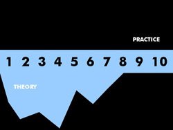
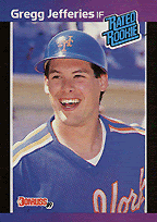
Take a look at one of the study's multimedia "heatmaps," below.


Like moths to a flame, the viewer is irresistably drawn to the human face, and the area around the eyes specifically, while watching the video footage. This, too, should be old news. As John Henderson, Carrick Williams, and Richard Falk of Michigan State University put it, the human face is "arguably the most important and salient visual stimulus a human encounters" (PDF). My wife understands this when she keeps people out of her photographs - if you let them in, they automatically become the subject. The human mind circles that face in response to hundreds of thousands of years of rigorous training, the same programming that is largely responsible for that fat, juicy cerebral cortex in the first place. Meanwhile, a nineteen-word sentence appears at the bottom of the screen which contains infomation about the speaker's job description that will be included on the test.

Perhaps the real lesson here is not how poorly facts are remembered when they are presented in a multimedia format, but how ineffective the standard television news model of multimedia content is. I'd like to see a study comparing text narratives with methods of sharing information that link "facts" together using what might we might define in the broadest sense as "procedures" or "process" - that is, with visual frameworks that communicate information in a conceptually-organized manner. Web news providers, as well as designers and educators, can certainly learn from that.

To learn about open-source eyetracking software and free hardware designs, read my post on the subject here.

Saturday, June 10, 2006

Introducing Think In Pictures

As a designer and editor of multimedia educational materials, I have followed several excellent blogs centered on technology integration in education and on the ways web technologies can help facilitate student-directed learning. I am a latecomer to educational theory; my background is in journalism, design, and history, and my interests have always centered on on aspects or artefacts of human communication.

I am personally interested in the read/write web, in the use of blogs, podcasts, and the rest of the Web 2.0 to facilitate student-directed learning. But to the extent that teachers (or students) must still present some information in a structured, one-to-many format, I think something has been lost in the educational technology conversation. My interest in creating this blog is to discuss the ways in which one-to-many communication can be facilitated through the use of multimedia, and the way visually-oriented multimedia can assist educators in planning a teaching space in which discussion, participatory meaning-making, and understanding flourish. In pursuit of that topic, I am sure to touch on many others, from educational theory and research to experience-based observations, and from technical tips in multimedia production to discussions of contemporary art or cultural events that bring these issues into clearer focus. My overall goal is to maintain an emphasis on "the visual" in all things so as to offer a blog that suggests that "visualization" is at the heart of what we do as educators, and that there is a benefit to centering one's thinking along those lines.

To get a sense of where I'm coming from, take a look at my PowerPointers wiki, which offers research- and design-based guidance on the use of PowerPoint as a "visual medium."