
Lifespan As Process
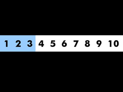
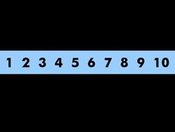
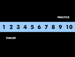
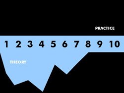
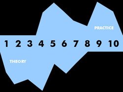
 Several months ago, when preparing for a series of advanced PowerPoint training sessions, I designed an introductory slide that attempted to map out where we were headed in the training session. I had broken my advanced PowerPoint training down into ten "rules" I felt (and feel) should govern PowerPoint useage from an educational perspective. My goal was to fire a shot off the bow at the opening of the session so the antsy people who want everything to be hands-on would relax for the first half of the training, which had a largely theoretical emphasis, and that those who feared being asked to apply new skills would know they didn't have to do anything right away. I came up with a visually satisfying but completely unscientific "timeline" that mapped the level of "theory" and "practice" that would be covered in each of my ten subsections, which were titled and clearly delineated in the presentation. What I created was one slide, but it is shown in stages below. Each of the blue blocks appears by wiping from left to right, and the blue bar wipes in two segments because, at the time, the training was divided into two sessions.

I was reminded of this attempt at visualizing time when I came across an interesting exercise Dan Russell posted on the Creating Passionate Users blog a couple of weeks ago. He wanted to visualize his entire lifetime in a PowerPoint slide (gee, if I had a nickel for every time someone said that) and whipped up a grid of 500-day blocks of dots that add up to a 20-year timespan. As such quantifications tend to do, the results travel from retina to brain with a vague, tingly "seize the day" sensation:

I decided to try to use an Excel spreadsheet to create a graph illustrating something about my life's trajectory, as interpreted from the ripe old age of nearly thirty. I used a simple spreadsheet layout to gauge my level of happiness, engagement and adaptation (changing in response to environmental stimuli) on scales of one to ten at each year of my life. Since this assessment is laughably imprecise, I decided to assign values very rapidly and intuitively, recalling general life circumstances that pertained to a given year for no more than five to ten seconds before assigning H, E, and A values, and to resist going back to fiddle with them. Since this exercise does not map my actual experiences throughout my life (who can remember how happy they were when they were two?), the strategy makes the most of what this does represent quite well: the emotional "story" I draw upon unconsciously as I continue to develop as an individual.
To take things a step further, I treated the sum value of these three variables as a measure of my personal "cohesion" to further interpret the dataset. This is an attempt to create a general "evaluation" of my life at any given year.
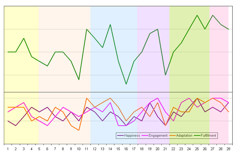 On the chart above, the Happiness line is purple, the Engagement line is pink, the Adaptation line is orange, and the Fulfillment line is green. Color-coding of the plot area is meant to offer some guidance as to major life changes, which correspond with school changes (elementary/middle/high/college) followed by additional life changes (long-term location changes, marriage, and life with a child).
What I found most interesting about this exercise was that it demonstrated no clear corrolation between the levels of individual components, but a lot of loose tracking between channels. A major stressor that temporarily lowered Happiness (a difficult pregnancy and birth) proved an "investment" that led to greatly increased Happiness in subsequent years, as well as peaks of Engagement and Adaptation; at other times, decreases in the Happiness level almost seem to anticipate future drops in Engagement and Adaptation.
Much can be made of this stuff, even (or especially) if you construct your data set with a reliance on your intuition rather than careful examination. Perhaps the most enjoyable aspect of the exercise was using the spreadsheet and charting capabilities in a purely "artful" (that is, nonscientific) way. I'm not much for journaling, although I've done so in fits and starts. Maybe I should keep a "statistical abstract" instead.
![]()


No comments:
Post a Comment