NYC's "Blueprint" for Arts Integration: Or, A Textbook Case of PowerPoint Abuse
An interesting article in the New York Times Monday discusses NYC's "renewed push" for funding and innovative thinking in arts integration in the schools based on the city's 2004 "Blueprint for Teaching and Learning in the Arts."
The story covers a lot of bases, but I wanted to highlight an interesting point that Edward Morgano, the regional arts supervisor for Region 5, made in the article. The article was describing Morgano's thinking regarding his priorities in disbursing funds.
"When a school in his region asked to take students to see a Broadway show, for example, he said: 'My initial response was, "No, that's not O.K." I need to know if this is a culminating experience. Have they studied theater? Do they know what downstage right and stage left means? For kids who are just going to get it as a one-shot, that's not acceptable.'"Could this guy do double-duty holding the purse strings for technology funding as well?
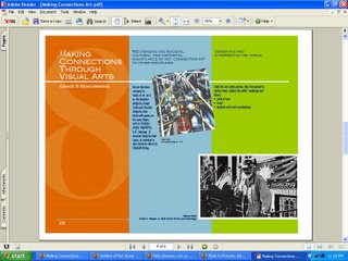
Showing its old-media roots, the NYT fails to link to the blueprint itself, but I'll leave observations about newspapers' web failures to the experts, and note that the City's dissemination of this material proves that you can be technologically very modern and yet very backwards at the same time. The report is offered to the general public (and, presumably, to teachers and administrators who must interpret these guidelines) in PowerPoint slide form - a total of more than 150 slides (an estimate) broken into twenty-two topical sections. The format used is almost ideally suited to minimize the blueprint's readership.
Ironically, I faced all of these problems when attempting to blog about them. On the road presenting a teacher training workshop and working from a work-provided laptop with a limited palette of applications, I found myself working with the web equivalent of a flint knife to try to capture a graphic to demonstrate what the NYC Department of Education considers a wise dissemination method for extremely important information that needs to get into as many hands as possible. Since my work laptop lacks Photoshop, I went through a couple of GIMPshop mirrors looking for that great freeware app, and came up with only corrupted downloads. I ended up doing a screen capture of the PDF page I wanted to display, pasting it into Microsoft Paint, and marveling at that programs total lack of a functional cropping tool. Guess I just should have posted the PDF for download. Ah, the wonders of a ubiquitous document format!

Let's go through the many notable features of the PowerPoint-PDF method NYC-DOE chose to use for this important information.
- The created slides emphasize complex arrays of highly detailed information, making them impractical for presentation purposes - note the predominance of 12-point text (and 4.5-point captions!)
- The slides are not downloadable in slide format, but only as PDFs - making this literally impossible to view in its native format, PowerPoint, or to present to a group from this website.
- Slides are in rich color, preventing any practical paper distribution.
- No alternate print version (in standard document format) is anywhere to be found.
- No web (HTML) version is available, which means that search engines cannot find and index the content, and the information fails to meet basic accessability requirements.


No comments:
Post a Comment