SHOW ME

Monday, July 31, 2006

Sparklines: Handle With Care

Dan Russell from the Creating Passionate Users blog got me hooked on Juice Analytics after he noticed me blogging a bit about visualizing the passage of time using Microsoft Office software, and about his "dot-plot" exercise in particular. Since then I've kept up with their blog, and some of their public-oriented posts about analytics play very well in Peoria, by which I mean they are intelligible and useful to people like myself who are more or less brine shrimp when it comes to statistical analysis.

So I've been reading the JA blog for a while, and they've been talking a lot lately about their hiring practices and management philosophy, and, fickle blog-reader that I am, I was starting to wonder if this really was a feed to grow fat on. Then they posted a nice little visualization in Excel that made me very happy.

If you've spent any time writing Excel formulas, this should make immediate sense:


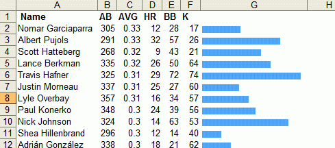
If the way they wrote this formula doesn't immediately strike you, head over to their blog and let them walk you through it - it's extremely simple and this technique has many fabulous applications. Most importantly, it does exactly what a visualization embedded in a data table should do: It makes the data easier to understand than text alone.

This is a loose application of the concept of "Sparklines" developed by information designer Edward Tufte. These "mini-charts" - "intense, simple, word-sized graphics," as Tufte describes them - offer tiny snapshots of graphical data that look like they should be cut out and pasted to the wall of a dollhouse home office. While they have many useful applications which allow for quick comparisons and for the insertion of chartlike objects into tabular data and even into blocks of text - even statistical analysis has its faddish behavior. Since many have sung their praises and some now seem eager to apply Sparklines to every imaginable dataset, I'd like to offer some observations to accompany Tufte's own suggestions regarding the care and feeding of Sparklines.

1. Sparklines often suffer from isolation. Single charts, or groupings of charts which (a) measure different things and (b) use different scales, lose considerable value without x- and y-axis values. Information Aesthetics should certainly be excused for using these -

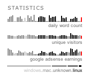
- and there is a tiny thrill at seeing so much data compressed so tightly. But without a scale to hang your hat on, there's little of real value here. The unique visitor graph is meaningless without an x-axis (the date) which would allow for some interpretation of what new content readers found interesting, and without a y-axis ($ values) the advertising revenue chart is meaningless as well (assuming I cared about this in the first place). At least with the word count chart I can see what days the bloggers take off, and I could see further utility in offering paired metrics of word count and the number of posts per day; this would tell you, at a glance, the depth of content on the blog and thus whether it was more concerned with sharing links to other sources or offering its own analysis, or, to put it differently, whether it took on the role of a hub or a spoke. As they stand, however, these Sparklines, with the exception of the OS indicator, are the statistical equivalent of Pop Rocks.

2. Some audiences demand more complexity. Fans of Tufte should know this well from his critiques of PowerPoint, which he argues is not a design space suitable for representing any serious data; his critique centers on how much information is lost in translation as business and scientific reports move from paper formats to PowerPoint slides. Sparklines come with related baggage - they strip data of much of its detail, and this tradeoff must be acknowledged and the cost-benefit ratio assessed. Juice Analytics posted a sample Sparkline application back in January that was highly illuminating to me, although not in the way the author intended. Titled "Restoring Romance to the Sports Page," a Sparkline enthusiast saw a self-evident case that turning this
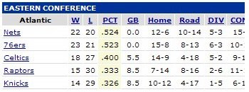
into this

would be a boon for sports fans. Anyone can see that here Sparklines offer great visual depth at a very low mental processing cost - it's a great way to compare team records in a qualitative way, and even offers chronological data that a win-loss record does not, identifying good and bad streaks over the course of a season. More generally, the attempt is interesting because it reminds us of how much chronology is lost, and how useful that timeline is, when discussing aggregate statistical data for players, teams, and leagues over the course of a season. But the data offered in the simple table is not being respected by this suggested change, and I suspect serious fans - by which I mean people who regularly study the statistics provided in newspapers - would be dissatisfied with the change, and not merely on the grounds of tradition.

I'm not much of a sports nut, but I've known enough of them to know that they have a couple of needs that this sparkline fails to satisfy. I also believe there are many audiences for which similar or additional criteria are poorly served through the use of Sparklines.

First, they do independent analysis, based on their own criteria, using the statistical data. Stripping out the home/road rankings takes an explicit side against the psychological analysis fans regularly engage in; using Sparkines, one source of the Celtics' biggest problems in the sample season above becomes invisible. As a longtime San Antonio Spurs fan, I can attest to the "romance" of a team's divergent win-loss records on and off the home court; it offers solace when a team is down, has predictive power when a team is up, and even, at least in terms of "romance," is a major player in the anticipated, if not real, outcomes of national titles, where a series of seven games comes down with statistical certainty in favor of one team or another based on the complex and highly individualized metric developed by every fan, and of which the home/road records are at a variable of variable importance. {Addendum: Chris Gemignani wrote in from Juice Analytics to point out that their Sparklines example also failed sports fans in its disregarding of relative team standings. Good point, Chris!}

Second, the method by which they communicate this information is verbal, not visual. Numbers can be easily verbalized by humans, while Sparklines would require beat-based or musical interpretation. As much as I'd like to see tailgaters comparing opposing teams' records using an elaborate system of chest thumps or boardroom executives singing lilting arias to each other in the elevator to review stock prices, in terms of practicality, numbers win. In some cases, the best application of Sparklines is in supplementing, not replacing, other means.

None of this is intended to suggest that Sparklines are not useful; indeed, their overextension may be the natural result of the obvious, instinctual, and dramatic utility that accompanies truly innovative ideas. But I do believe that when the dust settles from this discovery, they will be implemented with greater care.

That being said, there are a couple of great resources now that can help you produce your own Sparklines. Bissantz has developed a custom bar-graph font and MS Office Add-In that can generate Sparklines from statistical data, and LodgePhoto has written a script that can create Sparklines in Photoshop from data stored in text files; I'll be playing with both of these as I attempt to make sense of the results of a survey I am conducting of blogs hosted on Blogger.

If anyone else has seen additional critiques of the limitations of Sparklines, I'd love to see them - I found nothing to moderate their well-deserved praise. I may amend and add to this post as I or others develop additional points of critique, but I will always give credit.

Friday, July 28, 2006

Jill Greenberg and the Short, Fat Tail


The mainstream media inexplicably clued into Jill Greenberg's "End Times" series a few days ago (ABC News actually called the show, which opened in April and closed in early July, a "new exhibit" in their ABC World News article yesterday). It reminds me of the time about a month ago when I was watching CNN in a hotel room and saw them do their take on the "Cable Guy" video (repair guy videotaped sleeping on couch after waiting on Cox repair-guy hold for over an hour) when the video had already been downloaded by every 18-to-24-year-old in the English-speaking world and the "story" was a month old. Mainstream news outlets generally hold bloggers in disrepute yet rely heavily on them for their pop-culture news, which might sound contradictory but I guess is just savvy strategy. The fewer regular blog readers there are, the longer they have to prepare their institutional take on a story. By rolling it up in the "blog controversy" wrapper they have the opportunity to regurgitate the issue, throw in a little Mrs. Dash and call it fresh-baked.

For those who complained in the past that the blogosphere lacked a coherent "pro" side to the debate, after pointing out the obvious reasons - we're an opinionated bunch, the "pro" argument is the technical quality of the work itself, and hey, the work is morally bankrupt, what do you want us to do? - the best well-rounded article I have seen on the topic came from the L.A. Times. They do their best to be unfair to all sides, clipping the art world for their tin ear to the ethical concerns and not treating the millions of people who do read blogs as a bunch of losers. (Most other articles take great pride in positing their own sophistication by helping interviewees explain how a good photographer can fool a "naive" viewer.) In their article I came across a tidbit that may surprise some, but not me.

The day Boing Boing ran its post, the Kopeikin Gallery website rocketed from its usual 1,000 hits to 14,000. Kopeikin was receiving enough angry e-mail to consider hiring extra security. At one point, Kopeikin posted a comment on Peterson's blog: "I sincerely thank you for the attention you have brought to the exhibition and my gallery," he wrote. "I have made several sales to people who you have introduced to the work and who understand and appreciate it."

In fact, that assertion was false, Kopeikin admits, but then Kopeikin views Peterson as a fount of untruth, from his pseudonym onward. "I was just sending him information to see if he'd print it," Kopeikin said. "Jill and I were like, 'Let's tell him we're thanking him, because we're selling tons of prints.' ... Which wasn't true.... He totally took it."

This is what I love so much about Paul Kopeikin: His ego undermines his interests at every opportunity. These are the kind of enemies you hope to have in life. He lies to Thomas Hawk (anonymity has its place, folks) and to Hawk's thousands of regular readers, then admits it to the L.A. Times because he thinks it makes him sound clever. See, he "fooled" Hawk by tricking him into publishing his official response, which was really a lie!

Then he wants to rebut my assessment of the work, and writes in to tell me that he "hasn't bothered" reading my comments before launching into a statement of his own position. Roll over, Rasputin! And classy, too. Of course, Paul would never lie to a newspaper... right?

Stick around awhile and he may spring another leak.

Another source of some good commentary was, of all places, MSNBC, which interviewed Jill Greenberg and then refereed an argument between dangerously tanned former prosecutor Bill Fallon and starstuck celebrity defense attorney Debra Opri. Fallon speaks out regularly on issues affecting child welfare and abuse, and I was getting to the point where I was surprised to hear anyone agree with me on this issue. Here is a bit of what he said:
The parents are to blame, [but] the photographer is mentally ill. To say this is the same as a kid acting in a movie is ridiculous. I'm not saying you can take these people up on charges, but it's abusive of children, it's exploitative of children - look at the horror on those kids' [faces]. I know it's just a lollipop [being taken] away - I think one quote I heard was, "Well, they cry when you give them shots." That's for the good of the kid. This is for some political, social, artistic message that's using kids as pawns.
No one was unkind enough to mention that Debra Opri represented Michael Jackson's parents through the ordeal of having their son tried for child molestation. She did take several opportunities to stare deeply into the television audience and declare Jill a great artist, and her argument was whittled away by Fallon until she was left to close with the bizarre mantra of "It's not illegal. It's not illegal." If anyone missed the subtext, Debra Opri is drawing a bead on a potentially lucrative client who could open the door up to many other potentially lucrative clients. I'm not asking you to disregard her argument (such as it is) but to strip her of her expert credentials when you evaluate it. Of course, there is also the possibility (stranger things have happened) that a lawyer could go on the air to defend a celebrity who was already employing them - but that would be a lie.

If you want to watch more, watch the video yourself - courtesy of Robert Green, Jill's husband.

Thursday, July 27, 2006

Visualizing Dissent: Art As Graffiti

To read my previous post on the topic, "Graffiti As Art," click here.

Marianne Joergenson, a Danish graphic designer and artist, coordinated a volunteer army of knitters from Europe and the U.S. to produce the artwork above, "Pink M.24 Chaffee," which placed a decommissioned WWII tank outside of the Copenhagen Contemporary Art Center and wrapped it in a shared blanket of inspired protest. Joergenson wrote about the project at length on her website, and the following statement caught my eye:

Unsimilar to a war, knitting signals home, care, closeness and time for reflection. Ever since Denmark became involved in the war in Iraq I have made different variations of pink tanks, and I intend to keep doing that, until the war ends. For me, the tank is a symbol of stepping over other people’s borders. When it is covered in pink, it becomes completely unarmed and it loses its authority.
Change a few of the words and you'd be listening to an urban graffiti writer. Joergenson's act was coordinated with authorities, "permission-based," and perfectly legal. What if it had not been - if her group had snuck the tank into a public square in the middle of the night? Would this increase its power or decrease its legitimacy? At left, also posted to the Wooster Collective, is an illicit and anonymous artwork spotted in Basel, Switzerland.

Graffiti art gets its rare power not only from its confrontational stance towards virtually any viewer who respects the "fourth wall" of the public stage that graffiti writers willfully disassemble, but from its occupancy of a peripheral position with respect to the society it criticizes. This space is open to any visual artist who chooses to present their work in public, without permission, in a way that engages the work with its surroundings, and the two groups are beginning to borrow heavily from each other. Graffiti artists are exploring the fertile ground of targeted messages with immediate and iconic impact, and visual artists are taking to the streets to communicate with the public beyond the sanctioned space of the gallery walls. This social frame of protest allows artists to produce works that express strong aesthetic values without fearing that their works' aesthetics will be divorced from their underlying message. Their presence in our common, cluttered world rather than the blank slate of an art gallery repudiates our inclination to segregate aesthetics from the world it distills.

As I discussed in the context of graffiti writing yesterday, illicit art created in the physical world now has the power to reach vast audiences through its documentation and dissemination via the Internet, and while some of the pleasure of discovery may be missing - imagine stumbling across that row of tanks in Basel versus seeing it here - the objects' poached presence in the real world, and the knowledge that many others have stumbled upon them, and others have walked by them without noticing them, is no less delicious. This accessibility is, of course, wildly divergent from artwork's context in the real world; there, the piece will soon be discovered and likely removed, if this has not happened already. In rare cases, citizens lobby and win the right for a piece of illicit art to be adopted and "legalized," but this requires organization, speed, and open-minded governance. On the web, however, the piece is available to all for as long as it is of interest, and can be passed around among viewers, reinvigorated by new discussion, and take on a virtual life of its own. This is one of the wonderful ways in which the Internet is not like the "real" world: Everyone has a wall to tag, paint, or advertise on, and the strength and relevance of one's message plays a much greater role in its successful infiltration of a virtual visitor's life than any other form of visual or written communication. The closest analogues to graffiti on the web are "Shoot the Monkey" web banners, ads we are required to sit through before accessing "free" content, and blog comment spam - that is, advertisements.

In contrast, an increasing number of idea factories on the web are relying on advertising and graffiti's shared emphasis on producing intuitive, targeted graphic messages that will rise above the - above this - clutter of words and have a rapid, unmistakable impact, like Moiz Syed's Israeli, Lebanese, and now U.N. tally of casualties and the unceasing barrage of pop-culture critiques like the one above from one of Worth1000.com's many Photoshopping contests.

If the drive for net neutrality fails in the Senate, the contours of the Internet will be transformed from an open field of competing ideas into a form that is far more recognizable from a real-world perspective: a world in which virtual walls created by tiered access contain and guide the bulk of Internet traffic, and thus a world in which the sharing of ideas in the public square is centrally controlled, with contrarian and non-market-driven ideas pushed to the periphery. If that happens, the best analogue for graffiti art on the Internet will change as well. In that world, the online graffiti artist won't be the culturejamming Photoshop jockeys, the politically-minded information designers, or even those who scrawl revolutionary ideas on the walls of the web; it will be the web hackers, whose only messages are those of the most rudimentary spray-paint taggers: These walls oppress us, and Kilroy was here. The choice is ours - for now.

To read my previous post on the topic, "Graffiti As Art," click here.

Wednesday, July 26, 2006

Visualizing Dissent: Graffiti As Art

If you haven't thought much about graffiti and its role in public debate, cultural life, and even civic beautification, the current political situation in the United States is making a pretty good case for its value. Public frustration with government is at an all-time high, the U.S. is on the brink of a third concurrent war, and the current administration has controlled the American media better than Reagan, with none of Reagan's finesse. If Reagan's was the Teflon presidency, that of George W. Bush could be remembered by friend and foe alike as the Katamari presidency: ever enlarging, ever strengthening, every potential crisis lending new momentum.

Advertising agency BBDO West recently offered its services pro bono to the city of San Francisco, and chose graffiti cleanup as its Up With People message. For the agency executives it may have seemed like a safe issue. (One of the three advertisements it produced is at left; the others can be viewed here.) But the frustration and anger the agency's outdoor advertising campaign has generated within the graffiti art community has given some of the form's practitioners ("writers") an opportunity to explain their work in both words and images on such websites as the Wooster Collective, which posts photographs of graffiti art from around the world. Graffiti boosters responded to the ad campaign with a series of inspired response images, and the Wooster Collective synthesized the messages of these works by taking the unusual step of responding in writing to BBDO and the mayor's office of San Francisco in a recent text post. The schism the conflict reveals is as transparently class-based as the sick feeling you should be feeling during the current Stanley Steemer Carpet Cleaner commercials where the happy housewife boasts about how "clean" the servicemen are who come to clean the carpets in her spacious and otherwise spotless home. She isn't cruel so much as pathologically insensitive, and her steam-cleaned existence speaks to a dominant culture that runs roughshod over many in its pursuit of narrowly defined goals.

Ironically, BBDO and the community it took on have much in common. Like billboards, wall advertising, bench advertising, posters, and flyers, graffiti art meets you on the street where you live. Depending on its content, it may be designed to elicit shock, anger, amusement, joy, desire, or introspection. But graffiti art was written or drawn on-site by someone, often displaying great skill with spray paint or imagination in setting an incongruous scene into your environment, and is by its nature illicit; while graffiti styles and techniques may be exportable to the gallery, the civic mural, and even the artist's canvas, many writers would agree with my belief that true graffiti is illegal by definition, and that much of the charm of the exported stylistic qualities are borne of guilt by association. In this view, graffiti is a protest against everything every successful ad agency stands for: the commodification of public space, the standardization of the built environment, and the permission-based, central control of communication in the form of visual display, which dystopians and state planners the world over agree is the most powerful way to communicate with large groups of strangers who are busy doing something else - the definition of a modern city.

The political nature of the act itself takes much of the pressure off of writers to supply politically-charged content; the accusation is implicit in the act, and the resulting image can be purely ornamental and still carry the same weight. For the creator, this protest is often so internalized as to feel like a purely natural expression, without malice or anger. As one writer put it in an interview with Art Crimes:

Many people have the urge to write their names places to commemorate being there. People don't get upset when they hear stories of "Kilroy was Here" or kids scratching in Janet + Joe on a tree. But somehow when writing gets associated with the city, and kids from all races and backgrounds get together to express themselves in some rebellious way right in the face of everyone, it gets associated with evil. Then officials feel the need to go over graffiti with plain flat paint. The thing that they don't understand is that they are expressing themselves just as much as we are when we put our name or crew up. Unfortunately they don't have the creativity that we do.
Taking its name from an Italian term for a method of ornamenting architectural plaster or pottery by etching into it - graffito, "little writing," "little scratching" - the term was adopted to describe the type of graffiti art that emerged in the late 1960s and early 1970s in American cities, and which still constitutes a major strand of street art. In the words of Ilse Scheepers:
Although the general public criticises graffiti for contributing to the 'ugliness' of an area, graffiti writers as a rule do not write for the public as an audience. They write for themselves, and other writers, engaging in a dialogue with others who they may have never met, who inhabit the same city or visit the same areas.
This is the motivation that most people who have spared a thought for graffiti art can quickly recognize: These people feel cut off from other channels of communication; and, for some, engenders a curiosity about an otherwise "invisible" class of people who surround them. But there is another major strand of the modern graffiti art community which, while undertaking its project in the same spirit, attempts to communicate with its local community about issues of concern using a wide range of techniques and levels of meaning.

This fact can be attested to by the presence, in cities like San Francisco where graffiti is common, of illegally-painted murals executed with 30 cans of spray paint, dozens of oil paint sticks or markers loaded with artist-mixed inks, which have themselves been "defaced" by simple spray-paint or Sharpie tags. This visual conflict is tangible evidence of not only the competitive and performative nature of graffiti art but also a sign of competing communities at work who do not share a common goal. While simple tagging has its own argument to make as a system of meaning - if there is significance to the statement "Claudius Was Here" etched in a Roman monument, that meaning is only enhanced when the historical context is our own and the message is coded to prevent our understanding it - it is the latter type of expressive, engaging, and challenging street art that primarily interests me.

The anger expressed by the members of the Wooster Collective is largely a product of BBDO and the city of San Francisco's refusal to acknowledge the sociological significance of the former type of graffiti or the intrinsic value of the latter as an art form. And their argument has merit. In a city with a median income of $60,000 and a median home value of $750,000, in a nation where protest can be consigned to fenced "free speech zones" and where a programmer just testified to helping write code at the request of the Speaker of the Florida House that would use electronic voting machines to throw an election, those with alternative opinions have ample opportunity to feel like an outsider. (The best of several response images to the advertisement above is shown at left.) Why, they wonder, can Coke, Wells Fargo, the IRS or the Army inject themselves so easily into our public space, while artists and activists with a variety of critiques must stand on the sidelines or be accused of creating "visual pollution"?

Power has shifted towards dissent with the explosion of the Internet; the most concrete example of this is that through the Wooster Collective, The Streets Are Saying Things, and other websites, graffiti writers and artists who produce illicit public works can communicate better than ever before. Graffiti writers, producing their work under cover of darkness, once yearned for walls that had visibility but wouldn't be quickly painted over, to maximize locals' exposure to their work before it was removed; now they can write anywhere, take a photograph, and communicate their message with a worldwide audience. Illicit artists made the boldest statements possible in hopes of capturing the attention of a TV news crew to help publicize their work before authorities removed it, or created works so subtle they were rarely noticed; now a photograph of the finished project not only grants them the same exposure, but the work can even be designed with the photograph as the end goal. With the virtual space of the Internet rapidly eclipsing all other forms of visual communication, illicit art now finds itself with the same access to shape-shifting public stage that advertisers enjoyed almost exclusively in the last century.

Read my follow-up post, Visualizing Dissent: Art As Graffiti.


Tuesday, July 25, 2006

Tomorrow: Visualizing Dissent

As traffic on this blog has grown I have done my best to prepare my best content for the Tuesday rush (Tuesday and Wednesday, for inexplicable reasons, are the biggest traffic days for most blogs), so I thought I'd post a note for readers.

I'm working on a major piece about graffiti art, information design and the role of creative play in political and social protest in the age of visual politics, inspired in part by a variety of protest-based work published recently at the Wooster Collective as well as by contemporary artists who take in political themes in more traditional media. Part I will publish tomorrow morning, and Part II will be up on Thursday, so if you are interested in this topic or my interpretation of it I encourage you to return or simply subscribe to my site feed via the links at right.

Other pieces I'm working on include:

  • Flawed Tools, Advanced Techniques: How Edward Tufte's Critique of PowerPoint Fails Educators
  • Pirates of the Videodrome: Stock Footage on Google Video
  • Blogger Blogs: An Anecdotal Survey
  • Presentation Software Roundup: Alternatives to PowerPoint
My goal is to publish one major piece a week on Tuesday or Wednesday, and post additional links and comments on interesting content in the arts, technology, and education elsewhere throughout the week.

Friday, July 21, 2006

Fake Can Be Just As Good


Anthony Lane, discussing Pirates of the Caribbean: Dead Man's Chest:

“Life is cruel,” he points out, adding, “Why should the afterlife be any different?” The blasphemous splendor of that question resounds through the movie, spawning a mass of morbid detail and thus bolstering one’s conviction that computer-generated images, while constitutionally unfit for certain textures—all seas look fake, as do all healthy humans—grow ever more attuned to the monstrous, the decaying, and the deceased. ... Domestic drama has nothing to gain from the new technology; horror has nothing to lose. [Link, for now.]
How long will it be before breakthroughs render this delicious statement obsolete? Cornell researcher Steve Marschner, who shared an Academy Award for Gollum's transluscent skin in "Lord of the Rings," has just announced a breakthrough in the rendering of computer-generated hair:
Poets and novelists often describe hair as "shining" or "shimmering." Dark hair has a "sheen"; blond hair "glows." All this comes about because of the complex scattering of incident light off of individual hairs and from one hair to another. ...

The problem [in reproducing this effect] is that light traveling through a mass of blond hair is not only reflected off the surfaces of the hairs, but passes through the hairs and emerges in a diffused form, from there to be reflected and transmitted some more. The only method that can render this perfectly is "path-tracing," in which the computer works backward from each pixel of the image, calculating the path of each ray of light back to the original light source. Since this require hours of calculations, computer artists resort to approximations.

"People do something reasonable for one bounce and then assume it reflects diffusely," Marschner explained. In other words, he said, they assume that hair is opaque. "In light-colored hair it's important to keep track of the hair-to-hair scattering," he said.

Marschner and Moon's algorithm begins by tracing rays from the light source into the hair, using some approximations of the scattering and producing a map of where photons of light can be found throughout the volume of hair. Then it traces a ray from each pixel of the image to a point in the hair and looks at the map to decide how much light should be available there. [Link.]
Another iteration of the perennial clash between those who believe technology can never offer a convincing simulacrum of all that is good in the world and those who believe it is only a matter of time before it does just that. The most interesting questions, as with all such dichotomies, lie between these two perspectives: Technology may advance towards our expectations, but insofar as we live in a world dependent on technology, our expectations are shaped by its possibilities as well. The physical medium and language of film take copious liberties with reality, but we have internalized them - that is to say, they have disappeared, and contribute to our taking in of the world itself. At some point, animation that strives to be "true" to reality will meet an increasingly virtual society barrelling towards it from the opposite direction.

Mapping The Blogosphere

[From the wonderful xkcd: A Webcomic of Romance, Sarcasm, Math and Language.]

Thursday, July 20, 2006

In The Name Of Spam

A dead-end spamvertising site found its way here four times last night to offer me variations on the following message:

Hi Blogger, I found your blog quite informative. I just came across your blog and wanted to drop you a note telling you how impressed I was with it. I give you my best wishes for your future endeavors. If you have a moment, please visit my adventures site. Have a great week!
A WHOIS search for the guilty party didn't offer much help. From the home page of Mr. Adventure Man's domain registrar:
Did you know that for each domain name you register, anyone - anywhere, anytime - can find out your name, home address, phone number and email address?

The law requires that the personal information you provide with every domain you register be made public in the "WHOIS" database. Your identity becomes instantly available - and vulnerable - to spammers, scammers, prying eyes and worse.

But now there's a solution: [REGISTRAR NAME.]
I'll be moderating comments from here on out.

Wednesday, July 19, 2006

Video Encoding: YouTube Beats Google Video

YouTube seems to use a much crisper codec than Google Video. I have run several animated clips through both of them and there is always a notable difference in quality, and always in YouTube's favor. I'm a big fan of most of Google's recent projects, and think they have a better model for long-term viability. (Ever wondered what will happen to all of your YouTube videos if the company burns out? Or to the embedded YouTube videos in blogs and websites?) But I can't handle the compression level.

Here's a sample clip uploaded to both sites. It's a three-slide PowerPoint that intends to communicate the effects of supply and demand on price to seventh-graders (the image of the sun in the background relates to its inclusion in a teaching unit on nuclear energy). In keeping with the goal of minimizing onscreen text, there are pauses (including a few-second pause at the beginning) for instructors to explain to students what they are seeing.

YouTube Version


Google Video Version


I haven't experimented exhaustively with this - no live action, for example - but the difference seems clear. I guess this would be Reason #11 for some people. Google is also having problems with image rendering in its Picasa Web Albums, currently in "Test" mode, which I blogged about previously here, here, and here.

If I Had Three Wishes...


Julian Hector's "Mythlandia" would soon be a theme park. His beautiful 4x8' poster, which combines Greek mythology, literary figures of mythological stature, and both early (Paul Bunyan) and late (Superman, Blind Justice) American folk legends, can be explored on his website. [Via Drawn.]


On his own website, Hector credits Jaro Hess' "Land of Make Believe" as the inspiration for his own scene. Hess' painting, which features 60 scenes from children's stories, won an award at the Chicago World's Fair in 1933 in the Children's Literature Division. You can view a full (but small) picture of that painting here and purchase a reproduction, and can view detailed (but incomplete) images here.

There are at least a few direct nods in Hector's work to Hess' - the beanstalk from Jack and the Beanstalk travels up and off the page in both, for example. The two images make for interesting comparisons both in style and in tone.

I Art Video Games II: Space Invaders, Pong


Tuesday, July 18, 2006

Is Modern Art Going the Way of the Symphony? Met Raises Admission Fee To Become One Of Nation's Most Expensive Art Museums

Sometimes art forms that should have mass appeal are unduly restricted by high participation costs, and resist attempts at democratization, becoming increasingly irrelevant due to the cost of maintaining the institution. The concert symphony in America is a good example of this; huge public projects spend taxpayer money to fund an art form that must then support itself with high fees that most of the citizenry cannot afford to pay on a regular basis.

Visual art is threatened by just such a dynamic when museum admission fees get too high; the person on the street is discouraged from entering, or prevented outright, because they cannot contribute significantly enough to support their "share" of the massive costs associated with running the institution. In the case of art museums it is particularly sad because budget shortfalls are the product not only of the rising values of risk-free, gold-standard artworks but also of outreach. The effect of this cycle is that flagship museums go to great lengths to subsidize the art education of a generation of students who will grow up and realize they cannot afford to go to art museums.

The New York Times reported a few days ago that the Metropolitan Museum of Art in Manhattan has raised its admission fee from $15 to $20, one in a trend of rising admission fees. MOMA did the same thing two years ago, raising its fee from $12 to $20 in 2004, when it relocated to midtown Manhattan. Unlike MOMA's obligatory fee, however, the Met's is optional, although the museum doesn't advertise that fact. Museum officials declined to provide the Times with statistics regarding how many of the museum's 4.2 million annual visitors pay the full fee. Critics argue that high admission fees, even when optional, discourage marginal art-viewers from visiting museums.

The chart above displays the admission fees of some major American art museums; click on it for a larger view. The dataset does not include free museums, such as the Smithsonian in D.C. and the Getty in Los Angeles, and emphasizes the cities I'm familiar with - San Francisco, L.A., and New York. It also does not reflect "special exhibit" fees, which some museums surprise tourists with to inflate revenues. Houston's Museum of Fine Arts, for example, charges a low $7 general admission fee but has frequent exhibits which cost an extra $10 to enter, and which cannot be accessed without paying both fees. The museum occasionally even has two such fee-based exhibits (as it did when I visited once a few years ago), which can drive the total ticket price up to $27. These fees often go undisclosed on museum websites and may cause a chart like mine to unfairly penalize museums who charge only a flat admission fee to all of its offerings. The Times wrote about this phenomenon as well, noting that the Museum of Fine Arts in Boston charges $23 for special exhibits on top of its $15 adult admission fee.

The next "special exhibit" at MFA Houston is the collection of "French Masterpieces" that the Met is touring specifically to help raise money. It opens in Houston on February 4, 2007.

Thank goodness for galleries.

Biomedical Image Awards Showcase Gorgeous Scientific Images

View 26 gorgeous scientific images, listen to the scientists who created them talk about their work, and cast your vote for the Biomedical Image Awards 2006.


Description for the photo above:

Aspirin was originally extracted from willow bark but is actually produced in all plants as a defence mechanism in response to damage or attack. Much higher levels are therefore found in less than perfect fruit and vegetables. Aspirin is used to treat pain, reduce fever, and prevent heart disease and cancer. Some people think it should be reclassified as a vitamin. Colour-enhanced scanning electron micrograph by Annie Cavanagh and Dave McCarthy.
[Via Make.]

Mediahopping: Drawings Become Crafted Creatures


Lizzette Greco helps her kids create stuffed creatures modeled on their own drawings - her son made the pterodactyl above with little help from her. She also sells such creatures and can make them for other kids based on drawings their parents send in. For more examples, including shots of her amazing Halloween costumes, visit her Flickr photostream. To order a custom creature, visit her website.

Welcome To The Internet, Paul Kopeikin! Here Are A Few Things You Should Know.

To read the post that spurred this exchange, click here.

Audrey Hepburn as Paul Kopeikin, a lovely moppet in need of
some serious grooming
before he's ready to brave the online world

Dear Paul,

I must say this is a strange correspondence we're having. I wrote an open letter to you criticizing your showing of photographs taken by a woman who made little children cry in order to photograph them. I wasn't the first to point out the idiocy or the insensitivity of her actions; in fact, I was just backing up someone who had dared to criticize an artist's methods and had been taking a lot of heat by drawing attention to an exercise in stylized nonsense that most people hadn't seen, didn't care about, or had ignored. As a courtesy, I emailed it to you as well - it seemed like the appropriate thing to do with an open letter.

Weeks later, I find this little gem from you in the post's comments:
Wow. Three whole comments, and one from a guy (John Wilson) who is angry because I didn't want to be his penpal. This is really a big controversy isn't it? Surprising it's not on the cover of Time Magazine. I didn't read this when you emailed it to me so I don't think I'll bother now. But it's not surprising to me that you're from Texas, the same state that has given us the worst President in the history of our Nation.

Jill Greenberg's "End Times" series is Art and the methods used to make it are not child abuse. Not even a little bit. Anyone who feel otherwise is mistaken. The unfortunate thing is that by equating Jill's work with child abuse the definition of real child abuse gets watered down. Which is why people who want to pretend there is a controversy - there isn't - and get people angry are the ones doing the damage.
I hope it doesn't strike you as presumptuous - but how could it! - for me to explain a couple of things to you about this bizzaro world we call the World Wide Web. Think of it as a blog-driven rehabilitation effort - a quick shave and a grueling etiquette lesson and you'll be ready to join us in some civilized discourse.

As a man who clearly knows the value of publicity, I am confident you will make sure to "not read" this post as well. In fact, it would be best if you had your assistant print it out so you can read it in private - one thing you might not have heard yet about the Internet is that it also functions as a kind of backwards television. You're on channel 27 right now!

But seriously: Don't get too hung up on the three-comment thing. There did actually seem to be a lot of interest in my post, mostly because Thomas Hawk encouraged his site's visitors to read my criticism of the show - not my letter to you, mind you, but my main post about the show, which has accumulated roughly 30 comments to date. Of course, I took the time to link the two together, to ensure as much cross-reading as possible, and over the two weeks that followed my very young blog (not yet two months old!) experienced levels of traffic that are small beans by some site's standards but pretty good for a four-week-old blog that tries to marry art, technology, education and daily life by some guy who animates in PowerPoint. I show off my stats here, but leave the values visible so no one will think I'm bragging. Again, these hits are nothing for bigger, more established sites like Hawk's.


Those two posts alone have drawn over 2,500 page loads between them - granted, most of them to the main argument. That may be my fault - I didn't link directly to Hawk's blog from my letter to you, which might have drawn additional eyes. But I do think this reflects an interest in the topic. Hawk's own posts on the subject drew hundreds of comments - although you found some clever ways to dismiss those, too. But come on, Paul. That's a lot of interest, isn't it? Do you think people who read blogs and people who buy art don't overlap? I know it's easy to assume that others' habits mirror your own, but there are a lot of art-lovers out here navigating the series of tubes we call the Internet.

You could actually learn a lot from Jill - faced with Hawk's criticism, she wrote it off but stayed positive. She was going for those "on the fence" viewers who hadn't decided exactly what to think about what she'd done - which, in a case like hers, was most people, because her actions lack a historical context. One commenter to this site did make an interesting comparison:


Jackie Cooper won an Oscar for his performance in the movie SKIPPY. He was only 10 - the youngest person ever to be nominated for an Oscar.

In his 1981 autobiography "Please Don't Shoot My Dog", Cooper wrote that during filming, his uncle - the director - threatened to shoot the boy's dog if the child actor could not cry for the scene. When Cooper was unable to cry in the following take, his uncle took Cooper's dog out of sight and fired a gun so that Jackie could hear - making Cooper think his uncle had just killed his dog. The intense weeping that won Cooper the Oscar and WON HIS UNCLE THE OSCAR FOR BEST DIRECTOR, clearly became the defining trauma of the 10 year old actor's life - leading him to entitle his autobiography after the event.

So regarding actions with children in the name of art - Most of you probably have never heard of the film "Skippy" before this writing? And if you are someone you know has seen it - were you or they deeply affected by its art in such a way that this lifetime trauma to a 10 year old was worth it?
But then again, the same person wrote a lot of things about her personal interactions with Greenberg - unproven claims that are highly unflattering, so I won't repost them here. But shame on her for revealing her hidden agenda! It's astonishing how many people will object to something in the name of morality when really they're just jealous.

I've already taken up too much of your "not reading" time, so I'd better cut to the chase. Here are a few tips to make you a bit more presentable to the millions of blog readers who judge you by your words:
  • Don't bother responding to criticism by saying you can't be bothered to read your critics. It's like coming to a party with no pants on and saying the guests weren't worth dressing for. If you can't pull on a pair of pants, stay home.
  • Don't contradict yourself on two different websites by mocking critics for bothering to comment on one site and then claiming that no one cares about the issue because they didn't bother to comment on another one. This kind of double-speak works wonders in art dealing. But imagine yourself negotiating the purchase of a piece for the lowest possible price and then selling it up for the highest possible value with both transactions recorded live and played through a giant megaphone repeatedly for many years whenever someone wants to hear it. You'd probably say a few things differently!
  • Don't think that critical thinking can be held at bay by turning up your nose and writing art with a capital A. This isn't the 19th-century, Paul; everyone is a critic, and if we weren't, contemporary art would not be what it is today.
Blogs are about openness, intelligent engagement, and dialogue. If you don't care to discuss ideas with your critics, stick to billboards, where the stage is all yours.

In case you'd like to do a little light reading on reactions to "End Times," or just collect some virtual clippings, here's a list of interesting posts about the show. Who said bloggers don't do their research! I've marked the most enlightening ones with a "+" sign. But hey - you don't have time for this, right?

Those More Or Less Opposed
+ Jill Greenberg is a Sick Woman Who Should Be Arrested ...
+ Thomas Takes A Stand
don't we just adore innocence?
Yeah, what he said!
I'm sorry, Jill Greenberg...
Jill Greenberg's questionable treatment of children
Is photography exploitation?
Jill Greenberg (and husband Robert) Are First Class...
Wouldn't it be ironic...
+ Jill Greenberg and the boundaries of art
+ More thoughts on the Jill Greenberg controversy at Hawk's Digital ...
Jill Greenberg is Ill
Is Photographer Jill Greenberg abusing children in the name of art?
+ Jill Greenberg: "End Times" Indeed
+ Unsubscribed: American Photo Magazine -- Jill Greenberg Feature
+ Thomas Hawk vs. Jill Greenberg
For Shame
Jill Greenberg: Child abuser
Jill Greenberg Poses Photos of Emotionally Distraught Kids and ...

Those More Or Less In Favor
+ Jill Greenberg's End Times series
Photographer Jill Greenberg Controversy!.... Time to Buy?
Can I Be Her Assistant?
Blog my wife. Please! controversy doesn't rage so much as bubble ...
Like taking candy from a baby ... over and over
Jill Greenberg - "toddlers"
Freakin' Awesome!
thank zeus i don't have children
Amazing Emotion: End Times by Jill Greenburg
Jill Greenberg Photography

Staying On the Sidelines
On the subject of the ethics of photography... Jill Greenberg's ...
Jill Greenberg: Unclear on the Concept
What is art?
Photography and Ethics of photographing children part II
Discussing the ethics of photography

Where's the Art in Digg 3.0?

The wonderful folks at Digg recently expanded their social-bookmarking categories beyond the technology realm, and yesterday they announced that they will be adding a sports category as well as new Flash-enabled ways to visually map postings. Is this a good time to ask why the Digg universe, which now covers world news, business stories, and all manner of "entertainment" coverage in addition to 11 technology-related categories, doesn't have a category for art?

Social-bookmarking competitor del.icio.us currently has over 260,000 items in its database that have been tagged "art" by its users; the closest you can come on Digg to sharing information about art is to atomize it into only marginally relevant topics (I recently posted an art story, with a cringe, under "Design"), and a search for "art" itself turns up every smARTphone and depARTment in their massive information warehouse.

Digg's insistence that the site's Technology news continue as the site's landing page, combined with the kinds of categories they have chosen to add, look like YouTube envy to me - an eagerness to reach out to the world beyond their technology roots and build on their massive surge in user interest with a few populist cherries - "Celebrities," "TV," and soon "Sports" as well - but with an underlying discomfort with reshaping their identity in the process. But if Digg intends to compete with the user-tagging model of del.icio.us with a Web 1.0, AOL-style category structure, the least they could do is acknowledge one of the most interesting areas of our collective lives with a category of its own, one that puts all of our technology, entertainment, design, programming, celebrities, movies, and world news in perspective. Art? Let them eat gadgets!

Monday, July 17, 2006

How To Draw An Ellipse


Saturday, July 15, 2006

I Art Video Games: Nostalgia vs. Cinemania

I've been thinking a lot lately about how video games are reinterpreted as art by its consumers. Henry Jenkins has been threading a wonderful discussion on his blog (here's a great starting point) about video games as a form of artistic expression and the state of video game criticism, and argues that the medium of video games won't get its Lester Bangs or Pauline Kael equivalent until those steeped in its culture are old enough to pick up the gauntlet:

I have written and commented a fair amount about games through the years and I always feel vaguely inadequate in doing so because I know there's a 16 year old out there who can tell me why level 35 of this particular game was more interesting than level 12 and can offer a pretty good explanation why. And sooner or later, writers like me are going to be displaced by kids who were born with a joystick in their hands and who think games are not only art but are the highest form of art on the planet. And I will be a very happy man.
The last couple of years have seen a creative explosion in art dealing with classic video games of the 1980s and early '90s. A few examples:

Spaceinvader's "Rubikscubism" (a 2005 exhibition) [via Boing-Boing]:


A Super Mario made of Post-It Notes (2005) [ditto]:


Street art provides fertile ground, too; the image at top is a "Crate Tetris" installation created in Melbourne, Australia. [Wooster Collective]

Boing-Boing blogged about Janek Simon's Carpet Invaders, then posted a correction stating this was "only" a design for a carpet, not an actual woven rug. What they may still be missing is that it appears to be a video game mod projected on the floor, which I would vote is far more interesting than even an actual rug.


What's better, a clever interactive installation or a static, Buy Me Now art object? Simon should sell the needed hardware or software for the game - I'd gladly clear a space for this virtual rug. Why not a tabletop version, too? We could shoot at printed flowers from a Hungry Man dinner... Of course, the rug has the "Orientalist" overtone that Simon was going for - which is what makes this piece such a great remixing of first-generation video games. As he writes in his description of the installation:
From its beginnings this classic game dealt with political problems. The initial human figures where swiftly transformed into pixilated, triangular shaped, medusa-like, skull-headed extraterrestrials, so as to hide the body counts and bloody scores. ...

Conflict areas always meet inside the 2-dimensional space of military maps and game layouts. Janek Simon unites the old geometric designs of Caucasian and Armenian carpets with the low-resolution abstractness of the Space Invaders. The collector carpet furnishing the ethnic-design, world-cuisine magazine becomes a new shopping item for the homecoming marines and the kid back home. It is the Oriental rug for your portable arcade mosque.
Surely we can find some metaphor to justify a kitchen-table edition... PacMan chewing on obesity in America, anyone?

What these throwbacks remind me of more than anything is how much video games have changed since that first "golden era." How are today's games differences reflected in the art they inspire? The following projects might give us a few hints:


Recursive Instruments' "Recursions" is a series of woodblock prints that bring scenes from the massive multiplayer online roleplaying game (MMPORG) Second Life into the physical world, only to return those to the virtual world to display them in a gallery show in Second Life itself [via|link]. The phenomenon of virtual art galleries is worth blogging on in its own right, but this particular incarnation is a wonderfully nuanced one.

More typically, though, artists are expressing themselves by taking advantage of the cinematic quality of new games; the freedom of action allows for films can be scripted, cast, and shot all in the confines of a gaming platform. One popular example is "An Unfair War," the recently-released short film that criticizes the war in Iraq. We are working in baby steps here as far as technique goes - the story's simplicity adds to its power, but a video comprised primarily of shots of a man typing on a computer does not raise many hopes for the creative flexibility of the medium.


As with any nascent medium, those who take advantage of it will have to invent conventions and techniques as they go along. Early filmgoers would not have understood the rapid shifts in point of view that are a standard idiom of contemporary films; someone had to invent the technique, and then audiences had to learn it as a part of the language. Video game filming will undoubtedly evolve to explore its own strengths, which (also like film) will be further propelled by advances in the technology available to artists working in the medium.

But if most contemporary art that deals with video games seems fixated on the 1980s, that is probably because those are the games the artists know from their own discovery of them. Those games are dinosaurs to kids now, and by have none of the nostalgia value among younger gamers. In fact, the genre of art that renders the mesmerizingly simple pixelation of early video games is destined for a narrowly defined art audience - those of us whose first joystick was an Atari 2600's (or, for those of us with well-meaning parents like my own, a Texas Instruments Home Computer) or an original NES joypad.

Following Jenkins' lead, I'd posit that the potential of the new and developing medium can't be judged by its current practitioners. Just as we may need to wait for today's young game-players to join the ranks of established critics before we see the medium's Pauline Kael, we probably will have to wait until today's middle- and high-school students decide to become professional visual artists before will find anyone who can truly tell us what MMORPGs are really all about. These kids are just waking up to the creative palette their elders have invented for them, and the virtual auteurs of tomorrow are now busy making cultural remixes like the goofy World of Warcraft version of Othello:


As of 12:38 CST today, 2,630 videos relating to video games have been uploaded to YouTube today - balletic expressions of gameplay, choreographed music videos, scripted theatrical productions, and footage of kids sitting around in front of their Xbox. Will they be using tools like this to make art in their 20s and 30s, or will they be drawn into the culture of game creation itself - i.e., that this "transliteration" we're seeing of classic arcade games is a vestige of the older gaming generation's emphasis on physical objects? Parents, do you know where your children are? Teachers, are you helping your students see the creative potential in new media?

Daniel Goddemeyer's "Smoke" Doll: How Do We Measure Success?


Daniel Goddemeyer's Smoke doll breathes regularly in the presence of a child and experiences difficulty when exposed to cigarette smoke, yellowing and eventually dying when a critical level of inhalation is reached. The project's website explains:

The parents' realization that they are about to destroy the child's toy and that their smoking habits and consideration for the childs health are going to be visible to their social surroundings by an either healthy or sick doll will help to make the parents think about their smoking behaviour around their children.

It gains access to the parents home as an "innocent" object and gives the child a way to document and monitor the parents habits around them with the means of a physically visible object.

The doll takes the parents consideration for the child's health out of the parental home and makes this socially visible. For the parents, it is a lasting visual sign and accusing reminder of how much the child's health is affected by passive smoke.


Eyal Burstein's Progress Bar [via|link], pictured above, got me interested in how abstract processes can be visualized, and Smoke is interesting in the same way. But after thinking about it for a while and rereading the project description on Burstein's website, a few things that bothered me about this project have become clearer. Namely:
  • Children are punished directly, parents only indirectly. Depending on your perspective, this may mirror real life pretty accurately, but if the point is to change parents' behavior, the model might need adjustment. Anthropomorphism is strongest in the young; having a doll "die" could be very disturbing for a young child, even if the doll can then be brought back to "life."
  • There is no indication of what the declining health of the doll represents in human terms, which basically turns the reminder of secondhand smoke's ill effects into a graph with no axis labels. If this measured something specific, it might have more of an impact - it could even have a hidden display that the parent could use to check levels of secondhand smoke to see how the efforts they took (either to quit smoking altogether or to smoke only outside, improve ventilation, etc.) were paying off.
In sum, no one wants to hear "You're killing your child," for a variety of reasons, but many are genuinely interested in confronting the issue in a nonthreatening way. In a strange way, this seems like the perfect nagging type of gift for a well-meaning but intrusive outsider to introduce into a family to attempt to change parental behaviors, great for the grandmothers who write urgent letters to adviced columnists and routinely get told to butt out. Since the effects are measured in metaphorical rather than concrete terms, the effect of this doll is just a dramatic and highly confrontational form of nagging. Speaking as a parent (and nonsmoker), I can attest to how many better ways there are to help your adult child change for the better.

The doll seems strongest as a purely aesthetic statement, highly rewarding for those of us who already agree with its creator, like highly politicized art tends to be. But as its creator makes great pains to suggest that this is a truly useful object, I am left wondering if this type of doll could be applied elsewhere to greater benefit. Why not make pregnant teens carry something like this around to show them the risks their child will face when exposed to secondhand smoke from their own or someone else's smoking? What about a doll for toddlers that responds positively to gestures of affection and shuts down when it's abused, with Glo-Worm coloration to indicate its happiness level? One great example of a talking doll designed for a social and familial impact is the work-in-progress by Design That Matters: the Talking Cree Doll, which aims to be a "talking stick" that will bring generations of Native Americans together and help bring knowledge of the Cree language to the next generation. The toy's design goes well beyond the typical preprogrammed vocabulary of most talking dolls. From the group's project description:
The talking stick functions as a kind of bar code reader. After parents and elders stick appropriate tags on household items like chairs, tables, and doors and record messages into the device, the child 'reads' them with the toy, which 'speaks' the Cree word for the item. The toy allows the child to explore his or her immediate world at will, while reinforcing the acquisition of vocabulary through repetition.
I'm curious to know others' thoughts on the Smoke doll, both from a sociological and an aesthetic standpoint. Do you believe this is an effective tool for changing behaviors, or that it should be appreciated solely as an art object? Can an art object describe itself as a tool without having to function well as one in the real world - or does it function as a conceptual tool, educating by its existence rather than through its use? Do you have any other ideas or examples of how dolls could insinuate itself to affect change in an individual's behavior or a family dynamic?

Goddemeyer has some other ideas of his own; you can follow his work on his website.

Friday, July 14, 2006

Virtually Free Macro Photo Studio


Strobist posted a great tutorial last weekend on how to make a mini-studio for shooting still lifes and product shots on a neutral background. There must have been something in the stars, because I spent a few minutes that same day taking some photographs for my sister's birth announcement. David points out that his $10 price tag is pretty inflated - if you scrounge a bit, it should cost under $5. But what if you don't have $5, or don't feel like going out for supplies, or don't shoot small product shots very often, or are just very, very, very busy? On Saturday, I happened to match most of those criteria, so I employed the following setup:


Materials:

  • One subject.
  • One camera.
  • One piece of white foam core board.
  • One knife.
  • Sunlight.
Directions:
  • Slice board along one edge, making sure not to cut through the other side. Fold.
  • Set folded board up on a chair, rock, or anything else handy that is outside and preferably in strong, indirect sunlight.
  • Photograph. Photoshop.

DIY Design Corner: Open-Source Eyetracking


Iowa State University's Human and Computer Vision Lab has released open-source software and simple hardware design instructions for building your own eyetracking device. These tools are used to analyze useability and design strategies for websites, software, and web-based applications as well as training simulators and other cognitive studies. One leading professional purveyor of these services, Eyetracking, Inc., rose out of a twenty-year, federally-funded grant project at San Diego State University, and has surrounded itself with patented techniques - GazeTrace™, GazeSpot™, GazeStat™, GazeTransition™; another, Eyetools, which conducts the high-profile Poynter news-analysis tests I blogged about in June ("Eyetrack III's Implications for Educational Multimedia"), appear to have designed the "heatmap" analysis that makes it easy for anyone to interpret collected data. But the core technology is open-source, and Iowa State researchers and others have worked to make their work available and accessible to others free of charge.


Other institutions, including the Rochester Institute of Technology and Kansas State University, build their own headmounted systems, sometimes blending them with hardware from Applied Science Laboratories, and pair them with applications written for the "robust" MATLAB software for Mac, PC or Linux. Software is typically free, like that offered by Iowa State or another free program by researchers at Northwestern, but a single commercial license for MATLAB will run you $1,900. Iowa State even has a solution for that: a "lite" version of their open-source software that will run off of a Linux box. Iowa State even has a wiki on the subject, to which anyone can contribute.

If you're not up to the challenge, Eyetools lists their prices on their website and discusses their findings in a research blog - practices Eyetracker, Inc. declines to emulate. At $125 per person per page, a simple study from Eyetools could be pretty cheap for a up-and-coming Web 2.0 application. As an added bonus, Eyetools makes it easy for graphic designers to resell their services to clients.

Thursday, July 13, 2006

Advanced PowerPoint Animations: F For Fission Realized

Below is my finished (silent) version of "F For Fission," a scene from the animated film "A Is For Atom" which I posted in its original form here; I encourage you to view that original clip before viewing this one, as it lacks sound and is intended to be presented by someone who can explain the action as it proceeds (the best way to teach when using PowerPoint to illustrate concepts).


In the next few days I will be providing a link to this presentation in its native PowerPoint format - which, of course, offers a crisper image and smoother effects - and documenting how I achieved the effects. Topics covered will include several things that I rarely see covered adequately or even acknowledged by PowerPoint's proponents or detractors:

  • Achieving a consistent visual style in PowerPoint
  • Combining animation effects for maximum impact
  • Editing PowerPoint clip-art objects
  • The role of the presenter in good educational PowerPoint use
I'll also post soon about the benefits of this kind of exercise for exploring the ins and outs of PowerPoint animations. It's a great exercise for cutting your teeth on, in addition to producing a product you might like. Remember, however, that if you plan to distribute what you create, imitation is often not the sincerest form of flattery, and the work you emulate should be in the public domain.

As a graphic designer, one of my original goals with this blog was to use it to post work in progress. If you like what you see, let me know; I plan to post additional original PowerPoint-based educational materials in the months to come in a variety of subjects. I'll also try to post soon about my experiences converting from PowerPoint to video using Camtasia, and comparing the merits of YouTube and Google Video as streaming agents.

You can view the full version of "A Is For Atom," which is around five minutes long, at the Internet Archive. There are many other great scenes in this short cartoon. My own materials are free to use in any way you see fit; if you post them yourself, I'd appreciate a mention and a link to this blog.

In the meantime, can anyone recommend a good site that will serve PowerPoint files for free? Storage space on my PowerPointers wiki is pretty much dried up.

Advanced PowerPoint Animations: F For Fission

I came across the 1953 filmstrip "A Is For Atom" the other day and was floored by the quality of its animation. It is easily among the best scientific animation I have seen, and I found it in an educational film sponsored by GE touting the wonders of nuclear energy.

I have been working on some PowerPoint teaching materials that cover nuclear waste, and need to explain nuclear power and fission to seventh-graders in the process. I first considered editing this public-domain film down to the clip I wanted and embedding it in the PowerPoint, but I generally avoid that route, so I decided to try to recreate the scene using PowerPoint animation. Below is the original clip I am working to build in a PowerPoint-friendly format.


The process has been an interesting one, forcing me to confront some of the intricacies of PowerPoint animation as I attempt to replicate the effects in the film and at times discard them for a style that feels truer to the medium I'm translating into. I am putting the finishing touches on it now and will post my results in downloadable PPT form as well as on a video clip as soon as I run them through Camtasia and decide on whether or not to mess with adding sound. I have thought about adding clips from the original film's audio to enhance the video version I post here, but this would be less useful to teachers, who would be better off explaining the process themselves at the various pauses in the slide show.

You can download or view the full version of the movie where I found it, at the Internet Archive.

To view the finished PowerPoint in a streaming video format, click here.

Notes On the Aesthetic Inspirations for New Computer Games

Do many game designers dream about "new looks" for nascent video game code and come up with influences like Nazcan pottery paintings, Moche sculpture and the Raimondi stela? Raph Koster apparently does, and the game designer (and author of A Theory of Fun for Game Design) also shares his early experimentation with a freeform game involving learning how to fly like a bird.

[Via Boing-Boing.]

Wednesday, July 12, 2006

HCP Learning Center Opening and Print Sale

The Houston Center for Photography will host an open house of its new Learning Center along with its annual Summer Print Sale on July 29 from 11 to 5. If you're in the Houston area, the sale is a great way to peruse work by talented fine art photographers (shamelessly self-serving, but also true) with the artists on the premises to offer a personal connection.

HCP's Learning Center will be a hub for expanded outreach and educational opportunities both for amateur photographers and kids. A press release earlier this year made their goals for the expanded space clear:

This new facility will play host to an expanded version of the workshops, critiques, and lectures HCP already offers the public. The Learning Center will be home to three areas of focus: a room for critiques, lectures, and meetings; a digital lab with 9 computers where students can take classes with instruction in photography and video, and can print their work; and a library housing over 2,000 volumes of books and periodicals related to art and photography.

The Learning Center will also have a small exhibition space for students to curate as well as show their work in progress. The facility will also serve as the base for HCP’s outreach programs it offers to the community.
This year's participants in the Summer Print Sale include Mark Bagge, Marguerite Baldwin, Chuy Benitez, Joel Berry, Tatyana Bessmertnaya, Craig Bunch, Virginia Camfield, Jordan Foley, Tom Kilty, Frazier King, Thomas Lang, Cynthia Leigh-Nussenblatt, Dora Leticia, Bernard Levy, Austin Miller, David McClain, Jennifer McNichols, Alexandra Nemeth, Nhan Nguyen, Kristy Peet, Lazlo Perlaky, Jared Quarnstrom, Royce Ann Sline, Louis Smith, Robert Warren, William Winkler, Dorothy Wong, Vladislav Yushakov, Colin Zelt, and members of the Houston Photographic Society.