SHOW ME

Showing posts with label infographics. Show all posts

Tuesday, July 31, 2007

Infographic: The Urban Population

"Humanity will make the historic transition from a rural to an urban species some time in the next year, according to the latest UN population figures. The shift will be led by Africa and Asia, which are expected to add 1.6 billion people to their cities over the next 25 years. Read more."

Infographic: Indies vs. Majors in Music Webcasts

Friday, July 20, 2007

Divine Secrets of the Yahya Brotherhood

Harun Yahya has been sending a lavish and highly amusing anti-evolutionary coffee-table book to research scientists and educators around the world. From the New York Times:

At 11 x 17 inches and 12 pounds, with a bright red cover and almost 800 glossy pages, most of them lavishly illustrated, Atlas of Creation is probably the largest and most beautiful creationist challenge yet to Darwin’s theory, which Mr. Yahya calls a feeble and perverted ideology contradicted by the Koran. ....

[UC Berkeley evolutionary biologist Kevin Padian] said people who had received copies were "just astounded at its size and production values and equally astonished at what a load of crap it is."

"If he sees a picture of an old fossil crab or something, he says, 'See, it looks just like a regular crab, there's no evolution,'" Dr. Padian said. "Extinction does not seem to bother him. He does not really have any sense of what we know about how things change through time."

My very favorite thing about the book is its visuals. Yahya uses images of evolution, most of them likely to have been cribbed from other texts, and slaps a red "X" with the word "FALSE" splayed across it. Take that, science!


Others he probably had created especially for the book - for example, this image of an alligator "evolving" into a chipmunk! Clearly FALSE!


To celebrate this highly entertaining rhetorical technique and its astonishing implications, I've developed some merchandise you can use to refute the existence of just about anything that is bothering you - your morning cup of coffee, your laptop or car, even yourself! Make a statement to the world that you do not believe what might appear obvious to them - tell them it's FALSE!

The clothing and other merch is all being sold to benefit the American Association for the Advancement of Science, with all proceeds being donated to them. Check out what we have in the store and help support an organization that works every day to spread knowledge and understanding.

Tuesday, July 17, 2007

Top-Grossing Movie Color Chart

A visualization showing the dominant color schemes of top-grossing U.S. films (uncorrected for inflation, unfortunately), sorted by MPAA rating.

Created by the amazing Armin at Speak Up - follow the link for color schemes for the individual movies. Great stuff. [Link]

Monday, June 25, 2007

The Blog Belt

Saturday, June 16, 2007

Diagram of Musical Influences

Designer Marian Bantjes created this diagram of Jerry Garcia's "influences, contemporaries, and influenced" for The Fader magazine. [Link]

Friday, June 15, 2007

Range of Freedom

I love this map accompanying a story in the Daily Mail about the psychological effects on kids of having no room to roam freely. Click to enlarge.

I hate that the generational labels in the map are not labeled numerically or stacked in a way that suggests a reading order - either from the present generation back, or trickier, the opposite. A good portion of the impact is lost by requiring viewers to navigate the time-sequence with no narrative build. The ideal would be a time-lapse (Flash) produced from partial renderings of the original newspaper graphic. Most newsrooms don't think about enhancing content for an online audience, but here it would have made a big impact and would have been easy to do.

Wednesday, May 23, 2007

Visualizing Product Reviews

From information aesthetics:

[Summize is] a new type of search engine that crawls & analyzes user reviews of brands, consumer products, politicians, actresses or musicians, & presents the results as visual summaries or "snips", together with a bar chart of the "buzz" over time. the resulting color bars show the sentiment of these reviews[...]

[Link]

Monday, May 07, 2007

Emergency Kit Icons


Peter Grundy designed some uniformly good icons for items to include in an emergency kit, published in Wired. To my mind there isn't a single one that doesn't register the correct idea after you've read the list. [Link]

Wednesday, May 02, 2007

Infographic "Map" of Online Communities

Click here to see the full map from XKCD and read the details.

Tuesday, May 01, 2007

Dog Tail-Wagging: Left Is Bad, Right Is Good, Say Researchers

This is truly fascinating: Researchers from the University of Trieste in Italy have determined that dogs, which wag their tails to express both happiness and displeasure, wag their tails asymmetrically in a consistent manner to demonstrate whether their feelings are positive or negative. The New York Times reports:

When dogs feel fundamentally positive about something or someone, their tails wag more to the right side of their rumps. When they have negative feelings, their tail wagging is biased to the left. ...

Research has shown that in most animals, including birds, fish and frogs, the left brain specializes in behaviors involving what the scientists call approach and energy enrichment. In humans, that means the left brain is associated with positive feelings, like love, a sense of attachment, a feeling of safety and calm. It is also associated with physiological markers, like a slow heart rate.

At a fundamental level, the right brain specializes in behaviors involving withdrawal and energy expenditure. In humans, these behaviors, like fleeing, are associated with feelings like fear and depression. Physiological signals include a rapid heart rate and the shutdown of the digestive system. ...

When the dogs saw their owners, their tails all wagged vigorously with a bias to the right side of their bodies, Dr. Vallortigara said. Their tails wagged moderately, again more to the right, when faced with an unfamiliar human. Looking at the cat, a four-year-old male whose owners volunteered him for the experiment, the dogs’ tails again wagged more to the right but in a lower amplitude.

When the dogs looked at an aggressive, unfamiliar dog — a large Belgian shepherd Malinois — their tails all wagged with a bias to the left side of their bodies.

[Link]

Firefox Emissions Plug-In Measures The Global Cost of Your Travel

Real Costs "is a Firefox plug-in that inserts emissions data into travel related e-commerce website. The first version adds CO2 emissions information to airfare websites such as Orbitz.com, United.com, Delta.com, etc. Following versions will work with car directions, car rental, and shipping websites. Think of it like the nutritional information labeling on the back of food... except for emissions."

Download it here. [Via]

Thursday, April 12, 2007

Icons: One Laptop Per Child

My only criticism is that the "child" icon looks, iconographically, like it should be negating something. I get the arms-and-legs intent, but the "x" is a bit too pure. Why not draw on the iconography of signs relating to children? Perhaps because the silhouette additions to a figure to denote a child (rather than an adult) are either to pair them with an adult or to use a culturally-specific referent - lunch box, baseball cap, balloon - and that the mens' and women's restroom style figure necessarily comes with gendered baggage. Is there any universal symbol of childhood that could be attached to a small person, and any way to strike a unisex chord as well? Perhaps not. And perhaps this can explain the magenta x we are greeted with. [Via|Link]

Monday, April 09, 2007

Good Morning, Meat Man. Why Hello, Cigarette Face!

From a series of images designed to illustrate the nutritive paucity of various "diets."


Many more frightful images at the link.

Thursday, March 29, 2007

Fake Infographics: When Reporters Shoot Their Mouths Off

The Onion has a great infographic today accompanying a story about a Secret Service agent "taking a question" for President Bush. The graphic diagrams the scene and actions. I'm using a detail here because I hate getting sued. View the full image here or read the story.

Wednesday, March 28, 2007

Untimely Deaths At MIT As Bus Schedule

Creator Leonardo Bonanni explains:
i put up a bus schedule-looking framed piece of paper with my latest results on untimely deaths at mit. it was sparked by the obvious cover-ups and lies that make mit appear like it has normal suicide rates. then chris asked us to place a container in public, one that wouldn’t get taken down. after studying street signage, i settled on the discrete bus schedule format and built a frame for my spreadsheet. it seems to have worked! it’s still up, one week later. i guess if you carefully camouflage something controversial it can become public information without being torn down.
More info and photos at the link.

Monday, March 26, 2007

Tuesday, March 20, 2007

Visualizing Death In Occupied Baghdad

Data Mining points to a great interactive visualization by the BBC which maps the ongoing violence in Baghdad. The program draws body count numbers from the Iraq Body Count project, which as of this moment estimates a minimum and maximum number of civilian deaths in Iraq at roughly 59,000 and 65,000 individuals.

Thursday, December 21, 2006

The Best K-12 Visualization Blog On the Web Made the Edublog Awards' 2006 Finalists, And I Couldn't Be Happier

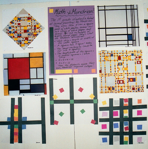
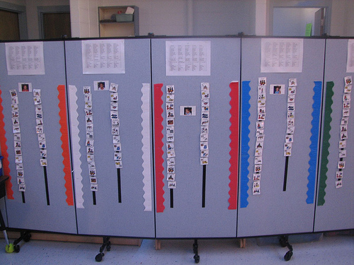
"Quiet Indoor Voices," by DeepEllen

One of my original reasons for creating Think In Pictures was to try to link up the topics of education and visualization. The educational blogging community is very tight-knit a community and does not seem to have as strong a connection to outside influences regarding how to promote visual learning as they do in other areas. My ideas for this blog have evolved considerably in the seven months this blog has been online, and I have moved from working in K-12 curriculum design to adult curriculum design and from the graphics side back to an emphasis on writing, so that early emphasis may be less apparent than it once was. But my primary goal of thinking about visuals in an eclectic way has persisted throughout that time, and has influenced my other creative work as well, in ways I will be able to describe someday if things go as planned.

Math & Mondrian project, photo by Bisse

Visual schedule for autistic children by MNicoleM

If you like thinking outside the box on visualization with people who don't bother to use ridiculous terms like "thinking outside the box," you should keep up with the Classroom Displays blog. It's one of those sites that can help graphic and information designers out of a rut and provide some grassroots inspiration. Education bloggers recently named it one of the top four "audio and/or visual" blogs currently online in the 2006 Edublog Awards. To my mind, the fact that Edublogs decided that a joint category for podcasts and images was the way to go is the best sign that a blog like Think In Pictures, as it was originally conceived, is still a good idea.

I have never had a real or virtual conversation with the blogger behind the Classroom Displays blog, but I know from her sourcing that Linda Hartley works overtime to get good work up on her blog. She is a heavy Flickr user, organizing submissions through a Classroom Displays Flickr pool and running a related wiki to boot, and is always scouring Flickr for good contributors. The fact that she holds a degree in Learning, Technology and Research and chose to investigate displays made of construction paper and crayons is an inspiring example of where you can end up when you think creatively and openly about visualization.

Monday, October 16, 2006

Visualization Versus Symbol In Mapping Social Networks


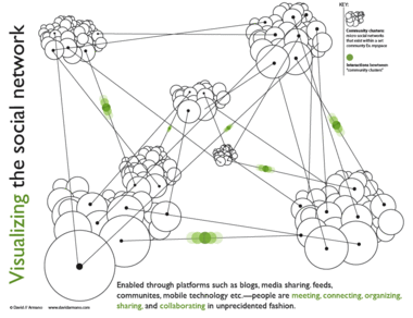
Data Mining's Matthew Hurst brought up an excellent point about data visualization in his critique of the above graphic, and Hurst's observations sparked an interesting debate with the image's creator, David Armano.

The graphic offers a "visualization" of relationships between social networks that bears little resemblance to their actual organization, and Hurst neatly dissects what is wrong with this image, and provides a classic example of why reference to data is imporant in constructing any visualization, however abstract its intentions. I encourage you to read their short discussion and think about what each of them is saying.

Any teacher can tell you that simplicity and accuracy are not mutually exclusive. On one level, we all know this. A statistical mean, for example, is not a falsehood; it is a simplification which is grounded in data and reflects it in a logical way. Describing a pencil eraser as having a length of 1 cm is not inaccurate if a measurement with calipers reveals that it is actually 12 mm; the former is an approximation which may be sufficient for its audience's needs. All good visualizations simplify in the sense that they render data more easily intelligible to the human mind, and the simpler they wish to be, the more careful they must be to ensure that their claims are consistent with the facts.

I produce teaching materials for 12- to 14-year-olds. It is a constant challenge when discussing topics like nuclear energy or virus replication to create diagrams, charts and graphics which avoid giving more detail than is of interest or use to a 12- to 14-year-old mind. But it is equally important to me to simplify information in ways that are still wholly consistent with the facts. To do otherwise would be to disregard one of the essential constraints that faces any interpretive art.

In criticizing Armano's graphic Hurst jumps in to a fray usually dominated by sites like Junk Charts, which regularly dissects visualizations which are poor communicators of the information they struggle to convey, but also occasionally highlight visualizations which have been streamlined and edited to the point where they have become symbolic objects (look, our stock price is skyrocketing) while still wearing the trappings of visualization. This is an interesting case in that I think Hurst has correctly identified that Armano managed to cross that line from the other direction.

In other words, I think that what Hurst uncovered in Armano's "visualization" is not a case of a diagram that betrays the facts but of a piece of graphic art which employs the language of visualization to lend authority to the informational context which surrounds it (be it a book, a public speaker, or a scholarly article). This is nothing new in graphic design, but it is often challenging in such cases to determine whether a content creator has crossed the line from symbolic representation and into false claims of accuracy.

I came across Joe Kral's wonderful Flickr photo set of old Penguin paperback covers not long after reading Hurst's critique, and the relationship between Armano's "truthy" diagram and many of the social science covers in Kral's collection seemed to me like a useful comparison. Many of these books utilized a design language which attempted to buttress the scientific underpinnings of works in sociology, a genre that was making a strong case for its status as the "new" science in the 1960s, and thus instructed readers in how to approach the work.


The above graphic represents both the tidy interlocking of elements of the book's subject and the way in which each element will be examined in isolation. The hexagonal blocking is also an obvious reference to the social organization of bees, which offers the comforting claim that human industrial organization is subject to an observable system of rigorous rules of behavior.

John Venn displayed the first Venn Diagram in a philosophical journal in 1880. Below is a nice graphical interpretation of this schematic which does not purport to contain any actual data.


This next one is a bit of a stretch but I thought it functioned as a strange sort of chart.


Unfortunately, in the case of Armano's graphic, the language of visualization is employed to a degree that can easily fool audiences into believing that they are looking at a representation of reality which contains actual data, rather than a symbolic one. Where the examples above are merely suggestive, Armano's makes a visual claim to providing actual information as a "map" of a network. But even networks can be visualized in ways that do not manipulate viewers in this way.


Armano has argued that his visualization is in fact meant to be a symbolic one, but the graphic's busy complexity, the use of data "points" and connecting lines (what is the function of the "points" if not to suggest chartlike qualities?), the inclusion of a "key" and the labeling of elements all suggest otherwise. If the designer were to accept that his graphic was being interpreted as a map of the true relationships between social networks, he might recognize Hurst's points as suggestions for improvement, and go back to the drawing board to create a graphic that is more consistent with the data, and which would be much improved by the change.