
Friday, September 29, 2006
Thinking Small: The "False Illusion" In Contemporary Photography

Illusions of scale are fun when you can see through them, or think you can; once the mental puzzle is solved, however quickly, I find it easy to grow fond of an image if its trick is visually interesting. Photography as a medium has an uncanny ability to portray these illusions in a convincing and unsettling way, whether deliberately or through a disorganized conspiracy of its elements. (Far less fun, to me, are those illusions which they eye cannot unravel without external sources of information - museum labels, biographies, exposes, and other elements of backstory.) Digital photographer Thomas Hawk got me thinking about this again over the past month or so after posting a string of photographs of miniatures from a display at the Alameda County Fairgrounds in the SF Bay Area.
Above is "Arsonist," a photo Hawk took and presumably enhanced in-camera or in Photoshop with a subtle painterly effect. It is a very well-thought-out photograph, requiring more than a quick glance to take it all in and offering something in return to those who do so. The yellow cast over the photograph, offset only by daubs of red of the fire engines and the encroaching darkness at the photograph's edges, gives it a feeling of age that is obviously false, and that darkness gives both the sensation of the viewer as voyeur and criminal (the arsonist watching the effects of his or her crimes from a hidden location) and of destruction (edges licked and damaged by fire). But it harbors no illusion.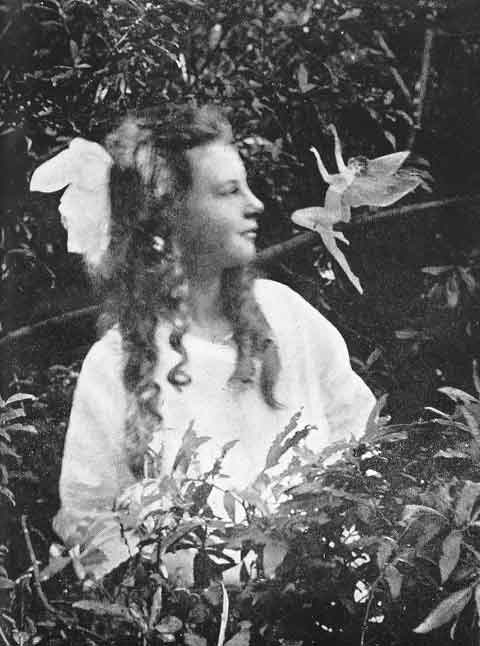
History is full of stories of people trying to fool other people with doctored photographs, and some of these involved illusions of scale as well, although generally utilizing darkroom techniques rather than in-camera effects or subject staging. Edward Gardner's famous Cottingley photographs are a prime example. They can be seen in the larger context of early twentieth-century spirit photographs that capitalized on viewers' relative naivete regarding the reality of a photographic image, and how that reality can be compromised.
But pretending to fool us, and inviting us to play along, is a newer phenomenon, one borne of experience, and one of the many quite obvious things that elevate photography to the level of art despite its mechanical component. It reminds us that cameras capture reality, but it takes a human to frame it. This relationship is at risk of being wholly consumed by the film industry, which has invested it with a level of passionate commitment that serious still photography has been reluctant to address.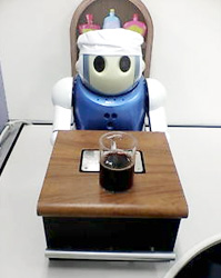 "False illusions" like Hawk's above owe a lot to our wariness at photography's power to fool us - perhaps it is for this reason that we can take such pleasure in demonstrating our ability to deconstruct such a puzzle using only subconscious, intuitive, reflexive effort. It is (for now, anyway) what still distinguishes our perception as uniquely human - artificial intelligence can categorize, but it is easy to fool it by stepping just beyond the boundaries of its classification system. Case in point: the wine-sniffing robot who grazed a human hand with its sensor and declared it prosciutto.
Most of the other photographs in Hawk's series of miniatures lend weight to this observation by their counterexample. These miniatures, for Hawk, are all about story - the story he imposes on his isolated subject, and how haunting they can become if framed properly. "She's Leaving Home," below, is a good example of this.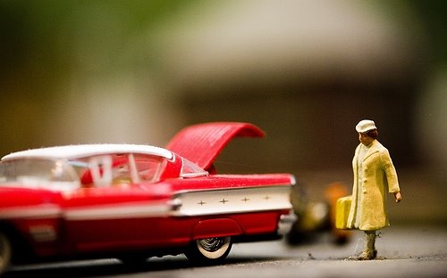
Despite its suggestively dark title, there is not much to this photograph beyond the warmth of its color and the contrasting depth of fields that wash over the viewer; there is nothing here that David Levinthal did not show us a long time ago. And there is no mystery.
I may be overstating the case for ease of interpretation; perhaps what is essential is that we can tell that something is amiss, even if we can't easily resolve it. The photograph below, one of NASA's recent Photos of the Day, has the bizarre look of a miniature and absolutely captivated my attention as a result. Were it not for the tail of ignited fuel and the known context of the photograph, I would argue that the photo looks like something shot on a model railroad. What makes that launch gear look so... tiny?
One clue to this mystery might be found in the "tilt-shift fake," a now-popular Photoshopping technique for making real things look fake. Flickr member electrospray, for example, turned this
into this

for instant miniaturization that can be quite convincing if one is not aware of the technique. If Gardner were alive today, he would likely be doing just this sort of thing (either that, or haunting Worth1000.com); it's just another opportunity for photographers to fool viewers who have not quite caught up with their methods. Seen in isolation, what would you assume the photograph below (also by electrospray) was a picture of?

Contrast this with "Several Times I've Wished Everything Would Slip Into A Void," a photograph of the ferry terminal building and palm trees lining the Embarcadero in San Francisco. This photograph (below) offers a wonderful illusion of scale that is so simple and so quickly unlocked it is hardly a puzzle at all. It is actually almost easier to view this photograph correctly than incorrectly, but it is composed in a way that allows us to toggle between the two views with ease once we recognize their possibilities, and I feel an unalloyed pleasure in doing this which is, I think, at the heart of the playful type of illusion I am trying to get my head around in this post.

There are many wonderful photographs that take this distinction between simple and complex illusions as a challenge, and work to break down the division between the two. One of my favorite examples of this is by photographer Jennifer McNichols (obvious disclosure: my wife, blogging partner, and all-around muse) who took a series of photographs at Madurodam, a bizarre Dutch microcosm that fetishizes all things Netherlandish via miniaturization. Her "Madurodam (February 2003)" offers a wonderful double-take that has failed with no one who has seen the image.
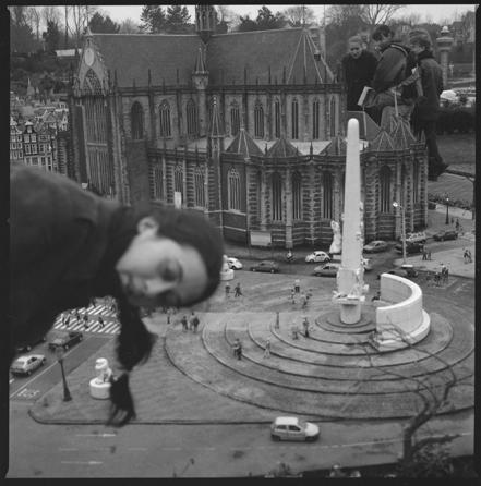
Jennifer had me release the shutter on this photo while she bent over at the waist and leaned in from outside of the frame, creating a strongly suggestive illusion in that simple move that she were in the correct position to be in a "real" scene - hanging over some balcony and lending the blurred street scene (the Dam, the old central square and original "dam" of Amsterdam) a realistic context. But the illusion is quickly broken by a reference to the actual scale of things on the other side of the photograph (a process of discovery aided by the fact that this image reads naturally from foreground to back, and supports our Western preference for reading from left to right). The illusion is so quickly posited and broken (all in-camera, as Jennifer would doubtless point out) in a heightened form of what all of these successful "false illusions" offer to viewers: the chance to see a staged reality shatter and reconstruct before their eyes. Somewhere between the vulnerability of being fooled and the transparency of honest photography, the deliberate telling of "bad lies" in art can remind us both of how manipulative photography can be and of how far we, as viewers, have come.

Thursday, September 28, 2006
B Is For Blogged: Steve Mack's Alphabet Book
 Freelance illustrator Steve Mack has been posting his way through the production of a gorgeous alphabet book on his Spot Illustration blog, and just posted his "Z" illustration. Mack, who has illustrated childrens' books, designed greeting cards for the major card companies, and contributed illustrations for magazines and books, lives in Canada with his wife Erin and son Alex, and was kind enough to agree not only to do an email interview with Think In Pictures but to send along the above "b-side" drawing for his "L" page, which was replaced by this lion. ("I felt it was too simple. Still a cute image though.")
I loved the idea almost as much as its execution; producing and publishing an alphabet book in serial blog form seems very natural to blogging, and is a great example of how artists can engage viewers by offering free access to their creative work in ways that old-school publishers might assume would dilute a copyright. Mack will soon have a print edition of the book available for purchase through eprinter Lulu.com. If you're interested in buying one, don't worry - I'll remind you!
TiP: There's a very strong historic style that comes through in your work. Can you break that down for me? As an illustrator, what are the features that give it that look we recognize and can unconsciously place?
Mack: I have deep respect for the illustration and design of many illustrators from the 1940s-1960s. A lot of illustration from that period was handled with a keen eye on simplicity of design, form and color. I think those are obviously timeless qualities people recognize and are the ones I focus on mostly in my works.
TiP: Tell me about your illustration influences. Can you name specific people whose work has really inspired you?
Mack: I am influenced by illustrators like Jim Flora, Alice and Martin Provenson, Alain Gree, J.P. Miller, Aliki, Bernice Myers, Aurelius Battaglia, Eric Carle, Art Seiden, Ed Emberly, Harry McNaught, Janet LaSalle, Leonard Weisgard, Mary Blair, Robert Louis Stevenson, Ruth Ruhman, Ryohei Yanagihara, Sasek, Tom Oreb, Tom Eckersley I could go on and on!
Designers like Paul Rand, Saul bass, Alex Steinweiss. I like designers who think in contradictory scale, bold images and limited color palettes.
TiP: I respect that your modifications for Adobe Illustrator are trade secrets, but let's speak more generally about that process. How would you advise young illustrators looking for a textural or "handmade" look to go about developing their own tools?
Mack: Well, we all have our processes and Adobe Illustrator is just another tool. Like paint brush or a pencil. I would tell young illustrators not to let the computer dictate your style. You can bend and pull the software in any direction you like. It just takes a lot of experimenting. Heck! I still experiment every day! That’s the fun of illustrating! If I wasn’t trying new things or if it was some "plug-in" I applied it would be a rather dull existence. I need to feel like I am crafting something not just clacking keys.
As for developing tools to look handmade I would suggest studying natural media. Look at old illustrators work and try and replicate that in Adobe Illustrator by any means necessary. There are hundreds of ways to provide texture in you digital work. It just takes a little bit of experimentation.
TiP: A lot of so-called Modern art emphasized the need for an art form to reveal the essential nature of its medium, but postmodernism seems to have broken up that particular cartel. Would you care to philosophize on the aesthetic of the "fake handmade" - i.e. creating something that is meant to look handmade or textured but is computer-generated and produced using entirely digital means?
Mack: I think that need is just created out of our medium of interaction. As an illustrator I sit down in my home studio and I converse with art directors spanning the globe. I can be in NYC in an instant revising a layout for a book and in the next instant I can ftp greeting cards to art directors in Cleveland then I can reply to a request from Japan. That is pretty amazing magic in my books. Handmade work will never go out of fashion and the computer brings immediacy to any project on many levels. Marrying tradition and technological is getting the best of two worlds for many.
TiP: What did you like best about your alphabet project? What did you find most difficult about it?
Mack: My alphabet project gave me a chance to experiment, have fun and come away with a printed book. I achieved all of those goals and hope it was entertaining. The best part is always reading people's comments. Some of the illustrations I liked lest got some of the best reactions. Funny how that is and I really enjoy when that happens.
I don't think anything was difficult. I completely enjoyed myself!
TiP: Do you have favorite illustrations from the set? Why are they your favorites?
Mack: Sure, I thought alligator was a good one for the textures I used and the boldness of the alligator's shape. I liked O as well for the odd way I colored the tentacles. I like when I do stuff that doesn’t make much sense other than to please my inner designer. That’s the beauty of being your own art director!
 That being said I hate B … I got carried away with that one. I lost focus and tried to include too many B objects. I find it breaks format and will be replaced for the published book. So that is an internet exclusive. The replacement will be a surprise for the people who get the book.
TiP: Do you have kids? If so, how old? How much do they engage with your illustration work?
Mack: Yes sir! I have Alex who just turned two and is a ball of sunshine! And my wife and I are pleased to announce we have another bun in the oven.
Being that Alex is only two he doesn’t really get the whole idea of what his daddy is doing. I do get involved with him while he’s coloring at his little desk but I don’t push any art stuff at him at this point.
TiP: The alphabet seems like a great superstructure to hang a lot of visual ideas off of - it gives you a discipline and a very clear direction and goal. Have you thought ahead to any other children's book projects that would give you the same kind of framework for a project? If not, will you miss it?
Mack: Yes, I have some more ideas for other projects based on the blog style of communication. The project was fun so yes, I will miss it.
I read a great quote from Eric Carle once that said: "When I start a book it’s a lot of fun. After a while it is work, then it becomes labor. Towards the end it feels like slavery! After I have delivered the finished illustrations to the publisher, I become sad. But when I see the printed book, I am happy again!" That sums it up nicely!
The Cold, Hard Truth About Collecting Women Artists
The Village Voice recently published a piece by Jerry Saltz highlighting astonishing figures for womens' presence on the New York contemporary art circuit. The opener is a zinger:
When it comes to being artists, women can be as bad as men. The problem is that even now, decades after the onset of women's liberation, women aren't being allowed to demonstrate this.It discusses some new figures:
According to the fall exhibition schedules for 125 well-known New York galleries—42 percent of which are owned or co-owned by women—of 297 one-person shows by living artists taking place between now and December 31, just 23 percent are solos by women.And makes its case:
Art historian Griselda Pollock has written about "women's struggle for meaning"; whatever we call this struggle, it needs to be seen as a failure of the imagination that amounts to apartheid. We all have to feel threatened by the bias. We must see it as a moral emergency. Having mainly men show means that more than half the story is going untold. Whatever story women tell will be told in ways it never has before.It's an invigorating and bracing piece, and you should read it. But what I loved even more was reading Lisa Hunter (aka The Intrepid Art Collector) turn this issue, quite pragmatically, on its head: If women artists are underrepresented, she argues, they are undervalued; this means that collecting art produced by talented women artists is not only a good investment but is, on balance, a better investment than artwork by equally talented men. She argues:
Long term, market forces are on the side of today's female artists. Look back at the past few decades in the art market: Whenever collectors were priced out of one area, they started reconsidering other artists, driving up prices there too. (Don't believe me? Try pricing Outsider paintings.) I feel sure that will happen for today's women artists when prices for male art stars go stratospheric. And once collectors start buying undervalued female art, galleries will start stocking more, in response to customer demand.I'm happy to report that Think In Pictures has several interviews with women artists in the works. I intend to continue to support women artists as well as emerging artists in general through a steady stream of artist interviews. Look for two new interviews with emerging female painters from me in the next two weeks.
Wednesday, September 27, 2006
Announcing A New Sister Blog: "Z Recommends"
 A week or so ago I added another blog to what is becoming a small network - Z Recommends, a consumer blog I will be co-authoring with my wife, photographer Jennifer McNichols, who has guest blogged here and who also collaborates with me on Darkroomers (a quiet blog for now that will eventually hold a lot of information about a darkroom-building project we're currently gearing up for). Z Recommends ("ZRecs" for short) is a kids' product blog built around our two-year-old daughter's priorities in life, a hybrid form we just invented that combines parenting advice, brief personal essays, consumer reports, and haphazard educational theory in what we hope will help us raise the youngest blogger of all time.
Today seemed like a good time to introduce that blog here because I just posted the first "Notes On The Digital Toddler," which discusses experiences I've had educating my daughter using YouTube, and is thus a great fit for Think In Pictures readers (I actually had to debate which blog it belonged in). There shouldn't be many good reasons to link between these blogs, but you can always find Z Recommends (as well as my other blogs) in the navigation on this one.
Tuesday, September 26, 2006
Interview With "Fabric Brain Artist" Marjorie Taylor
Marjorie Taylor is a professor and department head in Psychology at the University of Oregon. I first encountered her "Museum of Scientifically Accurate Fabric Brain Art" after it got the Boing Boing treatment about two weeks ago. I thought they were interesting enough to hassle Taylor for an email interview. Fascinating stuff!
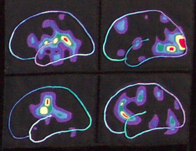 Fabric brain art by Marjorie Taylor (detail)
 The whole quilt
TiP: What first inspired you to create these quilts?
Taylor: I like to work with fabrics and have made about 30 quilts, as well as other projects involving fabric (hooked rugs, needle point, etc.). I like fine detail and enjoy using tiny beads, metallic threads - whatever - to create effects. When people in my department started using brain imaging techniques, I was immediately struck by the beauty of fMRI, PET, and ERPs. I like visual art influenced by scientific images and I thought the folds of the cerebral cortex would look great in velvet.
 TiP: Describe the techniques you have used. Quilting, beading, embroidery? Are these present in different combinations in each work? Other craft skills?
Taylor: I use both hand and machine quilting, embroidery, beading, applique and reverse applique. I use the patterns on computer boards as inspirations for quilt lines and electronic pieces (resistors, etc.), as well as different types of beads, as decoration. I particularly like to use tiny mirror pieces because it suggests mirror neurons. The materials are tulle, velvet, silks, satins, cottons, metal netting, and lots of different kinds of decorative threads. Lately, I have been incorporating old computer pieces (core memory) into the designs. Plus I like the look of circuitry diagrams in old texts and use them as well.
TiP: Do you do a lot of crafts, or did you learn these skills in order to do this project?
Taylor: I have always liked to make things.
TiP: What does it mean to you to interpret scientific research through such a traditional craft?
Taylor: It strikes me as funny.
TiP: There seems to be a form of meditation at work here, given that quilting, embroidery, etc. are relatively slow processes, while PET scanning, film development, and even interpretation of individual images are all relatively rapid processes. Is there anything else in your work that offers a comparable intensity of attention, for lack of a better descriptor? Any other thoughts on this?
Taylor: It is true that my pieces sometimes take a very long time. The first one took months because I did not know how to cut the velvet and fold it to make an anatomically correct brain. I made several before I was satistifed with the result. You are right that the process is meditative. It is calming to make fabric brains.
TiP: What are the stories behind the images of your work on the website? Do they reflect particularly interesting brain events or situations, or are they "normal" scans?
Taylor: One of them is based on a scan of the brain of one of the scientists working at the Lewis Center for Neuroimaging at the University of Oregon. I wanted to do a piece with a particular view so I went down to the center and Mark Dow gave me a scan of his brain that I cut up and used as a pattern. In other pieces, I have used scans from published articles in scientific journals. For example, one piece (done in reverse applique) shows PETs for hearing words, readings words, etc.
TiP: Do any of the scans you have recreated come from still-living subjects? If so, have these subjects seen them? What is their relationship to the work?
Taylor: The piece that is based on Mark Dow's brain is hanging in the waiting room of the imaging center where he works. He likes it.
Saturday, September 23, 2006
Striking Images From The Nikon Microscopy Small World Competition
Nikon Microscopy has published the top twenty entries from its 2006 Small World contest. There are a lot of beautiful shots in the set, and the two below should give you a sense of the range of the work presented there. Recommended!
 Two m-plane sapphire substrates (200x)
Melissa K. Santala, Department of Materials Science and Engineering
University of California, Berkeley, California, USA
Brightfield
 Seed of a Clematis vitalba shrub (a.k.a. Traveller's Joy) (2x)
Viktor Sykora, Institute of Pathophysiology, Charles University
Prague, Czech Republic
Darkfield
Eyespot Now Officially An Eyesore
Low-quality digital video can now look as bad as Photoshop-filtered, low-quality photos thanks to Eyespot's bevy of new effects. Unlike in pop music, where early adopters of new technologies can gain long-term cachet by exploiting new sounds and techniques to maximum effect, Photoshop's saving grace has been in the myriad ways its many tacky filters could be adjusted or layered to produce unique and subtle looks, and the best designers distinguished themselves with work that did not speak loudly of Chrome or Craquelure.
I'm sure educational technology buffs will more or less unanimously agree that young technophiles will be all over this stuff, but it begs the question: Why create tools to attract promising young talents to digital video just so they can spend valuable semesters in college learning why these tools sucked? And why give them effects that will only get in the way of storytelling at the moment we're trying to convince them that digital video is a way to express things that will matter not only to themselves but to people around them?
Friday, September 22, 2006
Inquiry Learning And Direct Instruction Needed For K-8 Science, Says NAS' National Research Council
The National Research Council, a branch of the National Academy of Sciences and the National Academy of Engineers, released a report yesterday that paints a dire picture of science education in the United States. The report is a typical grab bag of issues facing educators but key problems include a failure to offer meaningful science content to students at an early age and having No Child Left Behind state standards that are overly broad and which deemphasize "deep understanding" and an engagement with the scientific process.
The report also attempted to take a balanced view on the role of varying teaching styles. Hands-on learning and self-inquiry are important, the council agreed, but direct instruction is also essential. As the Washington Post reports:
One longtime battle about science education involves method: direct versus self-inquiry and hands-on learning. The report comes down on both sides, saying that one does not work without the other.
"Teaching content alone is not likely to lead to proficiency in science, nor is engaging in inquiry experiences devoid of science content," the report said.
Children proficient in science, the report states, should know, use and interpret scientific explanations of the natural world; generate and evaluate scientific evidence and explanations; understand the nature and development of scientific knowledge; and participate productively in scientific practices and discourse.
Lonelygirl15: Orson Welles Would Have Been Proud

I was speaking with a student worker yesterday who was editing PowerPoint lessons another student worker and I had produced about the role of radio in the 1930s and the impact of Orson Welles' 1938 adaptation of H.G. Wells' War of the Worlds on audiences. She was having difficulty appreciating how frustrating it was for people who took the radio broadcast at face value (in fact, most of those who thought the world was really being attacked by Martians had tuned in after the end of a competing program on another station, and missed the disclaimer that opened WOTW) and I came up with the lonelygirl15 videoblogs as an analogous example. The more I thought about it, the better it fit.
Both instances were works of art/entertainment designed to exploit the inherent trust consumers of the media format had in a popular and seemingly transparent genre. In the case of Welles, this meant producing the radio play in a strict news reporting format, complete with interruptions of regularly scheduled programming, emergency announcements, and bits of messy confusion and static. The creators of the three-month series of lonelygirl15 videos took advantage of the intrinsic honesty viewers assume is behind every webcam videoblog by exploiting all of the conventions of the medium - the teenage confessor, the yawningly slow and thus tantalizing storyline, the non sequiters and general dawdling around. As with War of the Worlds, audiences were largely angered and disgusted when they learned that they had been fooled by their belief in a genre's universal sincerity.
Welles took great interest in this kind of media deconstruction, and returned to it repeatedly throughout his career. He playfully used a spot-on, if slightly too pretty, simulacrum of film newsreels as the opening for Citizen Kane, and later genuinely fooled at least one audience member (me) by perpetrating a fraud in his brilliant half-documentary F for Fake, one of my favorite movies of all time.
In a sense, he invented a genre in violating the audience's trust in popular media. Many suspect as being intrinsic to popular culture, but I believe it is only present when some compelling interest (king, president, or corporation) works very hard to develop that trust so as to have an open and pliable audience for its messages. I haven't watched more than a handful of the lonelygirl15 videos, but the project seems like a worthy successor in that it made a very big splash in unmasking a naively trusting media environment and thus educating media consumers in a very direct way. Artists in this role, while they may aggravate and ultimately betray their audiences, play a very important and clearly functional role in media literacy. To call this a violation of ethics is to grossly misunderstand their cultural significance.
The new twist not present in other notable attempts to violate viewer trust in recent years - the viral, mythmaking hype surrounding The Blair Witch Project, for example - is that the pranksters found a truly naive audience waiting to be educated. Citizen Kane's "News On The March" was not just an effective and engaging way to open Welles' first film; it was an explicit reference to the reputation he forged as a maverick out of what could have been a disastrous public reaction to his work, and it acknowledged that Welles had already created a new media world from which there was no return. Most of us think we know already what millions of twelve- to eighteen-year-olds just found out, and can thus watch or ignore ABC's 9/11 "docudrama" without batting an eye at the use of the term to describe a work that is largely fictitious. We suspend disbelief to enjoy the show or hold it at arm's length because we know something stinks, but we don't engage with it on the level that radio listeners did with their evening programming in 1938 - or on the level that teens making their own videoblogs did with the blogs of their peers prior to lonelygirl15's unmasking as the actress Jessica Rose by the son of a Silicon Valley blogger. In this case, however, audiences have the power to respond - as is witnessed by the hundreds of videoblog entries that condemn, discuss, praise, or mock the entire episode. Radio listeners never had it so good.
How Not To Read A Photograph: Richard Woodward on Frank Rich And Thomas Hoepker's 9/11 Languor
 The Wall Street Journal's Richard Woodward neatly summarizes the now unavoidable final chapter in the saga of the 9/11 photograph of the kids who just don't seem to care that the world is falling down around them. (Image copyright Thomas Hoekper.)
Frank Rich took Magnum photographer Thomas Hoepker's bait and proclaimed in a pre-anniversary (Sept. 10) column that
from the perspective of 9/11's fifth anniversary, Mr. Hoepker's photo is prescient as well as important--a snapshot of history soon to come. What he caught was this: Traumatic as the attack on America was, 9/11 would recede quickly for many. This is a country that likes to move on, and fast. The young people in Mr. Hoepker's photo aren't necessarily callous. They're just American.The false profundity and fuzzy logic should have been cues to his turn of mind. Did he he really expect us to shrug off such callous - and even from a purely selfish standpoint, near-suicidal - behavior as "just American"? Does he really equate "recede quickly" with "not batting an eye while it's happening?" No, and of course not. But damning the photograph's subjects wouldn't fill out a column, and wouldn't feel nuanced. (To build on Stephen Colbert, pundits not in search of "truthiness" are, inevitably, looking for "nuanciness" - arguments that have the ring of nuance.)
Of course, Sept. 10 was not Frank Rich's day for nuance. David Plotz noted the "cheap shot" the next day in Slate, and the web journalist one-upped the print pundit by asking for the photograph's subjects to come forward and shed some light on the photograph's context.
OpinionJournal reports:
First to respond was Walter Sipser, a Brooklyn artist. "A snapshot can make mourners attending a funeral look like they're having a party," he wrote. "Had Hoepker walked fifty feet over to introduce himself he would have discovered a bunch of New Yorkers in the middle of an animated discussion about what had just happened." Another figure in the picture who wrote in was Chris Schiavo, a professional photographer. She bitterly chastised both Mr. Rich and Mr. Hoepker for their "cynical expression of an assumed reality." As a "third-generation native New Yorker, who knows and loves every square inch of this city," whose "mother even worked for Minoru Yamasaki, the World Trade Center architect," she stated that "it was genetically impossible for me to be unaffected by this event."Woodward looks for his Big Message too, and overreaches in claiming that such misinterpretations can manipulate "better than any computer program." What seems to be missing from his equation is that a photograph, as a representation of reality, always claims to be representative, even when it is exceptional. Given the proliferation of images around us, this means that we can selectively see (or remember, invest meaning in, what have you) photographs that reinforce our assumptions or suspicions about the world, while those that do not fit our patterns of mind simply don't stick. The impacts of this intrinsic, false claim of photographs is felt cumulatively. In the tidal wave of images that we see every year, month, week, and day there are few "gotcha" moments where the "true" nature of the photograph can be revealed or disputed, for every photograph, insofar as it purports to document life in a way that is both transitory and essential, is a contradiction in terms.
Anyone who interprets new artifacts to tell a current story about our culture will occasionally have to eat their words. The ideas one wishes to express can seem very exciting, and the evidence to support them can seem substantial as a result, even when it ignores reams of counterevidence, personal experience, or basic realities about the nature of photography which, at the moment of formulating that very special opinion, seem hazy and uninteresting by comparison. This is a disease that overcomes critics in any and every field, and it's how one recovers from it is the best sign of one's intellectual integrity. Unfortunately, Frank Rich just published a book, and to be seen eating any crow could hurt sales considerably and thus diminish the impact of his very good work in critiquing the visual and lingustic politics of the Bush administration. It's hard to blame him for trying to let the gaffe slide.
Wednesday, September 20, 2006
A Preview Of Things To Come At Think In Pictures
I don't have a major post for this week, but wanted to mention a few things I hope will significantly impact your experience as a reader. (No, I'm not migrating to WordPress...) I have made promises in the past that I have no intention of keeping - my Blogger blogs survey, for example, is dead in the water, as I realized I have much more interesting things to think about (for now) than indexing thousands of random Blogger-hosted blogs. So for this announcement I will only tell you about things I am working on right now:
- Artist/Educator Interviews: I will begin to feature these next week, and hope to keep up a steady stream of them. If you know of a K-12 art teacher who also works professionally as an artist (one litmus test for professionalism: they must have a website), I would love to hear something about them. I am currently asking people like this what it's like to take part in both of those worlds.
- Political Art And Its Discontents: Inspired by a ridiculous statement by a Guardian critic bemoaning the absence of war as a topic of interest to contemporary artists, I'm developing a review of contemporary political art encompassing historic exemplars of the form, criteria for political art that stands the test of time, and the phenomenon that is Bansky, along with an interview with a "war" artist and illustrator who hasn't gotten much attention yet but is very worthy of it.
- Visuals As An Aid To Writing: I recently finished and am now editing a draft of my first novel, and have been using some interesting spreadsheets and other visualizations in the process. These tools are not obsessive documents of my process but are borne out of specific writing and editing needs, and I thought they might be useful or interesting to others.
The Tangled Spaghetti Of Our Contemporary Faith In The Handcrafted
 Major web publications only rarely feature ridiculously hyperanalytical design studies without heading into dreamland and never coming back, but Slate does it with aplomb. I recently wandered into this magazine cover review from July that I had previously missed, by Seattle magazine's eat/drink editor Sarah Dickerman:
This being 2006, the spaghetti on July's cover is not styled in a neat spiral, as you might have found in 1984, but purposely tangled—a signifier of our contemporary faith in the handcrafted—and the flowers have been replaced by a bowl of heirloom tomatoes to indicate that fresh ingredients are the ultimate signifiers of good food judgment.That's the meat of it, so to speak, but there's much more if you missed this gem too.
Without totally abandoning selective focus, Gourmet and other magazines have been searching for a new photographic vocabulary. (Saveur, most notably, went through a recent redesign and adopted crisper, nearly overhead shots on its covers, too.) As depressive as Gourmet's recent covers have seemed, it has been mildly refreshing to see shadows and gravity return to still-food photography after years of sunny, horizonless shots.
Waterspout Studies, 1806-1969
 Benjamin Franklin, The Complete Works, 1806.
 From Les Meteores, Margolle and Zurcher, 1869
A waterspout off the Florida Keys photographed by Dr. Joseph Golden, NOAA, 1969
Tuesday, September 19, 2006
Ferrofluid
As the photographer explains:

More specifically, it's a superparamagnetic fluid, otherwise known as a Ferrofluid, in a dish over a neodymium magnet.
The key to a funky fluid like this [:] 10 nanometer magnetic particles in suspension. At that critical particle size, the particles’ magnetic fields balance with the surface tension of the liquid. So they don’t clump together, even in strong magnetic fields (in this case a N40 magnet).
Ferrofluids are used as heat sinks in loudspeakers and liquid seals around the fast-spinning drive shaft in a hard disk.
Picasa 2 Goes From Beta To Live, Gets Numerous Fixes, Now Supports RAW Files, Geotagging
Google announced today that Picasa 2 with Web Albums has just left beta stage and is now live. I was one of the early beta testers of this software and am glad to see the reports of all of the improvements based on my and others' feedback. (As a cross-platform computer user, I find the fact that Picasa is still not Mac-friendly to be truly bizarre.) Fixes and additions include:
- Nested folder viewing
- Saving to disk
- Additional importing options
- Geotagging for Google Earth
- RAW format support (probably the most requested feature by digital photographers)
Larger Thumbnails: Our thumbnails are slightly larger, so images are clearer, and we've improved speed as well. You will notice Picasa updating all of your thumbnails after the upgrade.This is the bug I reported way back in June and blogged about here, here, and here, got a quick response from Michael Herf on the Google Groups forum about, and then heard and saw nothing more on until this release. I was afraid this thread might have gotten dropped, because the bug hasn't gotten much attention elsewhere, but severely impacted your browsing experience in Picasa 2. I had thought with a web service it would make sense to roll out changes incrementally (especially bug fixes), but in hindsight I guess the big push is more valuable, at least from a PR standpoint. It gets Picasa back in the limelight for a moment and makes headlines that speak to those who were either unimpressed with the software before, hadn't tried it yet, or were waiting for some fix or other.
Unless Google is prepared to do some advertising beyond AdWords, however, this may also be a case that demonstrates how a beta version can harm your polished release - there were a lot of bugs in software that was entering a very competitive space against software that has very loyal users, and the buzz it generated was overwhelmingly negative.
I am looking forward to playing with this improved software. Since so few new products have come out of beta from Google, it will also be interesting to see how many new bugs this release holds - let's hope it's very few!
Click here for the Picasa 2 Release Notes. Click here to download Picasa 2 with Web Albums.
Monday, September 18, 2006
A Novel Promotion: New Fiction Marketed In YouTube Video
This "trailer" for The Mystery Guest is probably a first. And not a book jacket in sight.
Sparkline Generator SparkMaker Releases Strong Basic and Free Editions
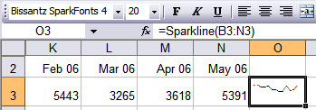 I don't usually mention product releases in this blog, but someone reading my previoius Sparkline post comparing features for SparkMaker and MicroCharts has emailed to tell me that Sparkmaker has just introduced both Free and Basic editions. The Free edition will produce line graphs only, and has a host of other limitations, but does include the image-export functionality for produced graphs that led me to a soft recommendation of SparkMaker over its new competitor, MicroCharts. These new versions represent an additional (and very smart) move by SparkMaker in the direction of easy access, prodded no doubt by the slightly more robust and much higher-priced MicroCharts, BonaVistaSystems' new entry into this niche market. The Basic edition of Sparkmaker costs $60 and lacks only a few major features (elements of the dialog box and full Office integration).
You can read a full feature comparison and download a Pro-level functional 60-day trial (which will back down to a Free or Basic version at the trial's end if you choose not to pay for the Pro functionality) at Bissantz's website.
Friday, September 15, 2006
Sparkline Generators For Excel: Features Comparison
Juice Analytics have highlighted two great resources for embedding Sparklines - "tiny, word-like graphs" - into Excel spreadsheets. Each involves the use of a custom font which interprets Excel data and renders it in "graphlike" fonts.
The two offerings are Sparkmaker and, more recently, MicroCharts. MicroCharts appears to be more robust, but the need for readers of spreadsheets to have custom fonts installed on their own computers to view the embedded charts seems like a significant usability issue - Sparkmaker has the ability to output its charted products in .gif, jpeg and .png formats, which renders them uneditable but allows for easy spreadsheet sharing.
I noticed that MicroCharts' free download is a trial version of the software that expires in August 2007. It's a generous trial window, so I was curious to know what would happen after that. I emailed Andreas Flockermann at BonaVista Systems, the company behind MicroCharts, to find out. Flockermann said that the final pricing has not yet been determined, but should be in the ballpark of $300 for a license, while the font needed to view such charts will remain free. Sparkmaker, in contrast, offers its Office add-in free of charge for personal and academic use, and sells commercial licenses for $200. While these prices may seem high to Office users accustomed to paying $30-$50 for a useful add-in, the addition of fresh-baked fonts (which can run anywhere from $40 to $100 apiece) makes both of these prices seem a bit more reasonable.
Here's a chart to sum it up. Color values indicate which service "wins" in each category; the best model for your needs will depend on which categories are most important to you. I discussed the uses and abuses of Sparklines in a previous post. Click here to read JA's post on MicroCharts.
UPDATE: Microcharts has since added a lot of new functionality and brought down its prices. In addition to the details I mentioned here, you should make sure to check their site out to make your own evaluation based on their product's new features. They have also informed me that they will be releasing Microcharts 2.0 in May 2007.
Wednesday, September 13, 2006
Keith Olbermann and The Colbert Report
This Colbert Report item ran a while ago but has stuck with me so I thought I'd make note of it for others who don't regularly watch the show. (I almost never do, thanks to YouTube.) I feel like this about television news most of the time.
Then, of course, there are amazing moments like the one below - on MSNBC, no less - that break out of the box. It's a little late for a 9/11 tribute, but I'll let this be mine. (If you'd prefer to read than listen, there's a transcript here.)
Coxeter, Escher, and Whiteley: Geometry, Art, and the Role of Visualization
 repare for a true blog post, quick and dirty. But the Boston Globe ran a great piece on Sunday about Donald Coxeter, The Man Who Saved Geometry. As it turns out, this article is right up the alley of Think In Pictures in that it paints a portrait of an academic climate in which visualization is finally coming to be seen as equal partner with language in a field's development and its outreach efforts, so I wanted to dash off a few comments about the article. (If you aren't registered with the Globe's website, borrow one of these usernames and passwords from Bugmenot.)
The article first describes the disrepute into which the study of geometry had fallen before Coxeter came along, instigated by a group that wrote under the collective pen name of Nicolas Bourbakis:
Coxeter responded to this challenge through a variety of means, including lecturing, collaboration with artists, and the development of new tools and applications for geometry. Of course, the connection to art interests me most. (I must admit, I hated geometry in high school.) Beginning in the 1950s, the Globe reports, Coxeter worked closely with M.C. Escher, who had no mathematical background, to help the artist visualize the concept of infinity in many of Escher's works.The Bourbakis espoused mathematical rationality and rigor. They believed the subjective and fallible visual sense was easily led astray, falling victim to impressionistic reasoning. In 1959, at a conference in France addressing the need to overhaul the French education system, Jean Dieudonne, a founding member of the Bourbakis and the group's scribe, infamously proclaimed: "Down with Euclid! Death to Triangles!"
Eventually, the Bourbakis way of mathematics pervaded the Western world, reaching even into grade schools with the Sputnik-motivated New Math reforms of the 1960s, which aimed to improve students' performance and to ensure America was not left in the scientific dust by the Soviet Union. Instead of shapes, children studied axioms and set theory.
As a consequence, mathematical and scientific investigation suffered from what Walter Whiteley, a great admirer of Coxeter and director of applied mathematics at York University in Toronto, calls the "geometry gap." Whiteley's thesis holds that when the areas of the brain that process visual and geometric concepts fall into disuse, the realms of mathematics and science suffer as well.

The craftily-structured paragraph seems to insinuate that Coxeter's mathematics contributed to Escher's "Ascending and Descending" infinite staircase, which is incorrect. This form was developed by Lionel and Roger Penrose and published in 1958; much of the groundwork in optical illusions was done by Oscar Reutersvard in the 1930s, but was probably not known to these later mathematicians, or to Escher himself.
Even more relevant to themes frequently touched on in this blog, the battle between geometry and algebra seems to be a phenotype of a purer tension between the expressive modes of language and visualization. The Globe makes the tantalizing connection:
In the design of educational materials - I will speak specifically about PowerPoint, which I use every day, but the same applies to Flash, web pages, or any other medium that involves the use of sequential visuals - this tension is often resolved in a way that makes the best use of both written and visual channels: illustrative diagrams that are just complex enough for the purpose at hand, or words that accompany pictures to create meaning that neither alone could communicate as effectively, for example.The visual and the algebraic perspectives are in constant flux in the mathematical and scientific disciplines. "The battle between geometry and algebra is like the battle between the sexes," said Sir Michael Atiyah, honorary professor of mathematics at Edinburgh University. "It's the kind of problem that never disappears. It'll never be dead, and it will never get solved. The question is, 'What is the right balance?"'
"It goes back and forth, and not in an accidental way," said Peter Galison, professor of the history of science and physics at Harvard. "Pushing hard on the visual methods ends up pushing toward the antivisual. Beliefs swing between an almost theological dogma that images are stepping stones to higher knowledge, or that they are deceptive idols that keep us from higher understanding."
But this harmony involves a case-by-case negotiation of a topic's text/visual balance that places it along a continuum, not at a predetermined set of values. There is no single right answer for how much of your explanation of a topic should be text, and how much image, and how the two should relate; in each case, factors include how much a topical visual can clearly show, how much text can do to help explain and/or place a visual in an essential context, and how much of the language involved (in PowerPoint at least) should be shared orally by a speaker rather than being written out. Cases where text should predominate tend (in my experience) to be cases where there is a strong narrative thread linking information together, and the logic of the narrative is the strongest means of reaching a student. However, even in many of these cases, a few words can go a long way, and visuals can dominate the slide.
The article got me very interested in Whiteley, and his home page at York University a fascinating report he wrote with several others for a SIGGRAPH conference, which covers a lot of ground regarding how and why students in the sciences should be thrust into some visualization and design challenges both to broaden their thinking and to prepare them to communicate the results of their work effectively. The paper includes a number of idea-packed lists (one of which discusses the role of narrative in learning, which gels with my own impressions offered above), and would be worth skimming solely on the strength of these aphoristic minefields even if the paper wasn't so interesting. One of my favorites of these is excerpted below, with points bolded which I find to be particularly difficult obstacles for "right-brained" people to appreciate when creating teaching materials for K-12 students (or any other general audience):
Basic misconceptions about visual perception and communication
- We see what is there.
- You see what I see.
- Mind and consciousness are the same.
- Reason is the primary cognitive experience.
- The tools for analyzing and understanding linguistic and logical processes are adequate for analyzing and understanding visual processes.
- If you are not conscious of using visual perception, you are not using it.
- I cannot be held responsible for unintended consequences of my use of visual media.
- Visual media has no effect on me. I can control the effect of visual media.
- Three-dimensional understanding is built from two-dimensional understanding.
- Visuals are trivial - you either get them or you don't.
- Visuals are hard - if you don't get them, there is nothing you can do.
It's The Monitor, Stupid

Slate has a great piece that argues that the best computer upgrade you could treat yourself to would not be a new CPU with a faster processor, but a giant monitor. They're just getting cheaper (a decent big screen should run you less than $3,000, and you could get the dreamy setup pictured above here for $6,000), and (at least for now) super-fast processors won't do much more for anyone but serious gamers when compared with the perfectly sensible previous generation. As someone whose productivity, or at least sanity, has been doubled through a dual-monitor setup, I'd have to agree - and a giant screen would be even better.
Anyway, I don't have anything intelligent to add, just wanted to suggest the article for a good, quick read.
Friday, September 08, 2006
The Confusing Diagram on FIJI Water Bottles: Or, Why Good Designers Are Worth Their Weight In Gold
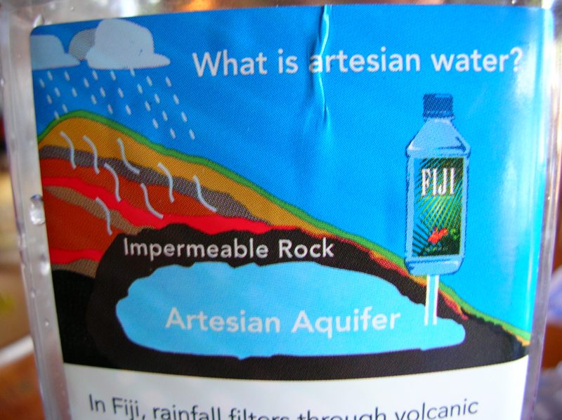
Numerous bloggers (most recently, the folks at Boing Boing) have noted the irony of FIJI Water's graphic describing the source of their artesian aquifer water, which sits contentedly below a layer of "Impermeable Rock" while rain pours down generously from the Fijian sky.
Basically, the geologic graphic this company created to promote their product is confusing because it employs a confusingly "cyclical" design trope common to water-cycle diagrams to show something that is not cyclical at all. To make matters worse, they throw a bit of misinformation into the mix.
The Idaho Department of Environmental Water Quality describes several types of aquifers, the most basic being:
- Confined—An aquifer overlain by one or more layers of impermeable rock or soil that restrict water to within the aquifer. The water is confined under pressure. Drilling a well into a confined aquifer releases that pressure and causes the water to rise in the well. These wells are sometimes called artesian wells.
- Unconfined—An aquifer that is not overlain by a layer of impermeable rock or soil. Water in a well will naturally stay at the level of the water table. As water is removed from the well, the water table at that place is lowered, causing the surrounding ground water to flow toward the well.
Here is a University of Georgia graphic showing confined and unconfined aquifers:
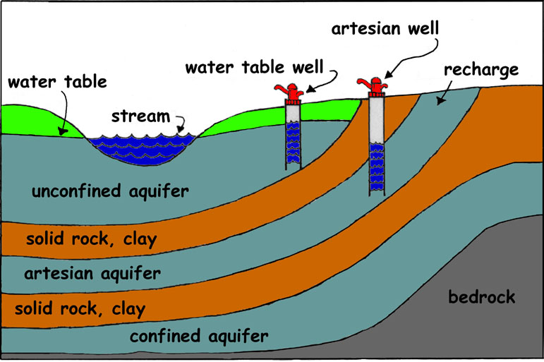
A confined aquifer, which technically is "locked out" of the water table by impermeable rock, does not have a recharge zone and thus does store a theoretically limited supply of water. This confinement can be caused by an impermeable layer of rock being laid down on top of an existing aquifer or part of the water table, dividing it from any porous area. Keep in mind that an aquifer itself is not usually an open space filled with water, but a highly permeable layer like gravel, silt, etc. that is saturated with water, and this starts to look a little more plausible.
But there are serious problems with FIJI's campaign. As their own website declares:
By definition, artesian water comes from a source deep within the earth, protected by layers of clay and rock. There is no opening, not even a porthole to the surface. As a result, the water never comes into contact with the air, protecting it from environmental pollutants and other contamination.Whoops! In fact, an artesian aquifer may be confined, or unconfined, as the above UGa graphic makes clear. Many others seem to get this wrong too. (Wikipedia exhibits a problem only Wikipedia can boast of, that of contradicting itself - a nice graphic clearly shows an unconfined artesian aquifer, but the first line of the entry that links to it defines artesian aquifers as confined.) To cite one of many definitive counterexamples, the U.S. Geologic Survey describes an artesian aquifer in New Mexico thusly:
Recharge to the artesian aquifer of the Roswell Basin occurs over a broad region east of the Sacramento Mountains known as the Pecos Slope where geologic units containing the artesian aquifer are exposed at land surface. Discharge from the artesian aquifer into sinkholes supports critical habitat for endangered species at the Bitter Lakes National Wildlife Refuge.Of course, Wikipedia's entry can be corrected in about five minutes. (Got five minutes?) But when will FIJI fix their water bottle labels? And does FIJI's error mean that they don't know what an artesian aquifer is, or that theirs may not be confined?
But the biggest source of confusion over FIJI's graphic is that they show rain falling on the area and the aquifer underneath it. This immediately suggests, as it should, that the water is recharging the aquifer. It is possible that their diagram is intended to show that the water was introduced to the area at an early stage, followed by the introduction of a lava flow that turned into a layer of igneous rock. If so, there is something truly medieval about the way this graphic collapses real time into a single image without any reference to time's passage. It is more likely that they included the rain to show how it does not penetrate into the aquifer, but it seems more likely that it deserves all of the scorn it is receiving. It is a very confusing graphic.
So, long story short, such things do exist, even if FIJI doesn't explain them very well.
A few design changes could have improved the situation. The folks at FIJI could have:
- Included a graphic showing how the impermeable layer is laid down;
- included a magnified view showing how difficult it is for water molecules to navigate their way through the mineral grains of an "impermeable" rock; or, most importantly,
- added an unconfined aquifer above the impermeable layer (the most common real scenario anyway) to show where the rain actually goes, and to highlight the distinction between a confined source and an unconfined one.
Imagining Terrorism: TSA "Precognition" and Computer Recognition of Emotions
 Boing Boing published an item on the Empathic Painting Project a while back and I've been thinking off and on about it ever since, without incident. It reminded me a bit of Komar and Melamid's Most Wanted Paintings project, except without the irony, certainly more of a science experiment than a concerted effort at artistic expression.
The technique might be more interesting in installation art than painting, which would give viewer emotions a dramatic influence over a space through their real or expressed mood. One great technological advance would be for a computer to interpret the collective mood of a group of people in the space, or to scan a variety of faces and interpret that information in some other way. This would provide real and socially useful information and making manipulation of the machine much more difficult - and, if achieved, much more interesting!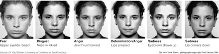 Of course, ideas like this are a creative inversion of the real work going on in this technology, a serious project which has plenty of 1984-style ramifications as well as the potential to save lives. (How often the two go hand in hand.) The New York Times published an article in late August about the U.S. Transportation Safety Administration's "behavior detection officers," an expanded cadre of officials who assess the facial expressions of would-be passengers in search of terrorist intent. Apparently, according to the graphic above, you must be happy, confused, or bored out of your mind in order to not look like a terrorist.
The Times takes the comforting tone of playing up the scientific nature of such screenings, but TSA officials admit that their techniques are not perfect. Put at its most ironic, their facial recognition techniquees are most limited by the fact that they "catch" a variety of emotions - fear, anger, frustration, stoicism - that are quite common among people going through post-9/11 security checkpoints!
I suspect that science will soon catch up with art, and human "behavior detection" screens will begin to look very... 20th century.
The Golden Age Of Embedded Comic Book Advertising

Think embedded advertising was invented by Hollywood or network television? Check out these great single-page comic-book "adventuretisements" from the early days of color comics. (Of course, the practice goes back much further than that! Radio, medicine shows... modern advertising can seem a lot less shocking when you remember its roots.)
See! Sam Spade save himself by using Wildroot Cream-Oil Hair Tonic!
Watch! Little Jim stare down a gorilla thanks to the gun he earned by selling White Cloverine Brand Salve!
Thursday, September 07, 2006
"Nightmare Before Christmas" To Get 3D Release

It's Christmas in October this year: Disney has plans to release the seminal Nightmare Before Christmas in a 3D version in time for the holiday season. Drawn!'s Johnny comments that "for an animated movie that’s nearly 15 years old, Nightmare really has legs — especially in this age of CGI-or-Bust." I couldn't agree more.
What's strange is that Burton has had so little success squeezing more value out of his techniques and animation team - I recently tried to watch Corpse Bride and gave up halfway through. For all its bustling energy, the film is absolutely lifeless. Nightmare, in contrast, featured a cultural mash-up - Christmas meets Halloween - that had so much to offer Burton that he just couldn't miss.
If you happen to have a pair of 3D glasses handy, dig them out and take a look at the generous collection of 3D stills animator Joel Fletcher has posted to his own website.
Mark Jenkins' Multimedia Graffiti Art: The Politics of Absurdity
I've seen some of Mark Jenkins' "Embedded" street series (see one of my favorite figures below) but have only now learned from his website how much more his work encompasses. The balance of political messages and absurdism is pitch-perfect for illicit public art - it confronts through engaging viewers' curiosity and imagination, and ultimately has opportunities to get people thinking where many graffiti messages only generate a combative response.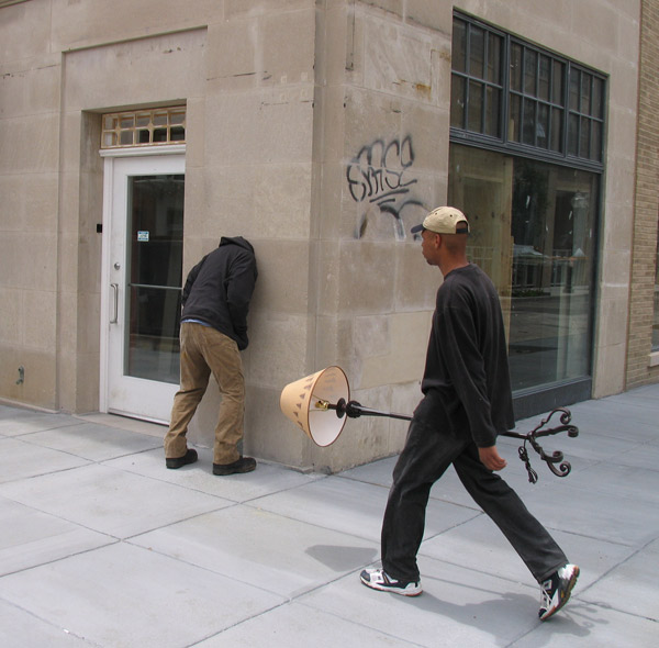


Wednesday, September 06, 2006
Toddler TV: "Interaction," and What Television Is Really Good For
The New York Times reported yesterday on a study at Vanderbilt University that found that toddlers are far more responsive to television programming that feels "live" than to the type of faux interactions pioneered by the Children's Television Workshop in the 1960s, which remain one of the key methods of children's television today.
The Times reports:
The test hinged on a hiding game. First the 2-year-olds watched the video — either the tape or the live version. The screen showed a person hiding a stuffed animal, Piglet, in a nearby room, often under a table or behind a couch. When the video ended, the children were asked to retrieve Piglet. Those who saw the recorded video had some trouble. They found him only 35 percent of the time. Children in the other group succeeded about 69 percent of the time, a rate similar to face-to-face interaction.
Does this mean that TV programs that simulate interaction are doing nothing for kids? Not necessarily, the researchers say. A few of the children in the recorded video group were especially responsive to the games and pauses, and they were the few children in that group who retrieved the toy.
“We found that if children gave evidence of treating the video as a social partner,” Dr. Troseth said, “they will use the information.”
A 35% success rate would be damning praise in the classroom. But the article goes on to minimize the findings:
To me, it sounds like we haven't come as far as we'd like to think. Maybe it's because we haven't yet figured out what educational TV is really good for.Their article referred specifically to “Blue’s Clues,” saying the show appeared to be “on the right track” — a point that, not surprisingly, thrilled creators of the program. Alice Wilder, the show’s director of research, said each script was tested in live settings with children to make sure that the show’s hosts — a young man named Steve in the early seasons and the current one, Joe — appear to be having realistic, child-centered conversations with viewers.
"Interactive" children's television was pioneered by the Children's Television Workshop in their design of Sesame Street. The CTW offered a breath of fresh air in the genre because they actually did research to test and improve their programming because their explicit goal was to improve literacy and help kids learn, whereas others were concerned primarily with entertainment and saw learning as a natural process that would follow without much forethought. There is still a huge gray area of unknowns in this genre, which critics on both sides use their imaginations to fill. But what we do know about child-television "interaction" we owe largely to Sesame Street. From the Encyclopedia of Educational Technology:
Critics in the 1960s predicted Sesame Street was doomed to fail because television was not an interactive enough media to facilitate learning. CTW researchers proved them wrong with what is now known as "The James Earl Jones Effect" (Lesser, 1974).It seems that if we will ever make progress and produce more effective television programming for very young children, it will need to examine several factors:
Producers filmed a segment in which stage and screen actor James Earl Jones recited the alphabet. Mr. Jones stared intensely at the camera. Moments later, the letter A appeared above his head. In his compelling voice, he then spoke the name of the letter. This sequence of events repeated throughout his one and a half minute recitation, maintaining wait times before the letter appeared on screen and before the letter's name was spoken.
When researchers showed this segment to children over time, they noted the following: During the initial viewing, children joined Mr. Jones in naming the letters. During subsequent viewings, the children anticipated Mr. Jones' spoken words and named the letter as soon as it appeared on screen. Finally, children were able to name the letter before it even appeared on screen. Clearly, children were interacting and learning!
- The role of single versus repeat viewings. My own daughter interacts intensively with our television, but not on the few occasions when we allow her to watch shows on PBS - her deep engagement, at the age of two, comes with heavy repetition that fosters a combination of emotions which encourages her to speak, act, and respond. This suggests that there might be different strategies for materials marketed as videos (Baby Einstein, etc.) than for serial programming on television. Broadcast children's shows will need to find ways to bridge that gap if they are to compete with intensively-watched videos for young children's attention.
- Applying learning models to interactive strategies. The silence in my daughter's television-watching is most deafening when she is asked a direct question by a character in a television show and fails to respond, then is praised as though she had answered. Who thought this was a good idea, and how can anyone be surprised to learn that toddlers can tell the difference between this and actual interaction? I think this particular strategy will be looked upon by future generations as evidence of just how naive our view of toddlers has been. There are better ways for a TV show to interact with a child than to ask a question and assume that it is answered correctly, and most of these ways come down to looking at the issue of interactivity more broadly. A show's ability to inspire movement, laughter, spontaneous action, and creative play among viewers can go far beyond the direct "problem-solving" of shows like "Blue's Clues" and engage children on multiple levels. Just as we no longer expect direct, lecture-based instruction to be the most effective teaching method, we should not expect a simple question-and-answer format in TV programming to be the best way to teach children.
- Evaluate what is to be learned. Surely, there is no harm in exposing a child of any age or maturity level to any learning content or strategy, if their attention can be maintained. But I am operating under the assumption that limiting our child's television-watching to a minimum is a good thing, because the things it replaces - direct interaction with a parent, as well as time to explore the world in an open-ended fashion - are generally more instructive and more rewarding than television. So I want the time my child does spend watching TV to be as beneficial to her as possible. To me this means that the content of learning should be aimed at her most intense concerns and interests at any age, or at least to those that can be met through a visual, televised performance. Among other things, this means that a good television show will help her do some or all of the following things:
- Allow her to explore places that are unfamiliar to her, but which she can connect with personal experiences. (Agriculture can be connected with the foods she eats, for example, and demonstrations of how certain real-world tasks are performed can be play-acted later.)
- Allow her to play games. (Blue's Clues meets this standard.)
- Invite her to explore movement and other forms of basic self-expression.
- Model language concepts that she can immediately apply to the world around her.
- Allow her to observe other children without interacting with them. That's right, without interacting. Interaction is proof of engagement with the world, but sometimes the cycles are not completed within the confines of a television show. We expect older students to be capable of "studying" a topic - reading, thinking, observing - and I think that young children's need for the same is minimized by shows like Sesame Street, which is scripted and edited in a way that stamps out opportunities for the consolidation of memory and for quiet observation.
Does this mean that problem-solving is not important to my toddler's development? My daughter solves problems every day, and my involvement in this process may be instructive, but it is always child-led. She finds problems that she finds it meaningful to solve, and we help her find solutions, encouraging as much problem-solving in her as she is capable of. Even with forty years of R&D in kids' television programming, no one has come up with a televised strategy that can compete with that.
Monday, September 04, 2006
1960s Stock Letterheads
More great advertising art from the collection of Dan Goodsell. Below are some of my favorites; there are many more in his post.
Saturday, September 02, 2006
Art Crimes
The wonderful graffiti hub Art Crimes has added links to my two posts on "Visualizing Dissent" (Graffiti As Art | Art As Graffiti) to the site's excellent Articles section. Susan Farrell's tireless work on this site has made it the best resource for writing about graffiti on the web, not to mention a great source for photographs of recent graffiti writing. I'm honored to have my voice added to the discussion there. Thanks, Art Crimes!
All This, And Cool Too: Party-Crashing at the Gates of YouTube
Something about Cai Guo-Qiang's sculpture for his "Head On" exhibition currently installed at the Dutch Guggenheim reminded me of Ars Technica's recent reporting on YouTube. A striking photograph from the Telegraph's Images of the Week (reproduced here for easy access) shows Guo-Quaing's sculptural installation of a wolf pack racing in a river of fur and teeth through the air and towards a gallery wall, into which the pack leaders have already unceremoniously collided.
Ars Technica's Nate Anderson wrote:
There comes a moment in the life of every sitcom where a desperately uncool father tries to act hip around his children's friends. The results, disastrous as they always are, should have given the UK government pause as it contemplated its own attempt at hipness—putting some videos on YouTube.Anderson was actually writing about two incidents he considered categorically uncool: The British government's use of YouTube as a cheap public relations tool (since pulled down due to copyright issues) and a defense industry whistleblower's attempt to draw attention to security and safety issues in a Lockheed-Martin project refurbishing ships for the Coast Guard. (This, too, has apparently been removed; a search for "Michael De Kort" turns up nothing.) I'd hate to insinuate that the door-panel-mounted LCD screens in the Think In Pictures limo show anything but OKGo treadmill-based music videos or that government PR films about "sharing the leadership challenge" meet my crew's exacting pre-funk standards. But what's profoundly uncool is watching a technology website completely misread the power of a new technology because it has momentarily donned sunglasses so dark it can't see the blindingly obvious.
YouTube is not just a cultural phenomenon. It is also, believe it or not, a website that hosts free streaming video. Some of these videos are indeed very cool, and most of them, cool or not, speak directly to very young people with lots of time on their hands who are very easily bored. Meanwhile, many more people who are no longer freshmen in college skim the surface, looking for the occasional work-break fodder. At this point, it's safe to say (and Anderson says it loud and clear) that none of us are seeking out statements from the British government or defense-industry whistleblowers.
But why not?
Google ranks websites based on inbound links. Are websites that serve a niche audience or that hone an amateur's skills mocked for joining the Internet because the majority of Internet users spend most of their time on top-ranked websites? Of course not. Then why assume that anything posted on YouTube is put up with the goal of garnering massive numbers of views? Should we really ask people like Michael De Kort or British government officials to stay away from a video streaming site which offers free uploads and video hosting, blog integration, and video sharing tools because their content doesn't match the site's current target audience - teenagers looking for the next viral hit or just a way to spend half an hour that they can laugh with their friends about later? De Kort's video was viewed more than 8,000 times in three days. Top-ranking videos tend to hit a couple hundred thousand views before fading out. But what if no one's counting?
I have posted two unerringly uncool videos to YouTube, examples of middle-school educational PowerPoint animations. It never once crossed my mind that I would be "mocked" for posting them. Here's why: I assumed the only people who ever saw them would be watching them on my blog. (How many searches for "educational technology" and "nuclear fission" do you think YouTube sees in a day?) I was making pragmatic use of an web-based application that met my immediate and personal needs.
How many people use sites like YouTube in this way? I'm sure Nate Anderson has no earthly idea. In the cases of the British government organization looking for some free PR or De Kort's revelations about Coast Guard insecurity, YouTube's primary audiences were not pandered to; they were ignored, a point Anderson completely misses in his article. The Washington Post put the blog to shame, going so far as to interview people for their story and coming up with a great source at YouTube competitor who has no problem cutting through Anderson's knot of audiences and the technological tools that enable them:
The real story for tech readers, Ars, is not how "embarrasing" it is to post serious videos for post-teenage audiences on a site like YouTube. It's a story about how easily technology blogs can get caught up in a web-app's hype and lose sight of what the future holds."This is an excellent example of the democratization of the media, where everyone has access to the printing press of the 21st century," said Dina Kaplan, co-founder of Blip.tv, a site that hosts grass-roots television programming.
Kaplan, like others, was hard-pressed to think of another video like De Kort's. "We have some people that come to mind that like to complain about government conspiracies," she said. "But in terms of something truly substantive and credible, nothing springs to mind."
Subscribe to:
Posts (Atom)


